


Link Building for SEO: The Beginner’s Guide

By Tim Soulo
Chief Marketing Officer at Ahrefs
You’re here because you need links.
You’ve likely heard that links (or backlinks) are what helps your website to rank higher in Google. And you need to learn how to build them.
Well... we (Ahrefs) have been building tools for professional link builders for 10+ years now. So it would be fair to say that we know a thing or two about link building.
In this guide, we have collected our best bits of knowledge and tried to explain all the intricacies of link building in simple terms so that you could easily put our advice to action.
But before we dive in, here are just a few quick teasers insights to get things going:
- If you have a brand-new website, it’s best to kick things off by building a few dozen foundational links.
- It helps tremendously to have a prior relationship with a website owner before you ask for a link from them.
- People link to web pages that are interesting and useful. So if your page is not that, you’ll have a very hard time building links to it.
- Links from relevant pages on authoritative websites have the most influence on your rankings in Google (and possibly other major search engines).
The basics of link building
You can think of links as votes. When other websites are linking to your page, it tells Google that your page is somehow important. Which is essentially Google’s PageRank algorithm in a nutshell.
So the more high-quality backlinks a page has, the higher it tends to rank in Google. And if you want to outrank it with your own page, you’ll likely need to get more links than it has.
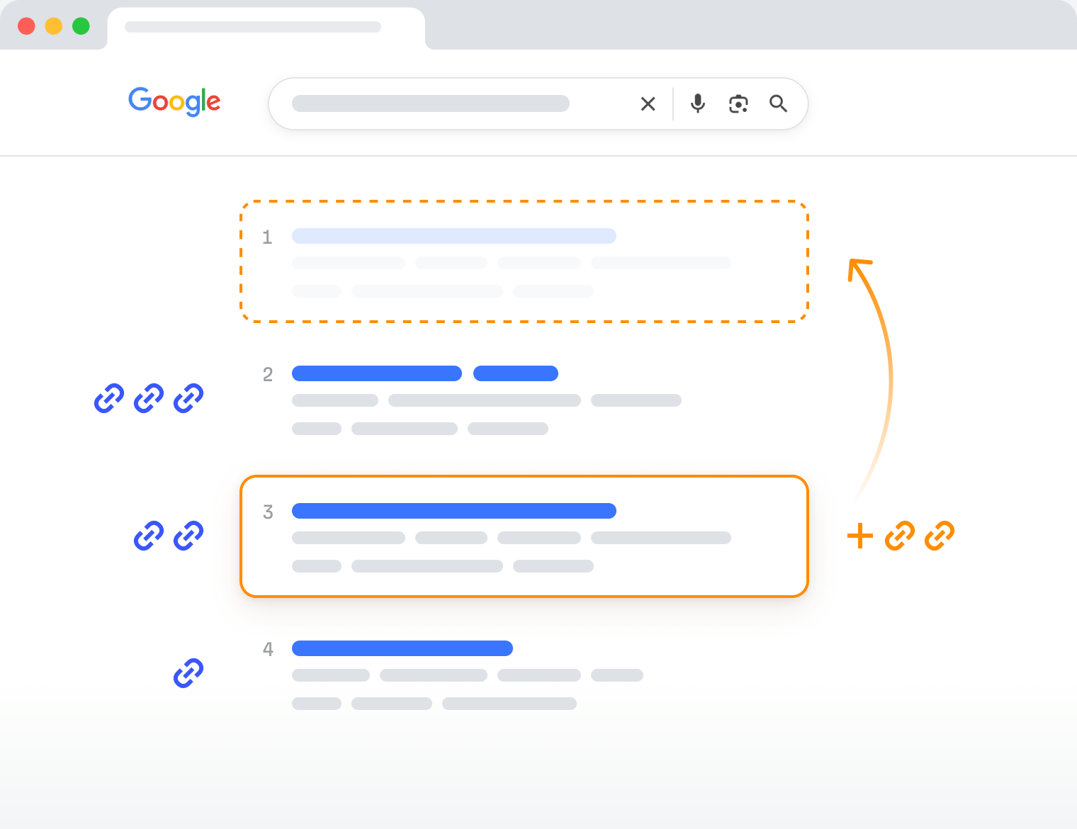
Backlinks help pages rank higher in Google’s search results.
I obviously oversimplified things quite a bit. Ranking #1 in Google is a lot more nuanced than just getting more links, because links aren’t the only ranking signal that Google uses. But it’s a very strong signal nevertheless, and it has a very direct influence on your search rankings.
So what is link building, and how do you do it?
Link building is the process of getting other websites to link to pages on your website. Its purpose is to boost the "authority" of your pages in the eyes of Google so that these pages rank higher and bring more search traffic.
Let’s get a bit deeper into that.
How to build links
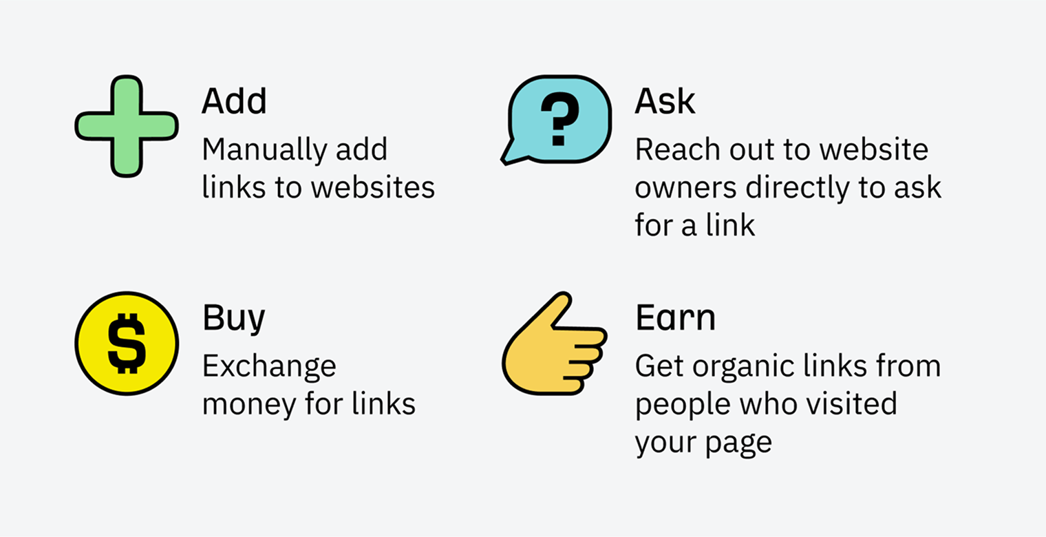
Conceptually, most popular link building strategies fall into one of the following four buckets:
How to get backlinks
You can also hire an experienced link builder (or a link building agency) to do it all for you. And that’s what a lot of digital marketers and business owners eventually end up doing because no matter which tactics you choose, building links is a lot of work.
But even if you decide to outsource link building, it would be immensely useful to have some basic knowledge of how it’s done. This way, you would be able to see if the person you hired is doing a good job or not.
So let’s take a closer look at each of the four buckets.
Adding links
This is when you go to a website that doesn’t belong to you and manually place your link there.
The most common tactics that fit into this category are:
- Social profiles creation.
- Business directory submissions.
- Review site listings.
- Posting to forums, communities, and Q&A sites.
Building links via those tactics is very easy to do. And for that exact reason, such links tend to have little to no value in the eyes of Google.
Other than that, these kinds of links barely give you any competitive edge. If you can go to a website and manually place your link there, so can your competitors.
And yet, this group of link building tactics should not be ignored completely. In fact, some professional link builders prefer to start with these kinds of links when they’re working with a brand-new website.
They refer to it as building "foundational links."
Think about it. Most online businesses have branded accounts at the major social networks, as well as listings at major business directories and review sites (Yelp, Trustpilot, ProductHunt, Glassdoor, etc.). And all of these pages contain a link to their website.
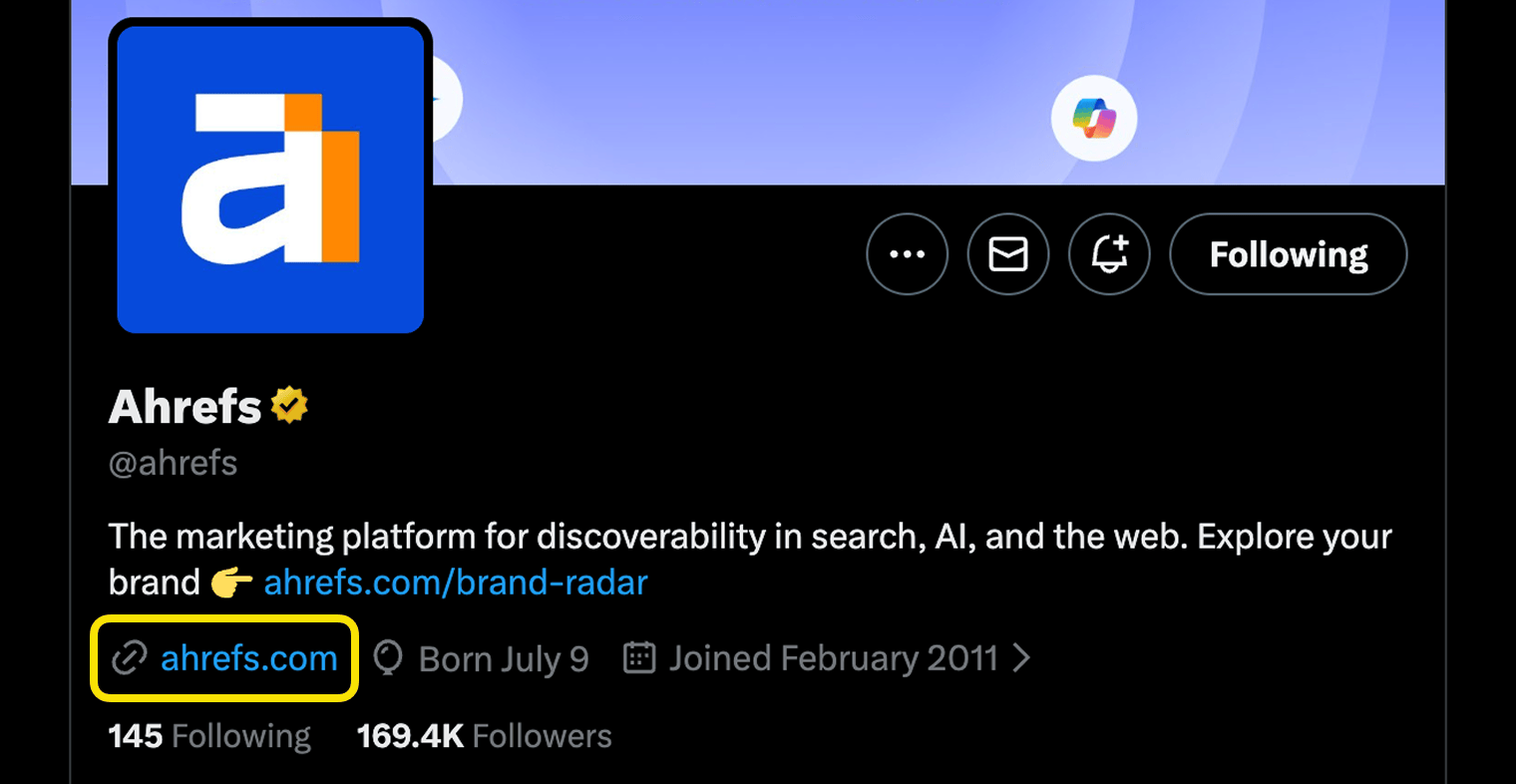
Google clearly pays attention to these profile pages. If you look at the "Knowledge" panel for Ahrefs (see the screenshot below), you’ll notice the links to our social profiles featured there. And we weren’t the ones who added them. Google identified our social profiles on its own and linked them to the Ahrefs brand as part of its Knowledge Graph.
Yes, these kinds of links are either nofollow or very, very weak. Which means that they hardly move the needle when it comes to ranking in Google.
But given that the ”nofollow” attribute is now treated as a hint, there’s a chance that over time your profile pages will accrue some quality links of their own and might start bringing a bit of search engine optimization (SEO) value to your website.
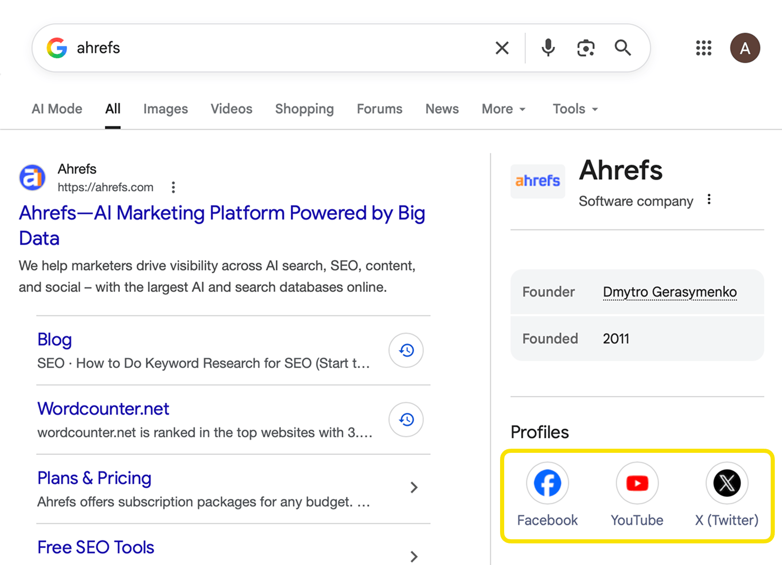
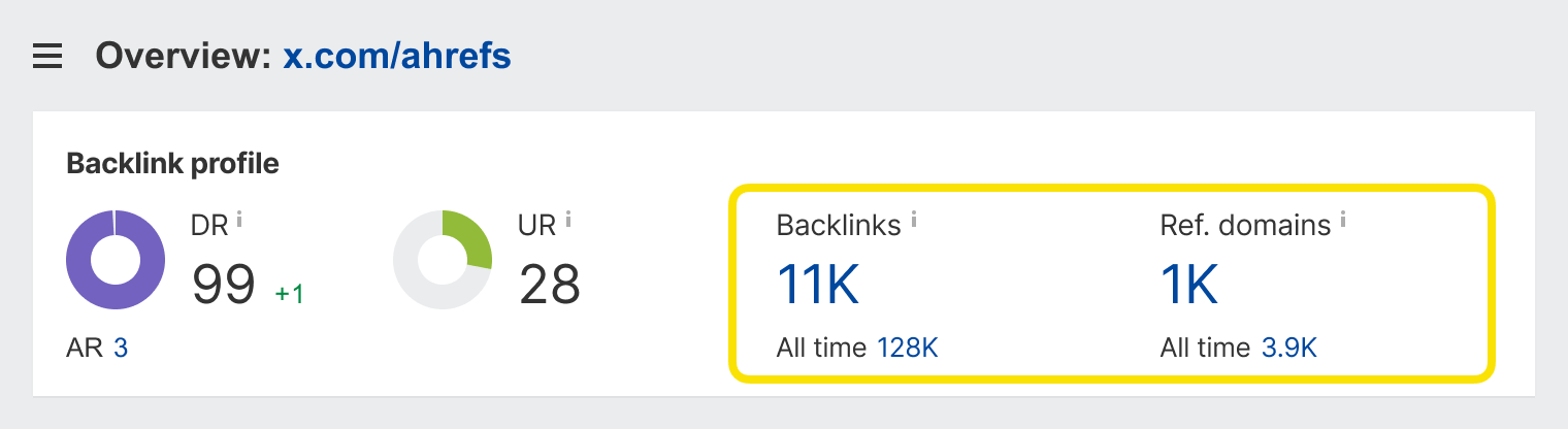
For example, Ahrefs’ profile page on Twitter boasts 11,000 backlinks, coming from over a thousand different websites. So I’m pretty sure it does have some ”weight” in the eyes of Google.
That being said, don’t go crazy listing your website in every imaginable social network and business directory there is. We’re talking about merely a few dozen of them where it is natural for your business to be listed. Anything beyond that would be a royal waste of your time.
And the best way to find some quality websites to add your link to is to study the links of your competitors. Which we’ll discuss in more detail later in this guide.
Asking for links
This is when you reach out to other website owners and ask them for a link, which SEOs often refer to as ”link outreach.”
But you can’t possibly reach out to the folks at datasciencecentral.com and ask them to link to your page with cookie recipes, right? You need to pick websites that are somehow related to your page, since they are more likely to actually consider your request.
The process of collating a list of relevant websites to reach out to is called ”link prospecting”. And the more effort you invest into finding suitable outreach targets, the higher your success rate would be.
But why would owners of other websites (even the relevant ones) care to link to your page anyways?
Well, ideally, you want them to be so impressed with your resource that they would naturally want to share it with the visitors of their website (i.e., link to it).
But not every page of your website is a one-of-a-kind masterpiece worthy of a thousand links. So SEO professionals have devised a set of tactics to persuade the owners of other websites to add links to their pages.
Here’s a brief list of these tactics, along with the general reasoning behind them:
- Guest posting – Write an awesome article for their website, from which you can link to yourself.
- Skyscraper technique – Find an outdated (or somehow inferior) page that lots of websites are linking to. Create a much better one on your own website. Then show it to all the “linkers.”
- Resource page link building – Find pages that list resources similar to yours and request to be added there.
- Broken link building – Find a dead page that has lots of links. Create an alternative on your own website and ping all the linkers about it. That’s broken link building in a nutshell.
- Image link building – Find sites that have used your images without proper attribution and ask them for a link.
- HARO and journalist requests – Contribute an “expert quote” for their article.
- Unlinked mentions – Ask to turn the mention of your brand into a link.
- PR – Give them a killer story to cover.
Here’s a caveat, though.
The reasoning behind each one of these tactics might seem quite fair and logical, but you’ll be surprised how low the success rate is. I mean, if you manage to get five links out of a hundred outreach emails, you can be proud of yourself.
But there’s one simple thing you can do to skew the odds in your favor. That is to build relationships with people in your industry way before you need something from them.
Think about it. If today you got a cold email from a random person asking for a link, would you even bother replying? I doubt so. But what if that email comes from someone whom you’ve previously talked to on Twitter or maybe even met at some in-person event? You’ll be a lot more likely to pay attention, right?
Thus, if you start connecting with folks from your industry in advance (and maybe even do small favors for them), you’ll have no issues reaching out with a link request at some point in future.
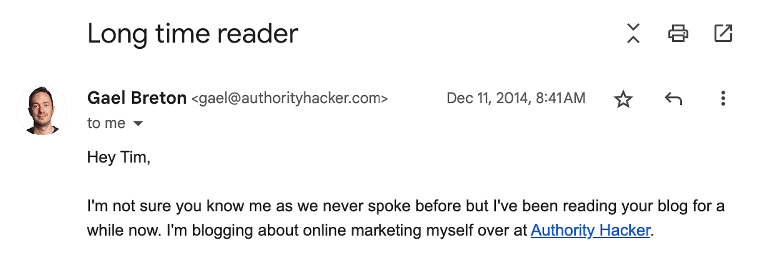
Here’s a good example from my own experience. Gael Breton from Authority Hacker first reached out to me back in 2014. That was before I even joined Ahrefs:
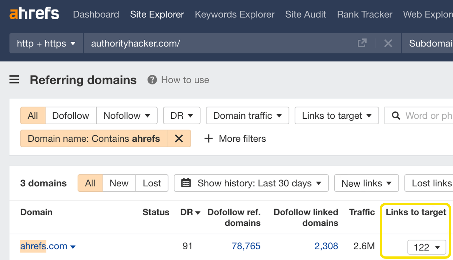
I enjoyed Gael’s work, and we’ve kept in touch ever since. Which is one of the reasons why his website has 122 incoming links from ahrefs.com as of today:
But don’t get me wrong. Gael didn’t ask me for links every once in a while to get these. We simply follow each other’s work. And when they publish something noteworthy on Authority Hacker, I would know about it and share it with our team. And then we might link to it at some point from our blog.
That’s how relationships help you to acquire links naturally.
Buying links
This is the easiest way to build links. A lot of website owners would be happy to link to you if you pay them for it.
But exchanging money (or anything else, really) for links is quite risky. Google considers it a manipulation of its algorithm. And it might punish you for it by kicking your website out of the search results.
Another risk of buying links comes from simply wasting your money on bad links that won’t even work in the first place.
That being said, we don’t want to teach you any tactics that might put your business (or your wallet) at risk. So there would be no tips on "how to buy links the right way" in this guide.
And yet, you should be well aware that many people in the SEO industry do buy links to achieve their ranking goals. Once you start researching your competitors’ backlinks and reaching out to the same websites, you’ll soon find out if they paid for any of their links.
Earning links
You ”earn” links when other people link to the pages on your website without you having to ask them to do so. This won’t happen unless you have something truly noteworthy that other website owners will genuinely want to mention on their websites.
So here are a few things that can make the pages of your website worthy of a link:
- Your company’s proprietary data
- Results of experiments (which require significant efforts)
- Unique ideas and strong opinions (i.e., thought leadership)
- Industry surveys
- Breaking news
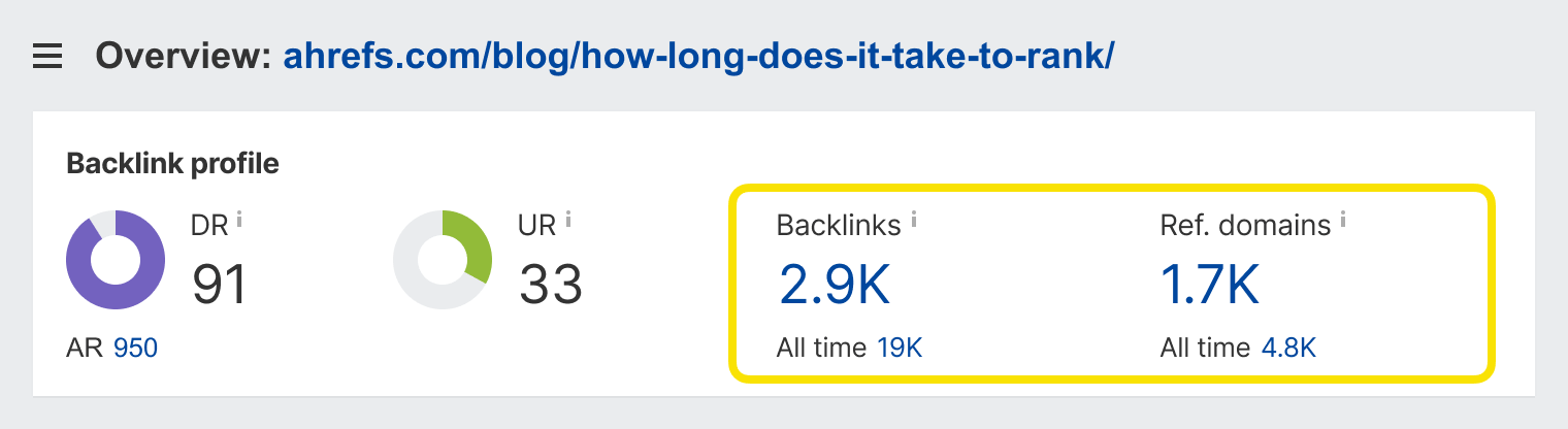
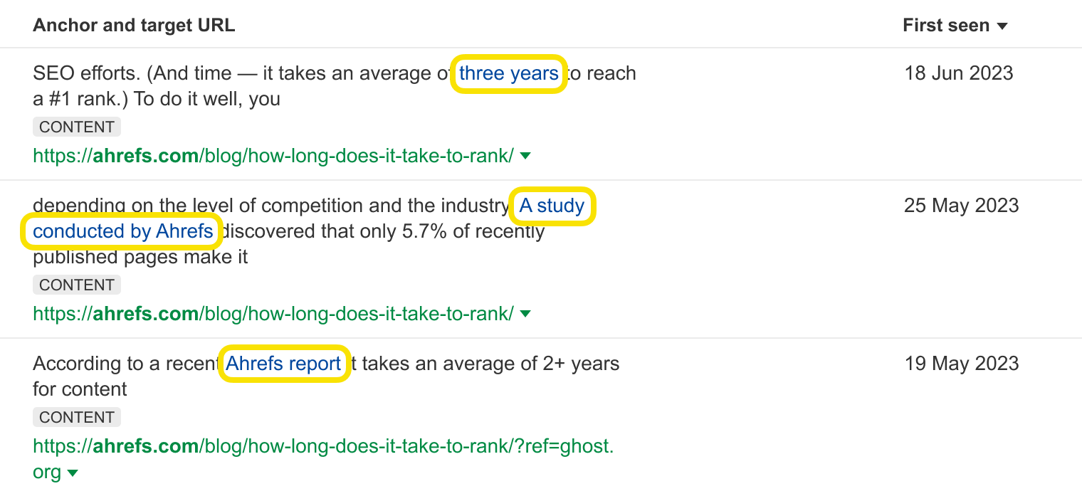
For example, back in 2017, we used our proprietary data to carry out a unique research study, which answered one of SEO’s most frequently asked questions: ”How long does it take to rank in Google?”
As of today, this blog post has almost 3,000 backlinks from about 1,700 different websites.
And even six years later, this research is still picking up new links. Here are a few linked mentions from earlier this year:
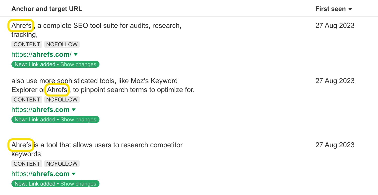
But you don’t necessarily have to create any content at all. Your business in itself can be link-worthy. Or the products and services that you offer.
A fair share of links to the ahrefs.com website come from people mentioning our products and company rather than the content we publish. Here are a few linked mentions we got just yesterday:
But people can’t link to things that they don’t know exist. So no matter how awesome your page (or your product) is, you’ll need to promote it. And the more people see your resource, the higher the chance that some of them will end up linking to it.
We’ll talk more about this later in this guide.
Which links move the needle?
Different kinds of links have different impacts on your page’s ranking in Google. And no one knows for sure how exactly Google measures the value of each individual link.
But there are five general concepts of evaluating links that the SEO community believes to be true.
What makes a good link
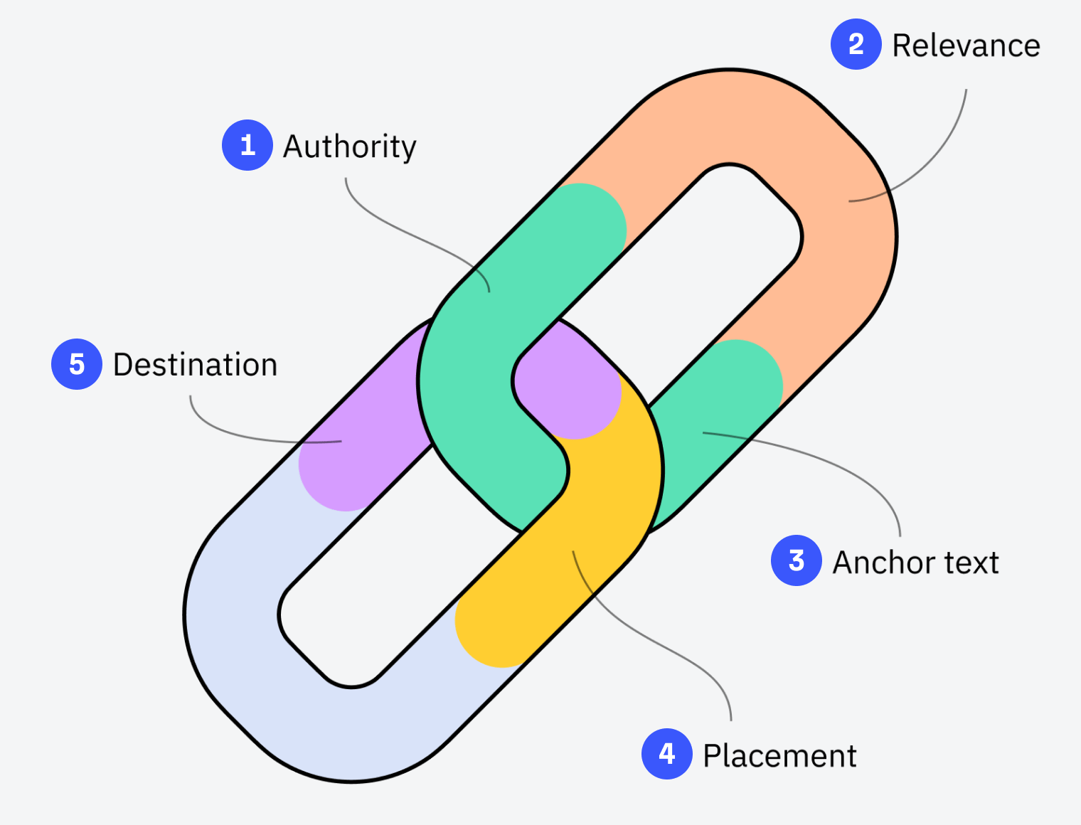
Authority
It seems intuitive that a link from The New York Times and a link from your friend’s small travel blog couldn’t possibly be treated by Google as equals. NYT is a world-famous authority, and your friend’s blog is hardly known even among their friends.
Over many years of building links, SEOs have gathered a lot of empirical evidence that links from more well-known and authoritative websites have a bigger influence on your page’s rankings in Google.
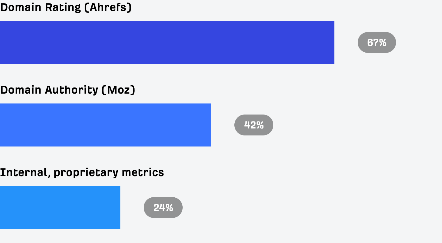
But how do you measure the "authority" of the website?
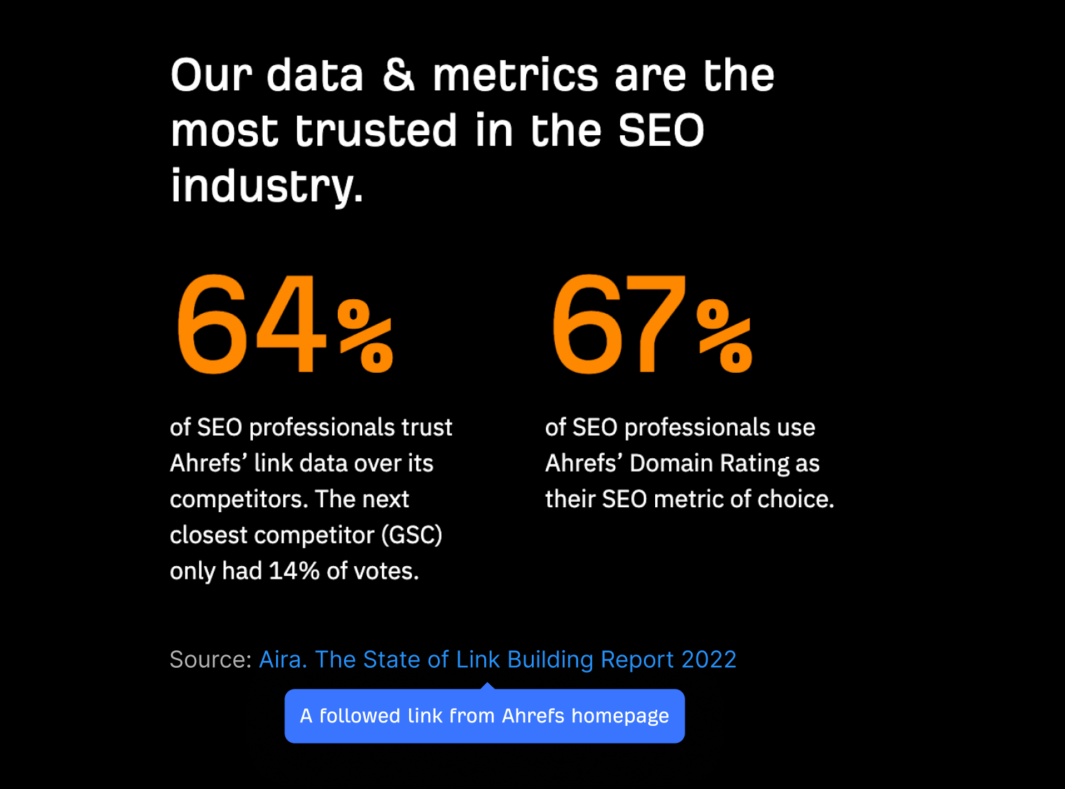
Well, according to an industry survey done by Aira, the most popular website authority metrics are Ahrefs’ Domain Rating (DR) and Moz’s Domain Authority (DA). With internally developed metrics (which often have DR or DA blended in them) holding the third spot.
Do you use any metrics to measure the authority and/or quality of a link?
The State of Link Building Report 2022.
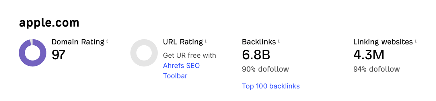
We actually have a free Website Authority Checker tool, which you can use to check the Domain Rating metric of any website:
But other than the authority of an entire website, there’s also the authority of the actual page that is linking to you. Which is known to be calculated by Google with the help of the famous PageRank algorithm.
In simple terms, the PageRank algorithm is based on the premise that pages with more backlinks (and better ones) of their own cast a stronger ”vote”.
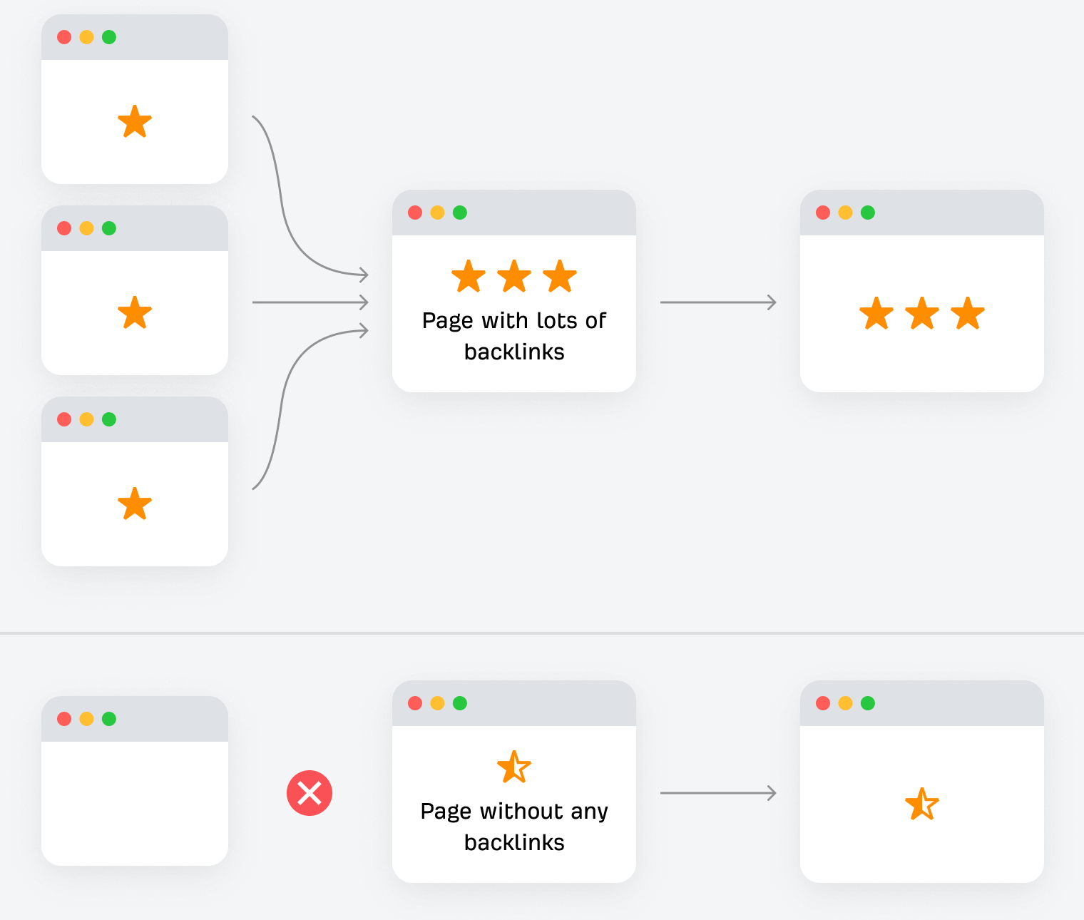
Pages that have backlinks cast a stronger ”vote” than those that don’t.
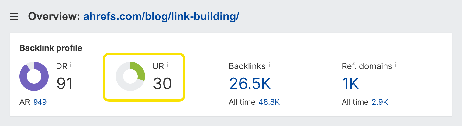
Here at Ahrefs, we have our own metric to measure the authority of the page. It’s called URL Rating (UR), and it is calculated in a fairly similar fashion to the original PageRank.
The UR of this very page that you’re reading is 30, and it has backlinks from over a thousand different websites (ref. domains):
And there’s one more thing you need to know about authority. If a backlink has a rel="nofollow" attribute attached to it, it most likely doesn’t cast a "vote" toward a website that it links to.
Relevance
If you run a blog about health and fitness, links from other websites (and pages) on the same topic will have more weight in the eyes of Google compared to links from websites about cars or finances.
Here’s an excerpt from Google’s “How Search Works” guide that corroborates this theory (bolding is mine):

If other prominent websites on the subject link to the page, that’s a good sign that the information is of high quality.
But this doesn’t mean that you should avoid getting links from websites that aren’t on the same topic as yours. I can’t imagine any seasoned SEO saying: ”No, please don’t link to my recipe website from dreamhost.com, a hosting website with DR 93.”
The thing is, whatever topic your website is about, there would be dozens of topics that are perfectly relevant while not the same.
For example, nutrition is very important for health and fitness. So it would be perfectly natural for fitness websites to link to articles about food. And if you want to work out regularly, you need to find time in your schedule for it, so linking to articles about time management wouldn’t be unnatural too.
In other words, relevance is a fairly malleable concept. Unless, of course, you try shoehorning links into places where they clearly don’t belong.
Anchor text
If you’re not already familiar with the term, ”anchor text” is a clickable snippet of text that links to another page. In many cases, it succinctly describes what the linked page is about.
So it’s no surprise that Google uses the words in the anchor text to better understand what the referenced page is about and what keywords it deserves to rank for. In fact, Google’s original PageRank patent talks about this quite explicitly (bolding is mine):
Google employs a number of techniques to improve search quality including page rank, anchor text, and proximity information.
So how do you leverage anchor text when building links?
Well, it’s better that you don’t. The more you try to control how different pages link to you and shoehorn all the "right words" into the anchor text of your backlinks, the higher the chance that Google will suspect manipulation and penalize you for that. So it’s better to just let the author of the linking page decide how they want to reference your page.
Placement
Back in 2010, Bill Slawski brought to attention a Google patent that described a "Reasonable Surfer Model." This model explains how the likelihood of a link being clicked may affect how much authority it transfers. And this likelihood is mostly determined by where the link is located on the page.
Let’s say there’s a webpage that consists of three blocks: content, sidebar, and footer. As a general rule, links in the content get more clicks because the content block gets the most attention from visitors.

Prominently placed links may transfer more "authority."
One other thing that can affect the CTR of a link is how high on the page it appears. Readers are more likely to click the links at the very beginning of the article rather than the ones at its very end.
Destination
When building links to your website, there are three general destinations where you can point them:
And quite often, the pages that you need to rank well are also the hardest ones to get links to.
That’s because website owners generally prefer to link to informational pages where their audience can get value for free rather than commercial pages where their audience is likely to be pitched some product.
Thus, one of the most common questions in SEO is, ”How to get links to boring pages?”
And the strategy that experienced SEOs usually suggest is to get lots of high quality links to your ”linkable assets,” and then transfer some of that ”link authority” to your ”money pages” that you want to rank well in Google.
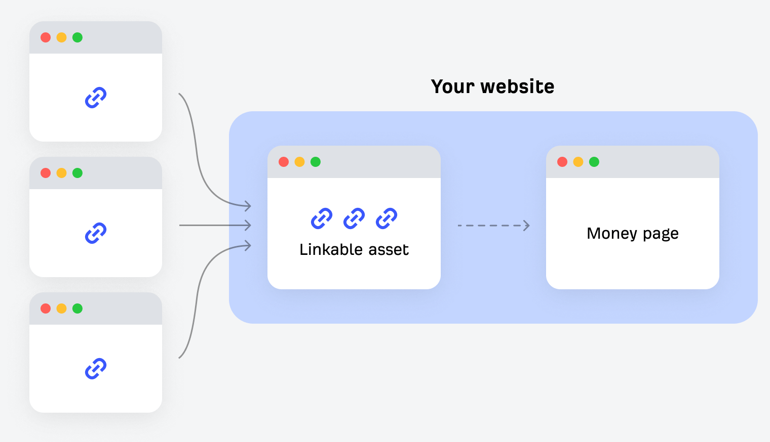
Use internal links to transfer authority to the “boring” pages that you need to rank well in Google.
Best link building strategies
There are many different link building tactics and strategies out there. Some of them can be very effective, while others no longer work these days and will most likely just waste your time.
Here’s what works really well today, according to our observations:
Replicating your competitor’s backlinks
If someone is linking to your competitor, there’s a good chance that they might be open to linking to you too.
A good way to kick off this strategy is to study who links to the actual homepages of your competitor’s websites. These people are mentioning the business as a whole and not some specific webpage, which you might not have on your own website.
For example, here are a couple of pages (with decent search traffic) that link to our homepage:
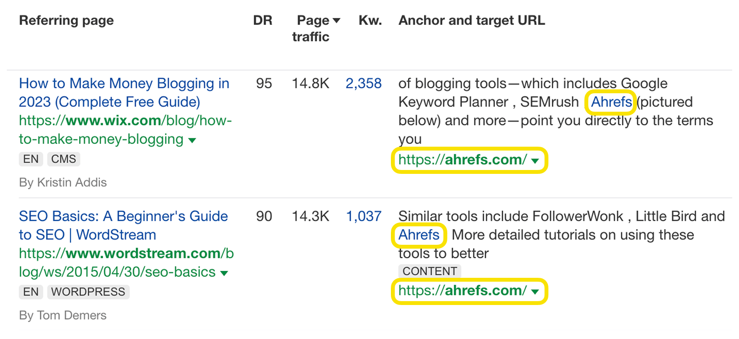
A screenshot from Site Explorer.
As you can see, in both cases, Ahrefs is mentioned right next to some other marketing tools, which only proves the point that asking to be mentioned alongside your competitors is a fair request.
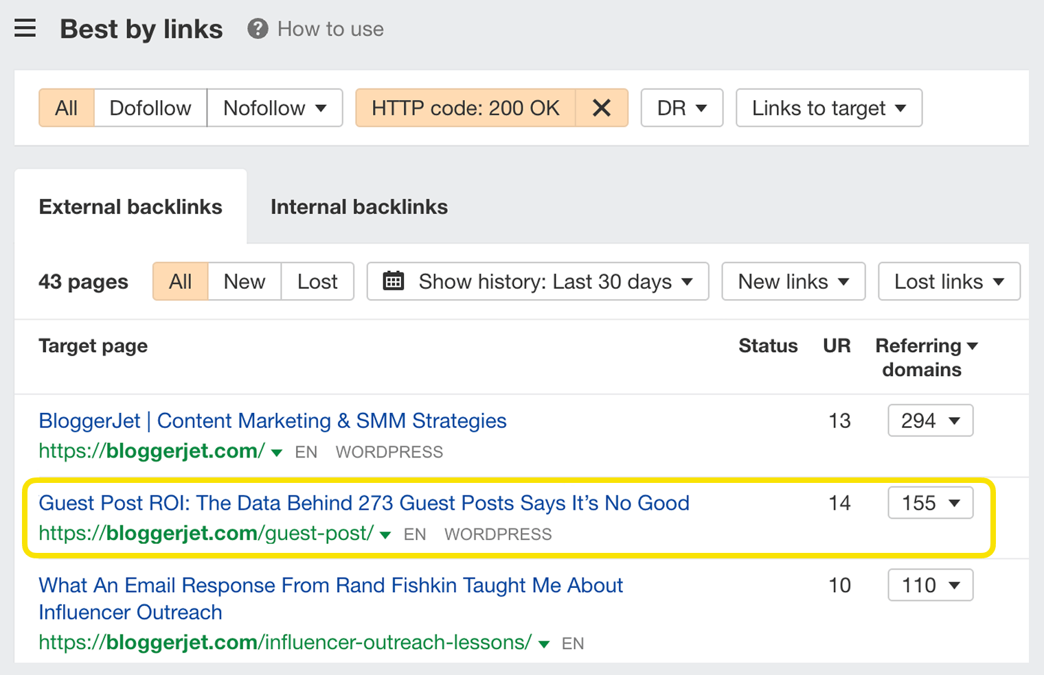
Once you’re done with the homepage links, the next step is to study which pages on your competitor’s websites have the most links. We have a report in Site Explorer just for that, which is called "Best by links."
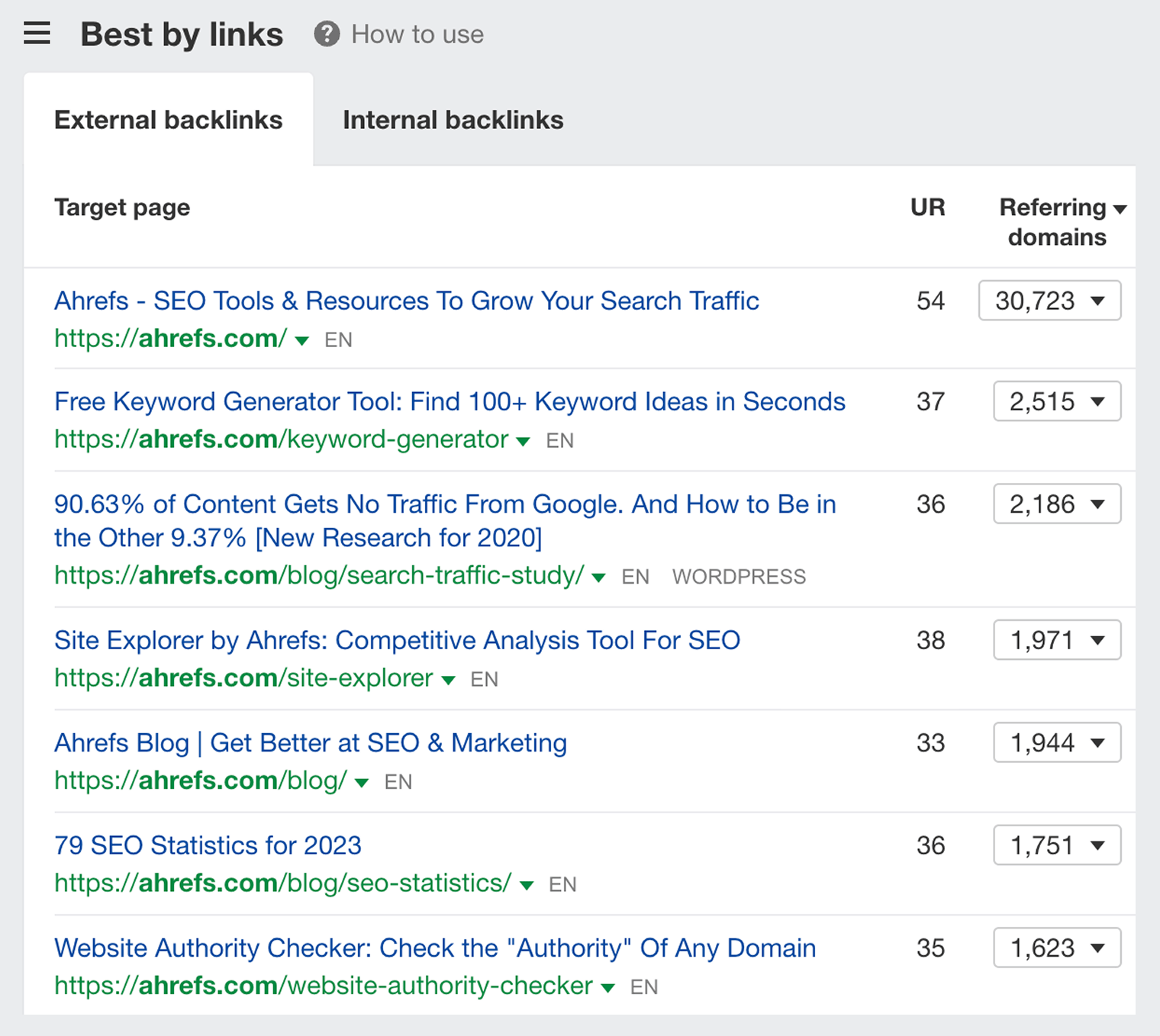
By looking at the Best by links report for ahrefs.com (above), it’s easy to spot what kinds of pages have brought us the most links:
- Our homepage – Because lots of people mention Ahrefs as a software or as a company.
- Our free tools – Keyword Generator and Website Authority Checker are two of the many free tools we developed. And each of these tools is attracting a ton of backlinks organically.
- Our blog – Thanks to a consistent output of useful content, lots of people are now recommending our blog and linking to it.
- Our research studies – People love insightful data. So the research studies that we publish tend to get lots of links.
Try browsing the Best by links report for your own competitors and see what kinds of pages bring them links. Once you identify what worked for them, you can create similar (or better) resources on your own website.
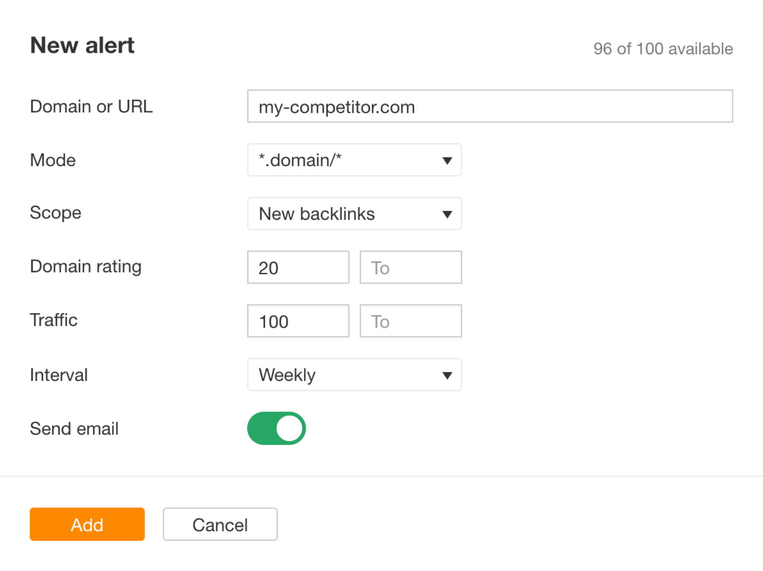
After you’re done with the above tactics, I suggest that you set up a backlink alert and get notified whenever your competitors get new links. This way, you’ll be able to immediately reach out to whoever linked to them and try to get yourself added on the same page.
All in all, your competitors are a goldmine of great link opportunities. And as you dig deep into their backlinks, you’ll soon see some link building patterns, which you can leverage on your own website. We wrote a pretty detailed article on that topic, actually. Make sure to check it out.
Targeted link outreach
So let’s say you’ve done your keyword research and a very specific page that you need to rank well in Google for a certain keyword. And you need to build links to that very specific page.
Well, the best place to start is to pull up the top-ranking pages for your desired keyword and research where they got their links from.
Just put your keyword into Ahrefs’ Keywords Explorer and scroll down to the "SERP Overview" widget. You’ll see the top-ranking pages along with how many backlinks (and linking domains) they have.
So let’s say you want to rank for "best productivity apps." Here’s how the SERP for this keyword looks:
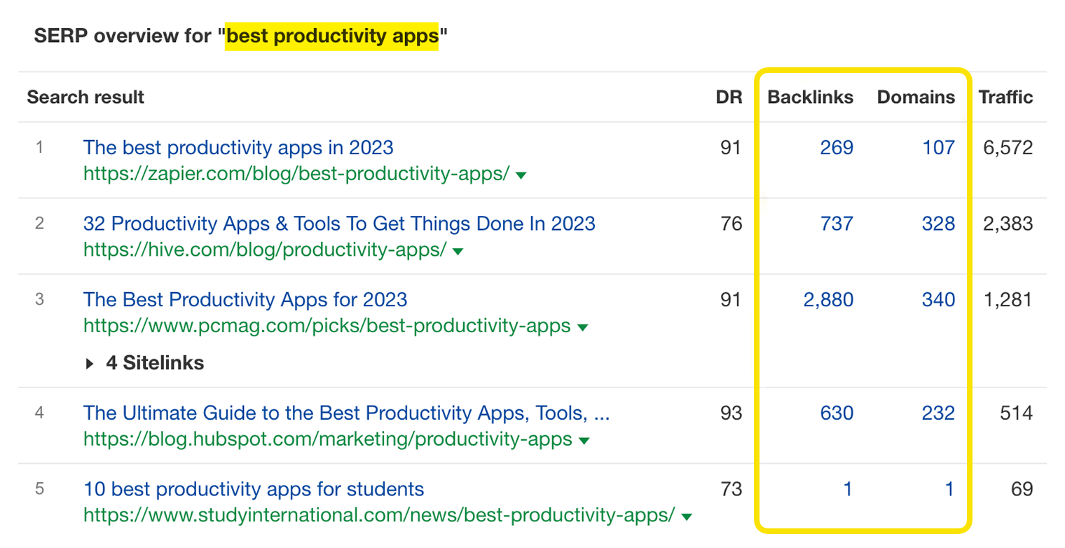
Once you click on any of the backlink numbers, you’ll be redirected to a list of backlinks of a given page in Ahrefs’ Site Explorer.
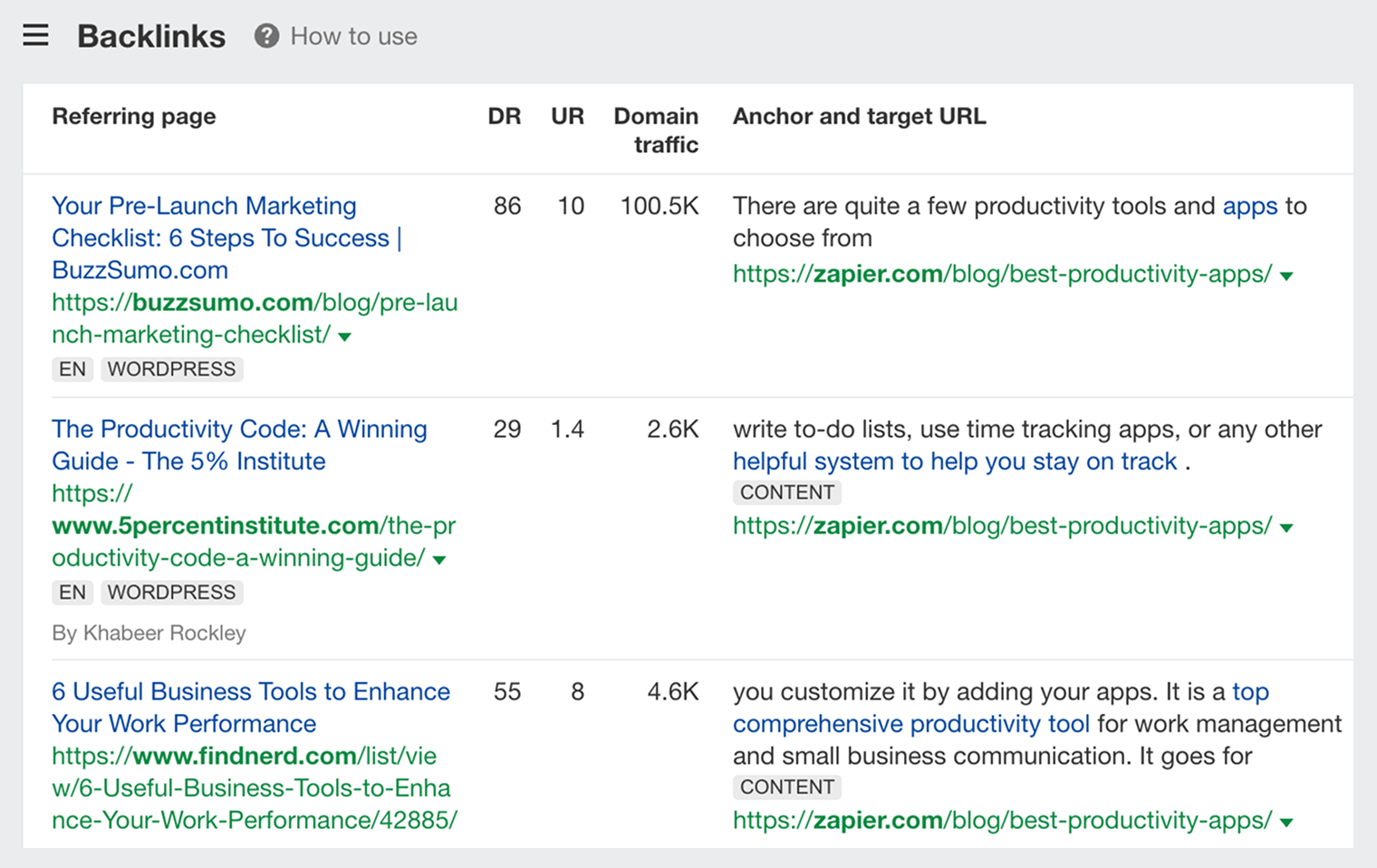
Here’s what you need to do next:
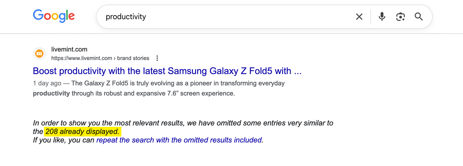
The next place you turn to for finding potential linkers is among people who mentioned your topic on their websites. For example, if you need to build links to a productivity app, you want to get in touch with all websites that have mentioned the word "productivity" somewhere on their pages.
You can try to search for them in Google, but it only gives you a limited number of search engine results. Just a couple of hundred on average.
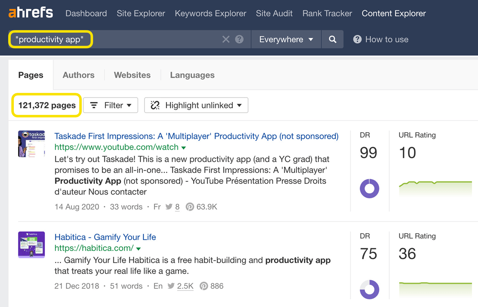
A much faster way to find thousands of pages that mention your topic is Ahrefs’ Content Explorer.
For example, if you search for the keyword ”productivity app,” you’ll get over 120,000 pages that mention this keyword.
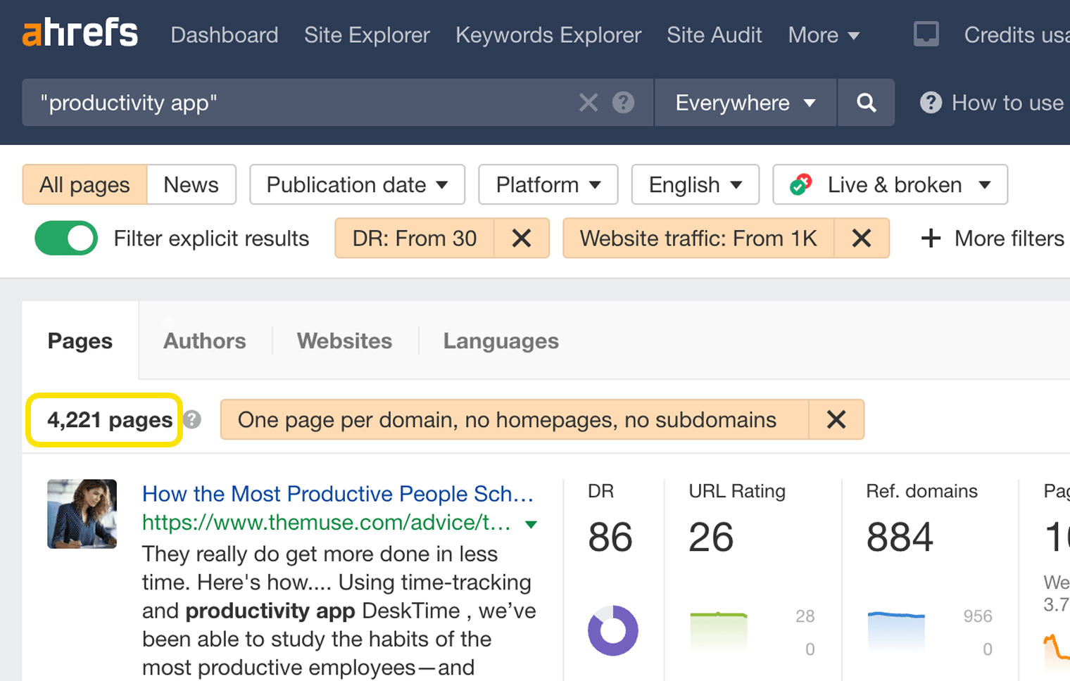
From there, you might want to apply the following filters to narrow down the list of results to the most meaningful ones:
- Language: English (or whatever language you’re interested in)
- Website traffic: from 1,000
- Domain Rating: from 30
- Filter explicit results
- Filters: one page per domain, exclude homepages, exclude subdomains
This way, you’ll end up with slightly over 4,000 pages. Which is a way more manageable number of link prospects to work with.
And your plan of action here would be very similar to the previous one. Review these pages one by one and reach out to the respective site owners if you think there’s a chance that they might agree to link to your page from theirs.
In all fairness, your success rate with both these groups of link prospects will likely be quite low. I know it because I did this kind of link building outreach not that long ago. And from my conversations with professional link builders, that’s pretty much the norm.
- Most people won’t bother replying to your emails.
- Many will reply just to politely decline your request.
- Some will ask for money or a link exchange.
- And only a few will actually link to you.
That’s why I mentioned earlier that you should start building relationships with all these website owners before you actually ask them for a favor.
A good way to do this is to reach out to them while you’re still in progress of creating your page. You can ask for their opinion, a quote, or even suggest to feature some of their relevant work.
And it is always of great help if something that you’re working on is of actual interest to them.
For example, back when I was running my personal blog, I reached out to 500+ fellow bloggers asking them to share some of their Google Analytics data for my small research study. That request piqued their interest, and many of them helped me out with it.
After my research was done and published, I made sure to give a heads-up over email to all these 500+ bloggers whom I originally reached out to. And that is how this article became the most linked-to page on my blog:
A screenshot from Site Explorer.
But, most importantly, all the hard work I poured into this research has gained me respect from many of these bloggers. And whenever I later reached out to them with some other request, I was no longer a "nobody" and they were more open to talk to me.
In other words, your email outreach will be massively more effective if what you’re working on actually deserves people’s attention.
Creating linkable assets
In SEO, we use the terms ”linkable asset” or ”link bait” to refer to content that is strategically crafted to attract links. Such linkable assets can take on many different forms:
- Industry surveys
- Studies and research
- Online tools and calculators
- Awards and rankings
- How-to guides and tutorials
- Definitions and coined terms
- Infographics, GIFographics, and "Map-o-graphics"
Earlier, I already mentioned two examples of linkable assets: a blogger survey I did for my personal blog and a research study we did here at Ahrefs. So let me show you a cool example from someone else.
The folks at Aira, a digital marketing agency, run an annual "The State of Link Building Report" by surveying hundreds of leading industry professionals. This report has brought them backlinks from over 600 different websites:
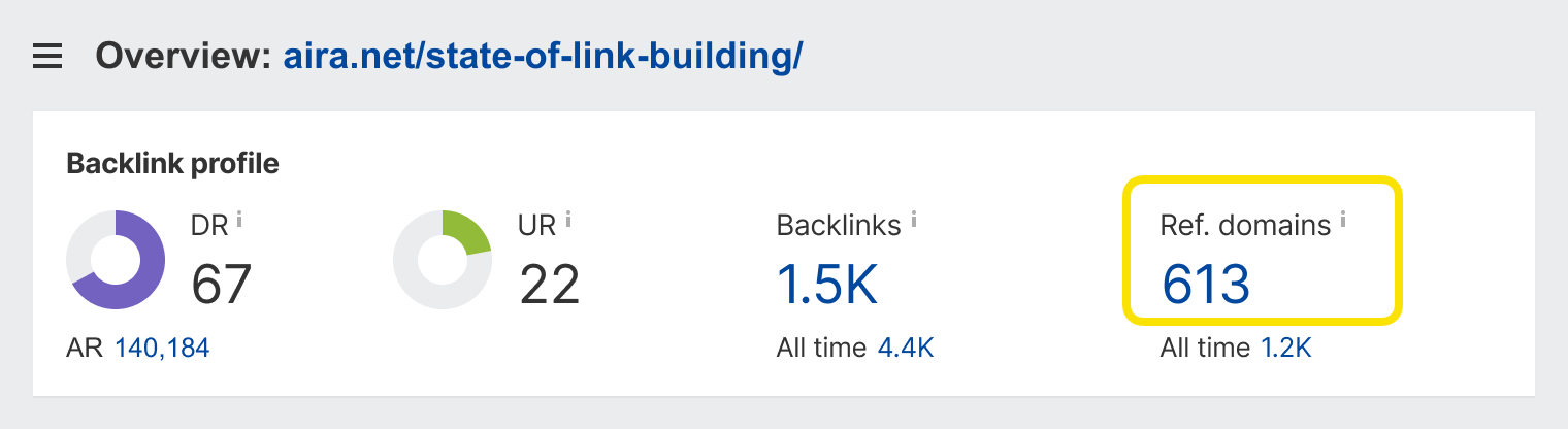
And one of these backlinks is coming from the very homepage of ahrefs.com (which has a URL Rating of 54):
Their report contains some data that is very favorable for our company, so we couldn’t resist featuring it on our very homepage. Many marketers refer to this kind of link bait as part ”ego bait.” But in Aira’s case, I don’t think it was deliberate, because they can’t know in advance what the results of their industry survey would be.
So how do you put this link building strategy into action?
Well, first of all, you need to come up with an actual idea of a link-worthy page.
You can start from a simple brainstorm based on the abovementioned list of linkable asset types:
- Can you survey your industry about something?
- Can you calculate some meaningful statistics from the data that your business has access to?
- Is there any interesting experiment, which you could carry out?
- Does your industry need some kind of free online tool?
- Etc.
And if you fail to brainstorm any exciting ideas, you can always go back to studying the websites of your competitors and figuring out what types of linkable assets worked for them.
Just don’t forget that even the best linkable assets have to be promoted in order to attract links. Because people can’t link to things they don’t know exist.
So let’s talk about content promotion real quick.
Content promotion
We actually have a separate article listing 21 content promotion tactics. But for now, I want to focus your attention on just the following three:
And don’t forget to promote your older content by mentioning it in your newly published content.
As Ryan Holiday said in his book "Perennial Seller": "Creating more work is one of the most effective marketing techniques of all."
Guest posting
This link building tactic is actually frowned upon by some SEO professionals. Mainly because some people tend to overdo it to the point of being spammy.
And yet guest blogging is one of the most popular ways how SEOs build links these days:
What strategies do you primarily use to acquire backlinks for your affiliate site?
Based on a Facebook poll of 179 SEO professionals
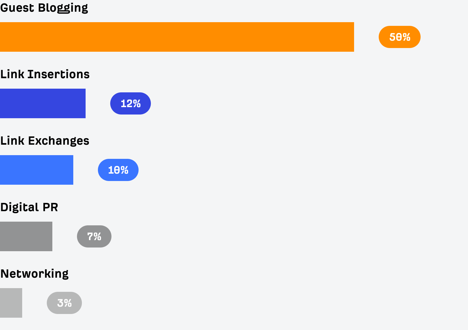
Source: Matt Diggity
Even here at the Ahrefs Blog, we do allow guest contributions once in a while. And our guest authors might link to some of their own resources, as long as they’re relevant to the topic of their post. Which means you can build links with guest articles in a perfectly legit way.
But how do you get your content published on the top blogs in your industry? Well, you just need to pitch them a really compelling article idea.
And here’s a simple tip on how to come up with content ideas that are hard to say no to. Just find a few competitors of the blog you want to write for and use the Content Gap tool to find which topics bring them lots of traffic but weren’t covered on the blog that you’re pitching.
For example, a quick content gap analysis of our own blog against the blogs of our competitors reveals a bunch of great topics that they get search traffic from, while we don’t.
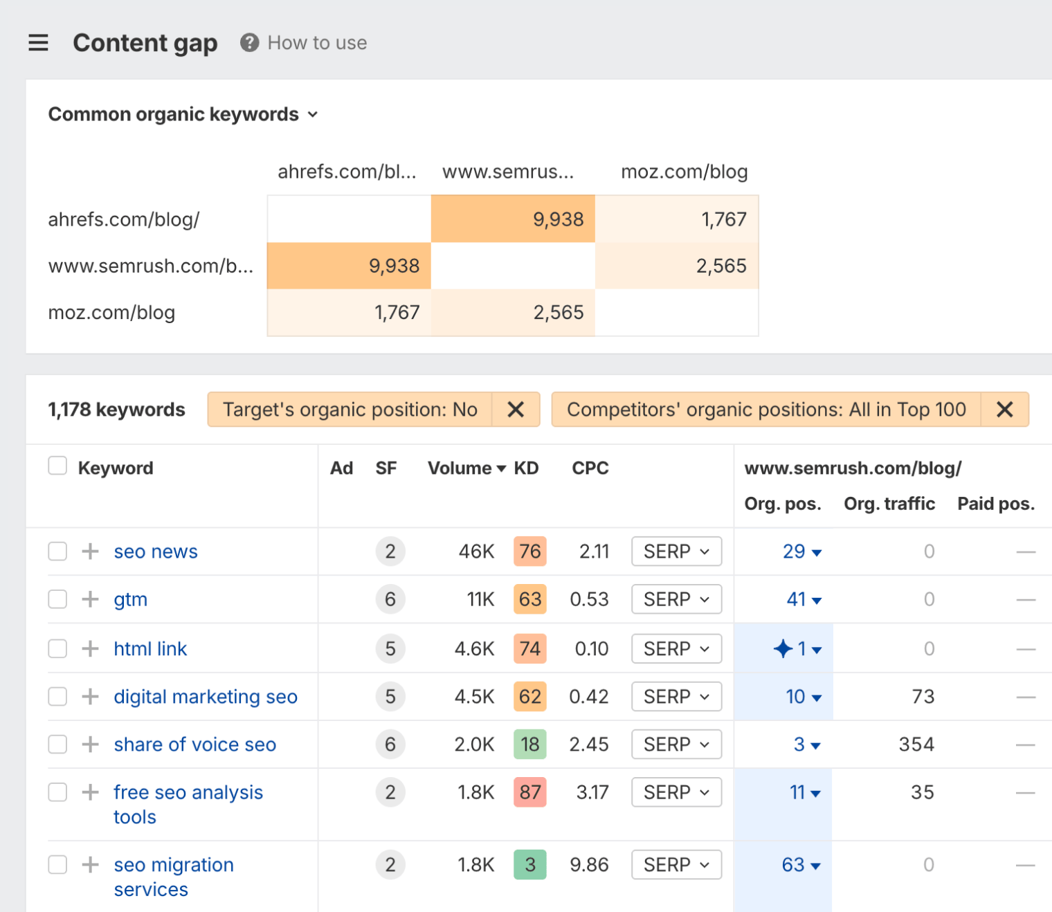
If someone made a compelling pitch that they could write a decent post on any of these topics, it would be very hard for us to turn it down.
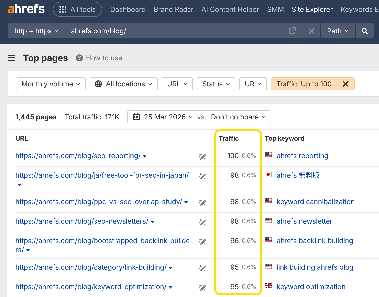
A somewhat lesser-known guest posting tactic is to find an underperforming article on the blog you want to write for and offer them to rewrite it from scratch. If you can persuade them that you can greatly improve that article and it will end up ranking higher in Google and bringing them more search traffic, I’m sure they’ll have a hard time resisting your pitch.
How do you find these underperforming pages? Just open the Top pages report in Site Explorer and use the "Traffic" filter:
Link building tools
While it is technically possible to build links with just a bit of brain power and a Gmail account, there are a number of link building tools that will help make the process of acquiring links much faster and easier.
Here are some free ones:
- Ahrefs’ Free Backlink Checker – Shows top 100 links pointing at any website or URL.
- Google Alerts – Notifies you whenever a specific word or phrase was mentioned on a newly published page. Which is a great way to source relevant link prospects.
And here are some premium ones:
- Ahrefs’ Site Explorer – Shows you all links of any website or URL with an option to sort and filter them by many important SEO metrics.
- Ahrefs’ Content Explorer – A unique link prospecting tool, which helps you find thousands of relevant websites for link requests and guest posting. Also helps to discover linkable assets on any topic from all around the web.
- Ahrefs Alerts – Similar to Google Alerts but has more flexibility with SEO-related filters.
- Pitchbox/BuzzStream/GMass – Email outreach tools. There are many other tools that let you send personalized emails at scale, but these ones seem to be the most popular among SEOs.
- Hunter.io/Voila Norbert – The so-called "email lookup services," which help you find contact details of websites at scale.
Let’s wrap this up
Whenever I explain link building to a complete newbie, I always use the same metaphor. It’s very hard to make friends if you’re not an interesting (and generous) person. The same applies to your website: If there’s nothing interesting or useful about it, then why would anyone care to link to it?
That’s why many SEOs claim that they never proactively build links. They just focus on doing notable ”link-worthy” stuff on their websites and promoting that work to relevant audiences. And the links come naturally.
That’s it from me. Hope you feel very educated about link building after reading this guide. And if you enjoyed the read and got this far, please give me a shoutout on Twitter @timsoulo. That would mean a lot to me.
Tim Soulo is CMO at Ahrefs. With over 15 years in the digital marketing industry, Tim is the author of many data-driven studies and actionable marketing frameworks, some of which gained industry-wide recognition. He enjoys challenging conventional marketing knowledge and optimizing for simplicity and efficiency.
Master SEO Step by Step
How Search Engines Work
Before you start learning SEO, you need to understand how search engines work.
SEO Basics
Learn how to set your website up for SEO success, and get to grips with the four main facets of SEO.
Keyword Research
The starting point in SEO is to understand what your target customers are searching for.
SEO Content
Learn how to create content that ranks in search engines.
On-Page SEO
This is where you optimize your pages to help search engines understand them.
Link Building
Learn how to create content that ranks in search engines.
Technical SEO
Prevent technical problems that stop Google from accessing and understanding your website.
Local SEO
Learn how to improve your visibility in local search results and get more customers from your area.
What AI Means for SEO
You can’t talk about SEO today without mentioning generative AI.
How AI Search Engines Work
Learn exactly how AI search engines like ChatGPT generate their answers and choose which brands and products to mention.