The Ahrefs Blog
Expand your SEO and marketing knowledge with detailed tutorials and case studies.


SEO
If you want to rank higher in search engines like Google, you need SEO. Check out the resources below to learn how to get more organic traffic to your website.
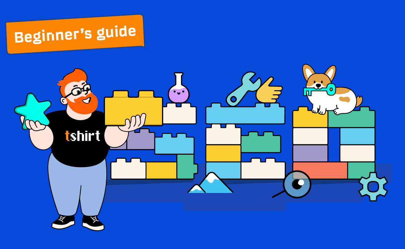
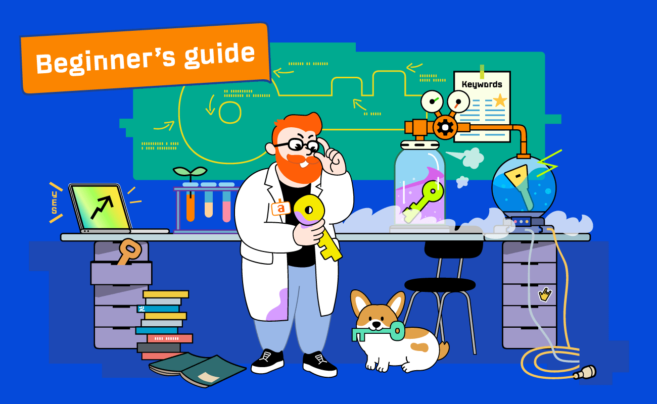
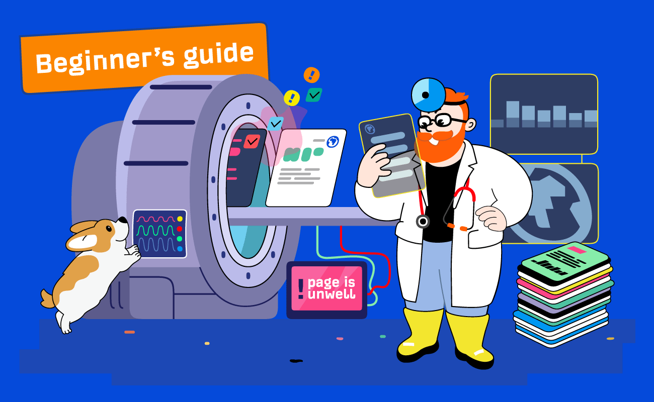

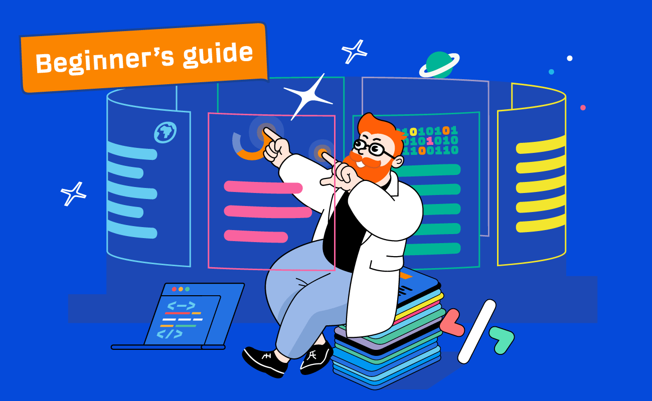

Guide
Beginner’s
Guide to SEO
Learn the basics of SEO with our comprehensive beginner's guide.
Start learning →Marketing
Marketing is the process of generating awareness, interest, and desire for a product or service. Check out the resources below to improve your marketing knowledge and create effective marketing campaigns.


Data & Studies
Studies and data-driven insights are crucial for understanding the ever-changing search landscape. Check out the resources below to improve your SEO knowledge with unique data and insights.