Step 2: …?
There’s more to image SEO than writing a few alt tags—a lot more.
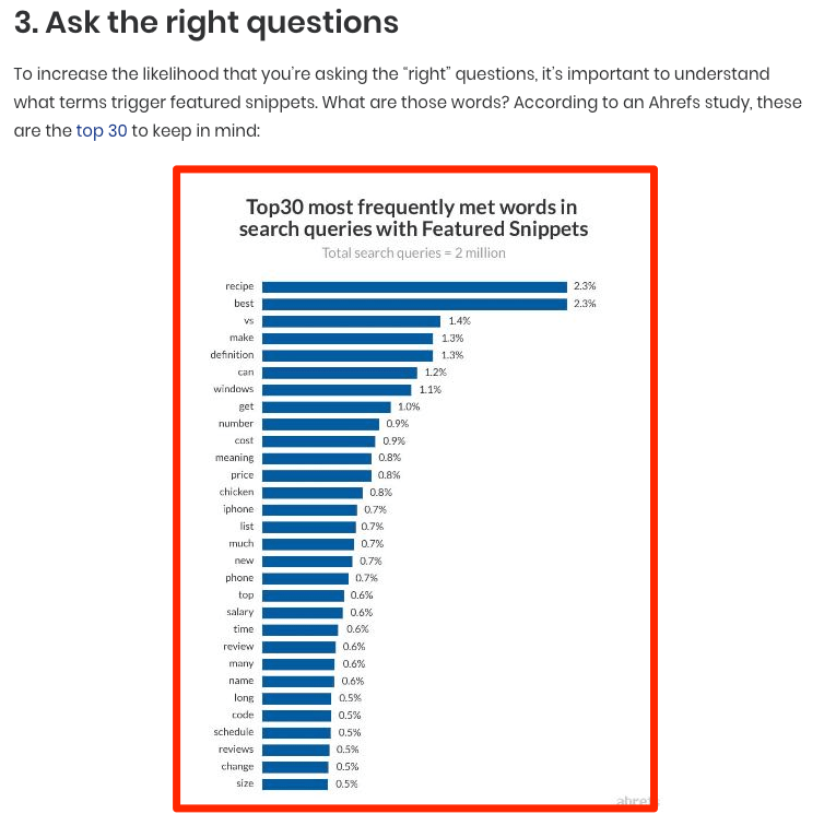
Some may even argue that with Google’s recent advances in machine learning, alt tags no longer matter. For example, here’s what happens when you upload a photo of a cat into Google’s Cloud Vision API—their machine-learning image identification tool:
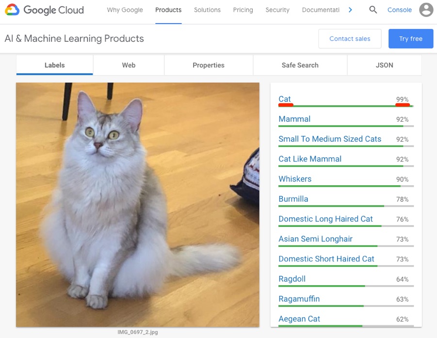
Google can tell that this is a photo of a cat with near-perfect accuracy. That’s impressive.
So what’s even the point in adding alt tags if Google understands the content of images? Is image SEO dead? Not at all.
In this post, I’ll run through 12 actionable image optimization tips for more organic traffic.

Here’s what Google says about image filenames:
[…] the filename can give Google clues about the subject matter of the image. For example, my-new-black-kitten.jpg is better than IMG00023.JPG.
This is SEO 101. Most people do this.
That’s likely because Google has been giving this same advice for years.
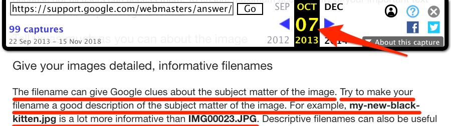
Proof that Google’s advice on the matter has remained consistent since 2013, via The Wayback Machine.
But once again, given Google’s recent advances in machine learning and their newfound ability to recognize images, how important is this, really?
Good question. I’m aware that cat example was pretty impressive. So let’s try another image.
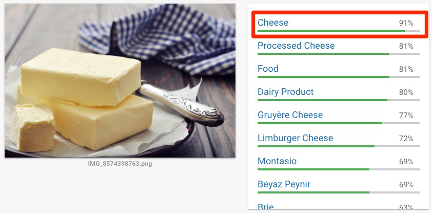
Google is 91% sure that this is cheese. Google is wrong. It’s butter.
Now, I’ll be the first to admit that butter looks similar to cheese, but the point still stands: Google isn’t perfect—you should do everything in your power to help them understand your images.
That doesn’t mean keyword stuffing. Keep your filenames descriptive and straightforward.
Good: dog.jpg
Bad: dog-puppy-pup-pups-puppies.jpg
It doesn’t take much effort to rename images to be more descriptive. So it’s worth doing.
Alt text (alternative text) describes an image. It’s what the browser displays to users with screen readers. Browsers also display alt text if there’s a problem rendering images.
Here’s the HTML syntax:
<img src="puppy.jpg" alt="Dalmatian puppy playing fetch"/>
That example comes straight from Google’s official guidelines. It’s used to show what a well-written alt tag looks like. Here’s their general advice for writing these:
Google uses alt text along with computer vision algorithms and the contents of the page to understand the subject matter of the image. […] When choosing alt text, focus on creating useful, information-rich content that uses keywords appropriately and is in context of the content of the page. Avoid filling alt attributes with keywords (keyword stuffing) as it results in a negative user experience and may cause your site to be seen as spam.
Matt Cutts gives some equally good advice for alt text in this old, yet still relevant video:
However, here’s a shortcut that almost always works perfectly—finish this sentence:
“This is a(n) image/screenshot/photograph/drawing of __________.”
Remove any conjunctions or connections (e.g., a/an) from the resulting sentence and use the last part as your alt text. Here are a few examples:
“This is a photograph of a chocolate cheesecake.“
<img src="chocolate-cheesecake.jpg" alt="Chocolate cheesecake"/>
“This is a drawing of my cat, Mark, playing with his toys.“
<img src="mark-the-cat.jpg" alt="My cat, Mark, playing with his toys"/>
You may wish to deviate from this formula slightly when writing alt text for product images. For these, it can be useful to add the product or serial number, like so:
<img src="battery-tender.jpg" alt="Battery tender (022-0186G-DL-WH)"/>
Google has no official guidelines stating that you should do this. But it makes sense because Google clearly understands the relationships between product names and serial/product numbers. Want proof? Take a look at the related searches for this query:
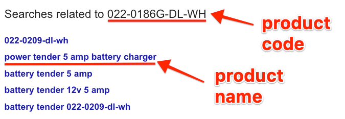
Google knows what product we’re looking for based on a search for the product number alone. So incorporating this into your alt text may help Google to understand that it is, in fact, an image of a product.
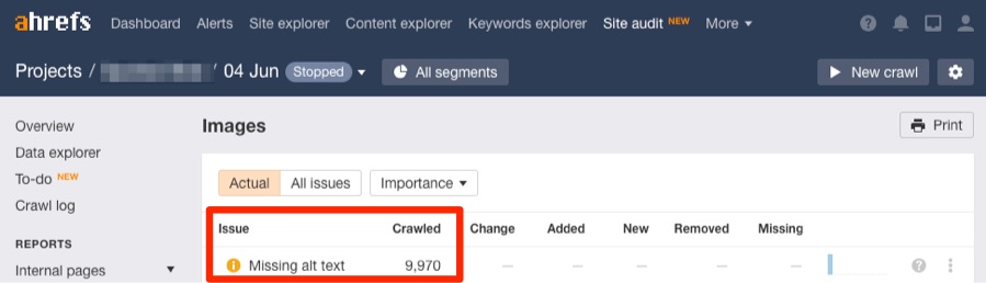
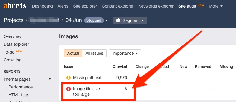
Find all the images on your site with missing alt text using Ahrefs’ Site Audit.
Site Audit > project > Resources > Images > Missing alt text
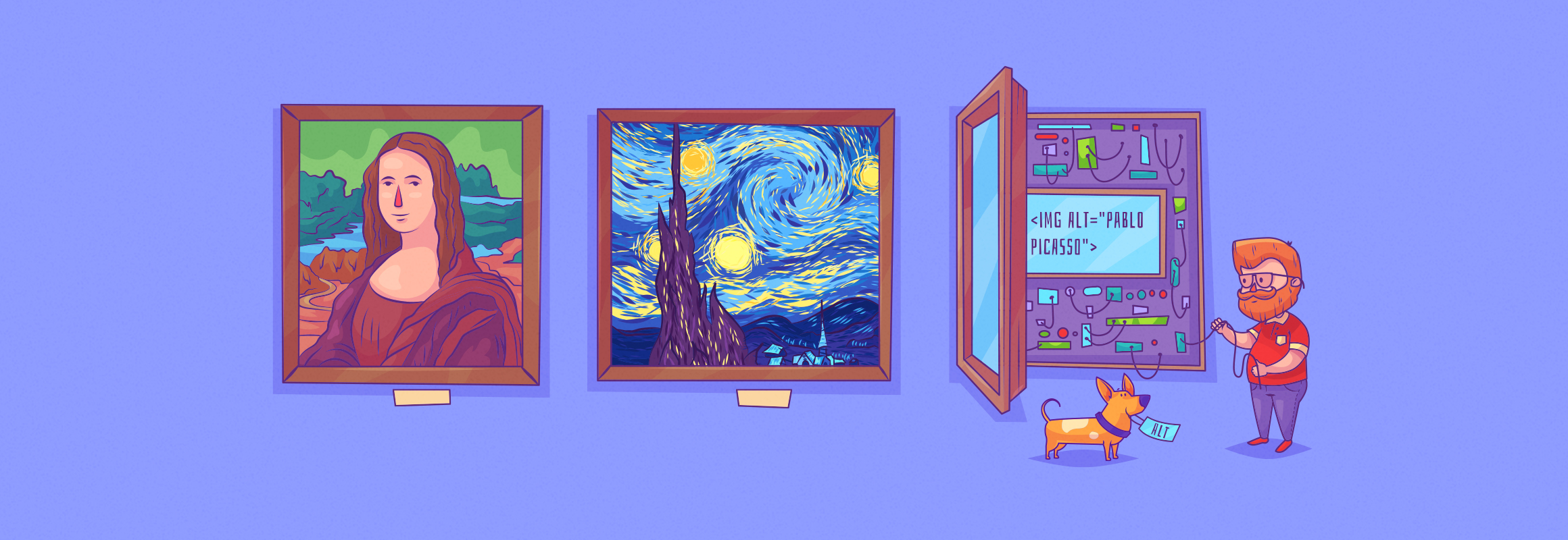
Oh, and don’t forget about captions. Those are important too.
Here’s what Google says:
Google extracts information about the subject matter of the image from the content of the page, including captions and image titles. Wherever possible, make sure images are placed near relevant text and on pages that are relevant to the image subject matter.
Look at that last image again to see an example of an image caption. It’s the small text below that describes what it shows. I recommending using these wherever possible.
Most images on the web are one of three file types: JPEG, PNG, and GIF.
Each of them uses a different compression method. That means file sizes between the three file types can vary dramatically. That’s important. Here’s why:
Images are often the largest contributor to overall page size, which can make pages slow and expensive to load.
Page load time is crucial for SEO. Google has confirmed that it’s a ranking factor on both desktop and mobile. Your task is to choose the most appropriate file type for each image—i.e., the one that offers the best compression with the least reduction in quality.
With that in mind, here is the same image as a JPEG, PNG, and GIF:
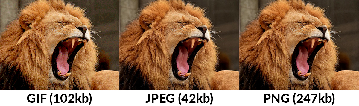
You can see that the JPEG image is a clear winner. It has the smallest file size, and there is little to no noticeable difference in image quality between that and the other two images. So is JPEG always the right choice? Not at all.
I think this illustration says it all:
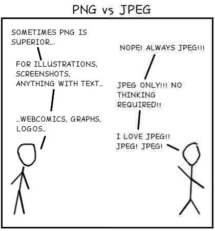
Generally speaking, JPEGs are the best format for photographs, whereas PNG’s are best for line drawings, text, etc. GIFs are best for moving images. Read this to learn more about the technical differences between these three formats.
Most professional image editing applications (e.g., Photoshop) will give you the option to save as either a JPEG, PNG or GIF. You can also use them to convert an image from one file format to another. Don’t have professional image editing software? Try this free tool.
For screenshots, here are a few applications that allow you to export in multiple formats:
Here’s what the Ahrefs Blog looks like on my 27-inch monitor:
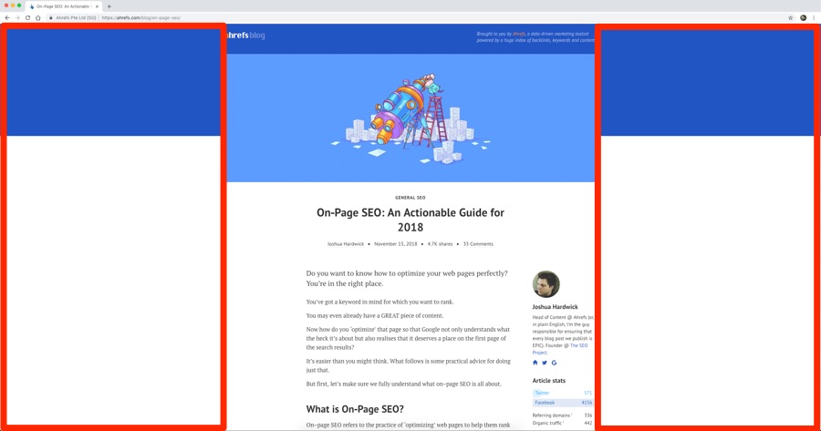
The Ahrefs Blog as displayed on my 27-inch monitor with a resolution of 2560 x 1440.
Notice that there’s a lot of white space on either side of that content? That’s because the maximum width of the blog content is 720px. In other words, no matter what your size screen, images are never displayed wider than 720px.
Now, the more pixels that make up your image, the bigger the file size will be.
The browser will resize images wider than 720px to fit them on the screen (at least with well-coded responsive websites). But, importantly, the browser still has to load the full-sized image. In other words, if we were to upload a 6000px-wide image, the browser would still need to load the entire thing even though it displays at 720px. That’s slow.
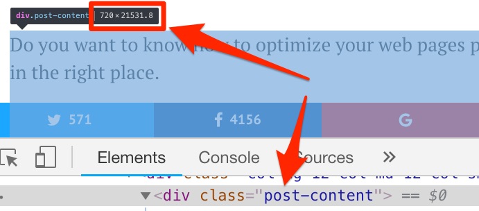
The solution is to resize and upload images in the maximum width you need. Be aware that this may not be 720px. It depends on the overall design of your website. The first step is to figure that out. You can do so by digging into your CSS.
Be careful with this, especially if you’re using a responsive design. Sometimes the width of your website may be higher on smaller screens than it is on larger ones. That’s true of the Ahrefs Blog.
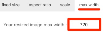
You can then use this tool to resize your images in bulk.
It’s only the width that matters, so upload your images in bulk then use the “max width” option to adjust only the width.
You should bulk upload your JPEGs and PNGs in two separate batches. Otherwise, the tool will convert all images into a consistent image file type. You can select between JPEG and PNG in the tool itself. Use the appropriate option for the batch of images that you’re optimizing.
Here are two reasons why this tool is great:
- Max-width resizing: Let’s say that the max-width of your website is 700px. You have a bunch of images that need resizing. Some are wider than 700px, and some are narrower than 700px. You don’t want to resize the narrower ones to 700px because that will decrease the overall image quality. This tool keeps those images the size they are. It only resizes the ones that are too wide.
- Keeps file names intact: You’ve spent ages naming your images for SEO. You resize them and download the resized versions. You open the .zip to find image1.png, image2.png. (You’ll understand this frustration if you’ve ever downloaded images from Google Docs!) This tool keeps the file names intact, so you won’t have to rename after resizing.
Take a look at these two images:
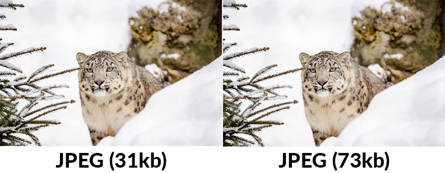
Both of them are JPEGS. There is little noticeable difference in quality between the two, yet the first image is 58% smaller than the first (31kb vs. 73kb).
Google has some seriously extensive documentation on optimizing images for the web.
The key takeaway in regards to file size is this:
For best results, experiment with various quality settings for your images, and don’t be afraid to dial down the quality - the visual results are often very good and the filesize savings can be quite large.
Google recommends three open-source tools to help with this: Guetzli, MozJPEG (by Mozilla), and pngquant. You can read their guidelines for using these tools here. However, be aware that these are command line tools. If you’re not comfortable using such tools, Google’s recommendation is to use ImageOptim—a free tool for Mac. (Find Linux and Windows alternatives here.)
Just drop in your images, and they’ll be compressed.
You can change the level of compression in the settings and even enable lossy compression.
It also strips EXIF data by default. That helps to further reduce the file size—albeit not usually by much. You can use this free web-based tool (officially recommended by Google) to strip EXIF data if you plan not to use ImageOptim.
Google has stated that EXIF data may be a “ranking factor” in Google Images.
For that reason, it may be something you want to keep. You can turn off the EXIF data stripping in the ImageOptim settings.
Our verdict? The potential positives of leaving EXIF data intact—when doing local SEO—likely outweigh the negatives.
How good are the results from this tool? I decided to run a little experiment. I took a small sample of 15 images—some JPEG, some PNG. I threw them all into this tool on the default settings. I did the same for a few other alternatives.
Here’s how they fared in terms of average file size reduction:
- Imageoptim: 69% (JPEG). 40% (PNG)
- Shortpixel: 42% (JPEG). 59% (PNG)
- Kraken.io: 13% (JPEG). 63% (PNG).
- TinyPNG: 27% (JPEG). 65% (PNG).
- Optimizilla: 27% (JPEG). 60% (PNG)
- Imagify.io: 6% (JPEG). 1% (PNG)
- Compressor.io: 42% (JPEG). 58% (PNG)
Imageoptim (Google’s recommended tool) was by far the best for JPEGs. But it was one of the worst for PNGs. It is, however, worth noting one caveat—ImageOptim defaults to 70% PNG quality. You can go all the way down to 40%.
Do that, and the average compression increases to 75.6% for PNGs. That makes it the overall winner for both JPGs and PNGs by far.
Still, if we stick with the results of the default settings above, Shortpixel appears to be the best all-round image compressor.
That’s especially good news for WordPress users because there’s a ShortPixel WordPress plugin. It’s free up to 100 images per month.
Furthermore, it gives you the option to compress all of the images that you already have on your WordPress site. You can’t do that with the other tools on the list.
You can find the images on your site that may benefit from compression with Ahrefs Site Audit tool.
Site Audit > project > Resources > Images
Here’s what Google says about image sitemaps:
Images are an important source of information about the content on your site. You can give Google additional details about your images, and provide the URL of images we might not otherwise discover by adding information to an image sitemap.
These are the tags that you can use in image sitemaps:

If you’re using WordPress and Yoast SEO, then images are added to your sitemap automatically. That’s even true for sites that have the “media” pages set to noindex. (Note: That is now the default setting in the latest version of Yoast.) However, Yoast only includes the required <image:image> and <image:loc> tags. If you add captions to your images in WordPress, Yoast doesn’t add these.
You’ll need to include those yourself, manually.
Google’s documentation for image sitemaps is rather sparse. Nowhere do they specify the desired syntax for the <image:geo_location> tag. It’s unclear whether an image of Sheffield, UK should be tagged as:
<image:geo_location>Sheffield, England</image:geo_location>
<image:geo_location>Sheffield, United Kingdom</image:geo_location>
The same is true for <image:licence>. Is Google hoping that you link to these official Creative Commons license pages? Or would they prefer you link to a licensing page on your site?
Your guess is as good as ours.
Google also states that:
Image sitemaps can contain URLs from other domains, unlike regular sitemaps, which enforce cross-domain restrictions. This allows webmasters to use CDNs (content delivery networks) to host images. We encourage you to verify the CDN’s domain name in Search Console so that we can inform you of any crawl errors that we may find.
That’s useful to know if you use a CDN to host your images. More on that later.
Here’s what Google says about vector graphics:
Vector graphics use lines, points, and polygons to represent an image. [They are] ideally suited for images that consist of simple geometric shapes (for example, logos, text, icons, and so on), and deliver sharp results at every resolution and zoom setting, which makes them an ideal format for high-resolution screens and assets that need to be displayed at varying sizes.
Many sites use vector graphics for their logos and other simple on-site elements.
SVGs (Scalable Vector Graphics) are perhaps the most popular vector format on the web. The World Wide Web Consortium (W3C) developed them and they’re based on XML. As such, all modern web browsers support them.
No matter what browser, device or screen resolution you have, SVGs will look crystal clear because they don’t pixelate. You could display a SVG on a screen the size of a planet—it wouldn’t lose one ounce of quality.
Here are Google’s suggestions for optimizing SVGs:
- SVG files should be minified to reduce their size.
- SVG files should be compressed with GZIP.
Their recommended tool to minify SVG files is svgo.
Not comfortable using a command-line interface? Use this web app or this Mac app to do the same thing. Both offer a simple drag and drop interface for minifying such files. I prefer the web app.
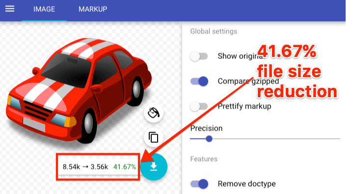
That screenshot sums up everything you need to know about SVGs. You can see that the original size of the SVG was 8.54kb. That’s insanely small. The minified (and gzipped) version is even smaller at just 3.56kb—a 41.67% saving.
Gzip compression is something that is enabled at the server level. In other words, the SVG above will only use 3.56kb of bandwidth if the server allows—otherwise, it will use 8.54k.
Use this tool to check whether gzip compression is enabled on your server. Follow these instructions to enable it if not.
Let’s say that you upload a 720px-wide image to your site.
If someone visits on a mobile device with a much smaller display, say 320px-wide, then their browser still has to load the 720px image. That image will look perfectly fine. But so would a 320px-wide image.
Do you see the problem? Loading the 720px image is a waste of bandwidth and serves only to slow down how fast the page loads. That isn’t good for SEO.
The solution is to use srcset.
This is a magical piece of HTML code that tells the browser to load different versions of an image for different screen resolutions.
Here’s the syntax, followed by an explanation:
<img src="image.jpg" srcset="image-medium.jpg 1000w, image-large.jpg 2000w">
The first part of the syntax is a pretty standard <img> tag. We then also include links to two other versions of the same image in different sizes—medium (1000px wide) and large (2000px wide).
Now I’m going to steal this next part of the explanation pretty much word for word from this article because it does a fantastic job of explaining what happens here.
Say you’re on a device with a screen width of 320px and is a 1x (non-retina) display. The images you have are small.jpg (500px wide), medium.jpg (1000px wide), and large.jpg (2000px wide).
The browser goes:
Lemme do some quick math that nobody cares about except me.
500 / 320 = 1.5625
1000 / 320 = 3.125
2000 / 320 = 6.25
OK, so since I’m a 1x display, 1.5625 is the closest to what I need. It’s a little high, but it’s the best option compared to those other that are way too high.
Now another browser visits the site. It’s also a 320px display but it’s a retina (2x) display. That browser does the same math, only then goes:
OK, so since I’m a 2x display, I’m going to throw out that 1.5625 image because it’s too low for me and might look bad. I’m going to use the 3.125 image.
Make sense? The browser essentially chooses the most efficient image to send to the visitor, thus reducing bandwidth and improving load time. Perfect. But does that mean that you need to upload many different sizes of all your images? Not necessarily.
WordPress takes care of automatically (starting in WordPress 4.4—which you should all be using by now). For each image you upload, WordPress makes these versions by default:
- Thumbnail: A square crop (150px by 150px).
- Medium: Resized so that the longest side is 300 pixels wide or high.
- Medium Large. Resized to 768 pixels wide.
- Large: Resized so that the longest side is 1024 pixels wide or high.
- Full: Original image.
Furthermore, WordPress also adds srcset automatically.
Here’s what that looks like for our blog (which runs on WordPress):
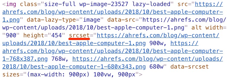
To reiterate: That code is generated entirely by WordPress. We didn’t upload multiple versions of that image.
Note that you can use the @2x syntax if you wish to optimize for retina displays. There’s also this WordPress plugin which adds support for such displays pretty much out of the box. Having said that, unless you go crazy with image compression (i.e., anything below ~40%) for JPEGs, you’ll likely find that your ‘regular’ images scale up just fine on retina displays. That’s my experience, anyhow.
Schema markup is likely something that you’re more familiar with in the context of Google web search. It looks something like this in the regular search results:
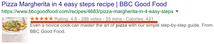
But did you know that schema markup may also be relevant for image SEO?
That’s because Google shows relevant badges on the thumbnails in mobile image search results. Here’s what they look like:
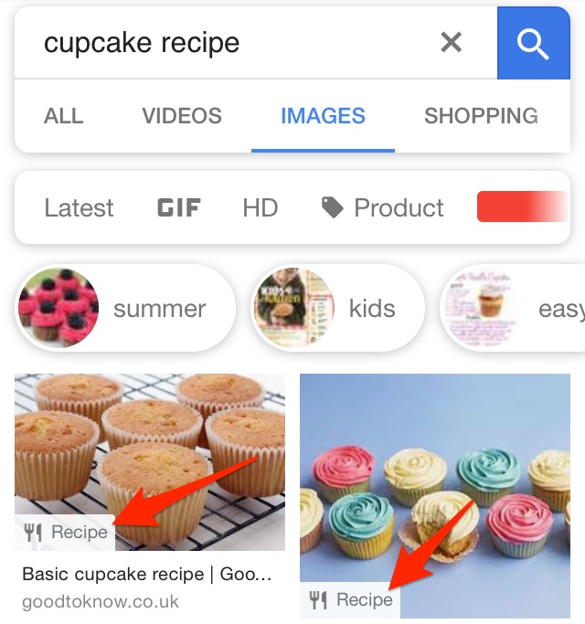
Google says this about these badges:
If you have images on your site, you can help users identify the type of content associated with the image by using appropriate structured data on your pages. This helps users find relevant content quickly, and sends better targeted traffic to your site.
Currently, Google has support for four types of markup: products, recipes, videos, and GIFs.
Ensuring that your images show these badges in Google image search is easy. You just need to add the appropriate schema markup to the page.
Add recipe markup to recipe pages.
Add product markup to product pages.
Add video markup to pages with videos.
Note that GIFs don’t require any additional markup—Google already knows they’re gifs.
Of course, unless you have any of this type of content on your website, you don’t need to worry about schema markup. It’s likely that Google is supporting badges for these four content types because they’ve recognized that their users often look for such content in Google Images.
Lazy loading is where the browser defers the loading of images (or any other objects—video, etc.) until they need to be shown on screen. Other images are loaded as and when they need to be loaded—i.e., as you scroll.
Here’s what Google says about lazy-loading:
Lazy loading can significantly speed up loading on long pages that include many images below the fold by loading them either as needed or when the primary content has finished loading and rendering.
There’s been a lot of debate in the past as to whether lazy-loaded images are good or bad for SEO. Google has also sent mixed messages. However, perhaps the best indication that Google does recommend lazy-loading in 2018 is this:
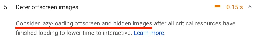
That’s a recommendation from Google’s very own PageSpeed Insights tool.
Google explains how to implement lazy-loading (in a way that ensures they can see the lazy-loaded content—very important!) here. There are a few different methods, but they all involve Javascript. If you’re not familiar or comfortable with such things, it may be worth hiring a coder to help with this.
If you’re using WordPress—as we are—then there are a few lazy-load plugins out there.
Most of them have poor reviews. We recently implemented lazy-loading on the Ahrefs’ Blog (you may have noticed) for which we use the A3 Lazy Load plugin. So far, so good.
Browser caching is where images (and other files) get stored in your visitors’ browsers. The result is that things load faster for them if and when they visit your website in the future.
For example, when you landed on this blog post, you had to download all the images in the article and display them in your browser. Now, without browser caching, this process would need to be repeated in its entirety should you want to reread this page tomorrow.
However, with browser caching, what happens is that your browser hangs on to some of these images. So when you view this page again—or a similar page—there’s no need to re-download all of them. Many are already on your computer and thus, will load much faster.
Here’s what Google says about browser caching:
HTTP caching can speed up your page load time on repeat visits.
When a browser requests a resource, the server providing the resource can tell the browser how long it should temporarily store or “cache” the resource. For any subsequent request for that resource, the browser uses its local copy, rather than going to the network to get it.
You may even see this warning in Google PageSpeed Insights if your website could benefit from browser caching:
So how do you enable browser caching for your images?
In WordPress, it’s pretty straightforward. Just install a plugin like W3 Total Cache. That will enable browser caching by default and add the required modifications to your .htaccess file.
For non-WordPress users, you will need to add this code to your .htaccess file manually:
<IfModule mod_expires.c>
 ExpiresActive On
 # Images
 ExpiresByType image/jpg "access 1 year"
 ExpiresByType image/jpeg "access 1 year"
 ExpiresByType image/gif "access 1 year"
 ExpiresByType image/png "access 1 year"
 </IfModule>
You can change the “1 year” part to “1 month,” “1 week,” “1 day,” “1 hour,” etc. Still, these settings should work well for most sites. These are also the values that W3 Total Cache uses by default.
Read more about browser caching and how it works here.
IMPORTANT NOTE. Do check that this code is compatible with your server before implementation. .htaccess files can be quite a hassle at times.
Most websites serve all of their files (including images) from a single server in a single location.
If we assume that your web server in the UK, then your images don’t have to travel far when someone from the UK visits your website. However, it’s a different story for your US visitors. Images have to travel much further to reach them. That decreases the speed at which your website loads.
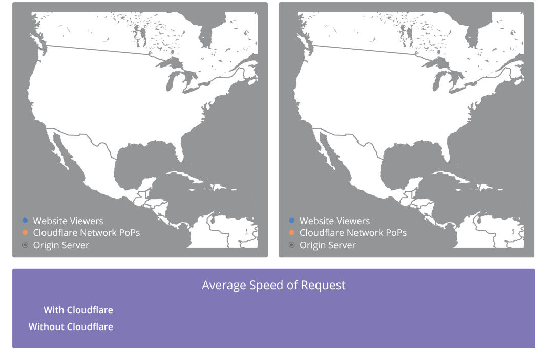
Content Delivery Networks (CDNs) solve this problem by caching your files across a global network of servers. Now, when someone visits your website, the images will be loaded from the server closest to them.
Here’s a cool GIF from CloudFlare which depicts this process perfectly:
There are lots of CDNs out there. Here are just a few of them:
- Cloudflare (free tier available);
- KeyCDN;
- Amazon CloudFront (free tier available);
- Google Cloud CDN (free trial available)
If you’re using WordPress, setting up a CDN is easy. Sign up for your chosen CDN, follow the instructions, then use a plugin like W3 Total Cache, CDN Enabler or WP Rocket to enable the CDN on your site. It’s that simple.
Still, it’s worth noting that your CDN will have a URL like xyz.cdnprovider.com.
That isn’t great for SEO for the following reasons:
- Your images are effectively hosted on a separate domain. If someone chooses to embed one of your images and link to you, there’s a chance they will link to the CDN instead. That means you miss out on a link.
- It can cause problems if you wish to change CDN provider in the future. You will have to change (or redirect) all of your image URLs, etc.
Here’s John Mueller’s advice when it comes to CDNs:
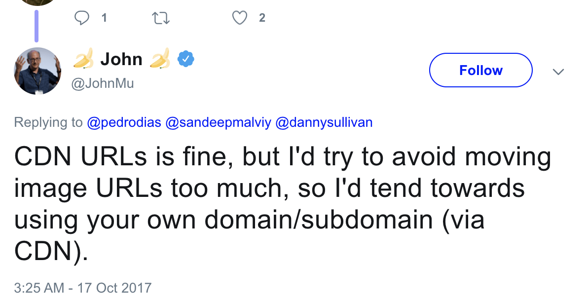
For that reason, I would recommend setting up a CNAME record. Think of this as an alias that can be used instead of the ugly URL that gets assigned to you by the CDN provider. So instead of xyz.cdnprovider.com, your CDN can be cdn.yourdomain.com.
Read this guide to learn how to set this up (and everything you need to know about CDNs in general).
Image CDNs are also a thing.
Google recommends two of these in their official documentation: Cloudinary and imgix.
The interesting thing about image CDNs is that they help to automate the process of image optimization. This is something that Google recommends and, honestly, if you have a big website, it’s a good idea.
Such services are not usually free, but they can save a lot of time.
Bonus tip: Recover “link equity” from image backlinks
Infographics. GIFs. Charts. These are all linkable assets that often get embedded on other websites.
Here’s an example:
This is an image from our featured snippets study embedded in someone else’s blog post.
Normally, people link back to the image source when doing this, but that’s not always the case. Sometimes people don’t link at all, and other times they link directly to the image (e.g., yourdomain.com/yourimage.jpg).
That’s exactly what this site did.
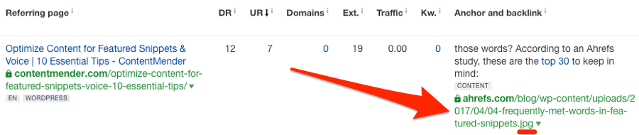
Unfortunately, this backlink is effectively wasted because no PageRank is transferred to the page itself. Nor is it able to “flow” around our site.
You can recover the “link equity” from these backlinks by reaching out to linkers with a quick:
Hey [NAME], saw that you used my pic. Rather than linking to the image, can you link to the original source?
It’s quick, easy, and conversion rates are often sky high.
How do you find such backlinks? Simple. Go to:
Site Explorer > enter your domain > select “domain/*” mode > Backlinks > search for .jpg in “URLs of backlinks”
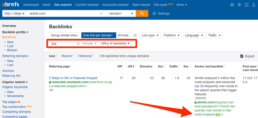
Reach out and try to convert any worthwhile ones.
You can repeat this process by searching for .png and .gif images too.
If you’re using a CDN, you can also find people linking to the images hosted on your CDN subdomain.
Site Explorer > enter CDN subdomain > select “prefix” mode
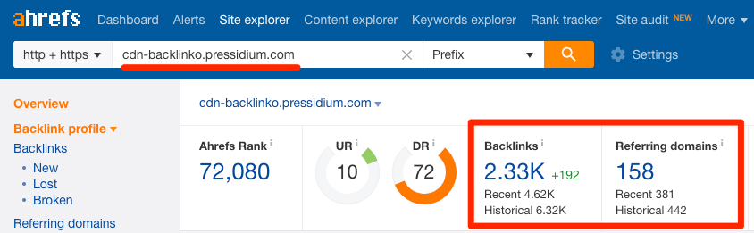
The screenshot above shows the link profile for cdn-backlinko.pressidium.com—the CDN Brian Dean uses for backlinko.com. There are 2,300+ backlinks from 158 referring domains (i.e., unique websites).
In other words, 157 websites (one of them is backlinko.com itself) link to images and other files hosted on the CDN as opposed to the site itself.
That’s 157 link opportunities.
Read more about similar backlink building strategies in our full guide to link reclamation.
Final thoughts
Image SEO is a complex topic. Google has tons of documentation on the matter. Their page about automating image optimization runs more than 15K words.
For that reason, it’s important to note that I haven’t covered absolutely everything in this article. That would be impossible. You can read Google’s documentation if you want to know the lot (and have a few weeks to spare). This article purposely focuses on the ‘big’ elements that I believe will have the most substantial positive SEO impact.
Keep in mind that you should also make an effort to ensure that your images are high-quality and contribute to a great user experience. That means staying clear of low-quality stock photos, making product images expandable, and so forth.