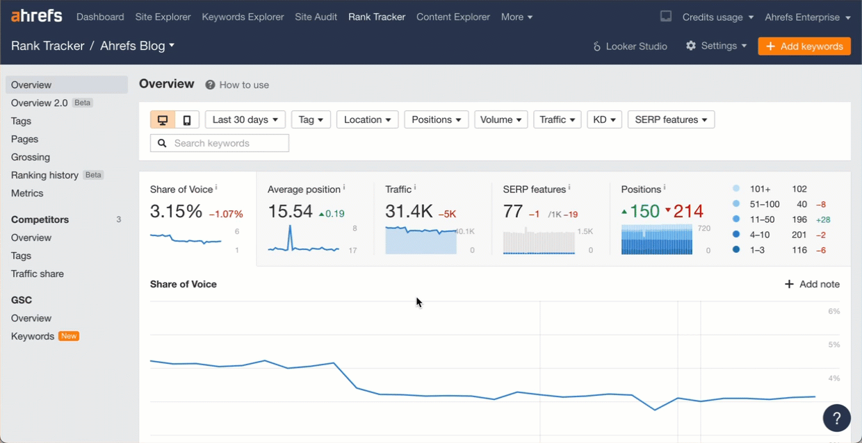
We’ve already launched some AI-enhanced features like search intent, but we made it even better by adding the traffic share for each intent. Check out this write-up from Si Quan for some more things we might add.
For the visualizations, you’ll need GPT-4. There’s an API, but you can also just use ChatGPT Plus for $20 a month. I’m hoping to bring many of these visuals to life within the tool, but these things take time and you can create them now. Let me know your favorites and any other use cases you find that you want to see us add!
For all these, export the data in UTF-8 format from the report indicated and run the prompt. Note that your results may differ a bit because of how LLMs work. You may need to ask for some adjustments to get exactly what you want.
Use case:
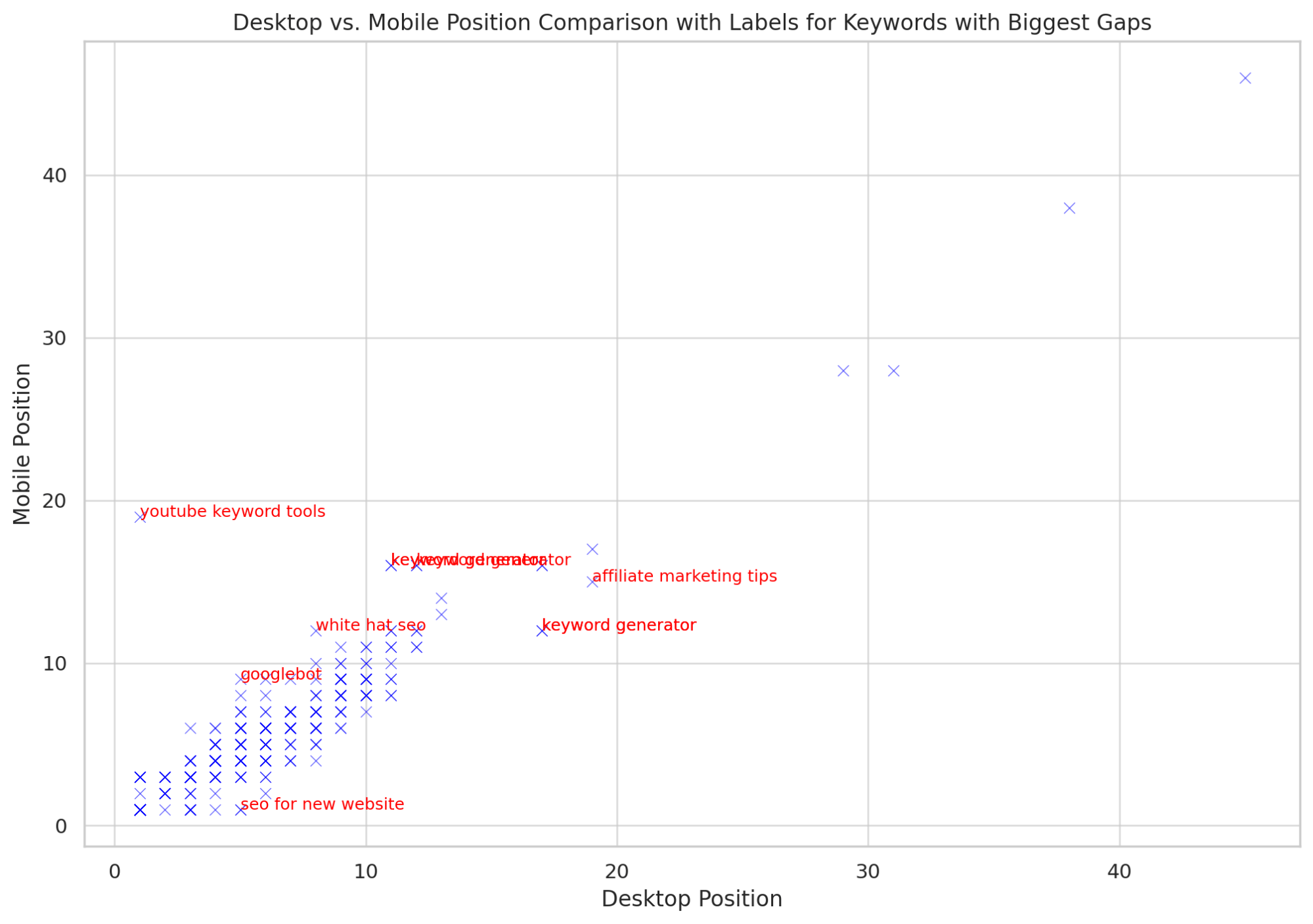
This allows you to see outliers. If you have some terms ranking better on Desktop vs Mobile, then you might want to look at mobile issues or Core Web Vitals.
You can see both mobile issues and Core Web Vitals in Ahrefs’ Site Audit. You’ll need to run Site Audit as mobile and connect to PageSpeed Insights.
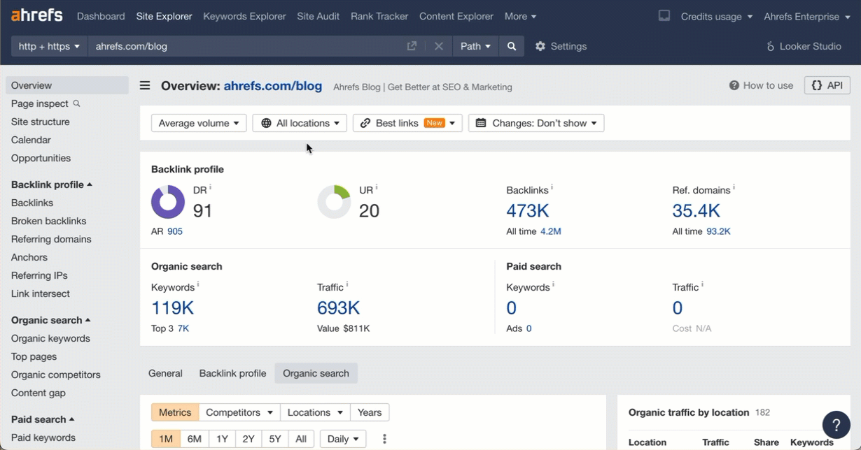
Data source:
Download your desktop and mobile rankings from the Overview report in Rank Tracker (remember to choose the UTF-8 format). Upload both files to ChatGPT.
Prompt:
Read these 2 files that contain desktop and mobile keyword rankings.
Show me a scatter plot comparing the desktop and mobile positions for each keyword.
Label ones that have the biggest gap between rankings.
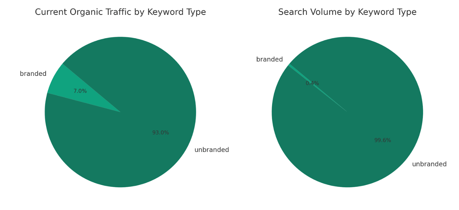
Use case:
See the breakdown of traffic and total volume by branded and unbranded terms. At a glance, I can see that the majority of our traffic comes from unbranded terms.
Data source:
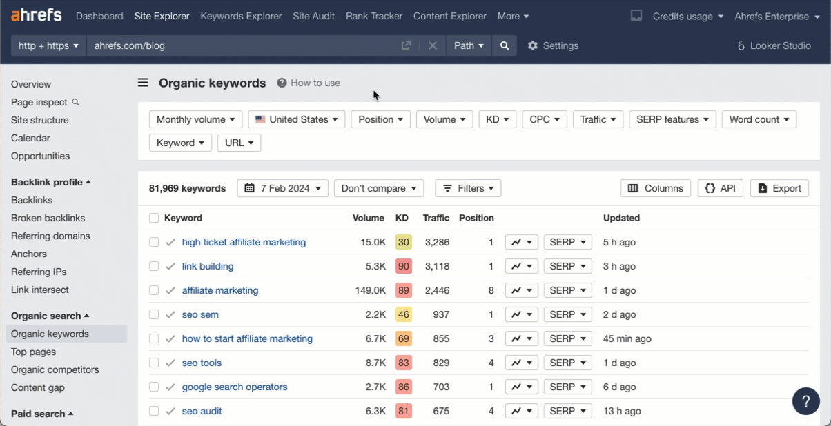
Download your keyword rankings from the Organic Keywords report in Site Explorer (make sure to select the UTF-8 file format) and upload the file to ChatGPT.
Prompt:
Label each keyword in the “Keyword” column as branded or unbranded. Then create a pie chart that shows the sum of “Current organic traffic” for both categories.
Also create this chart with the sum of “Volume” for each.
Use case:
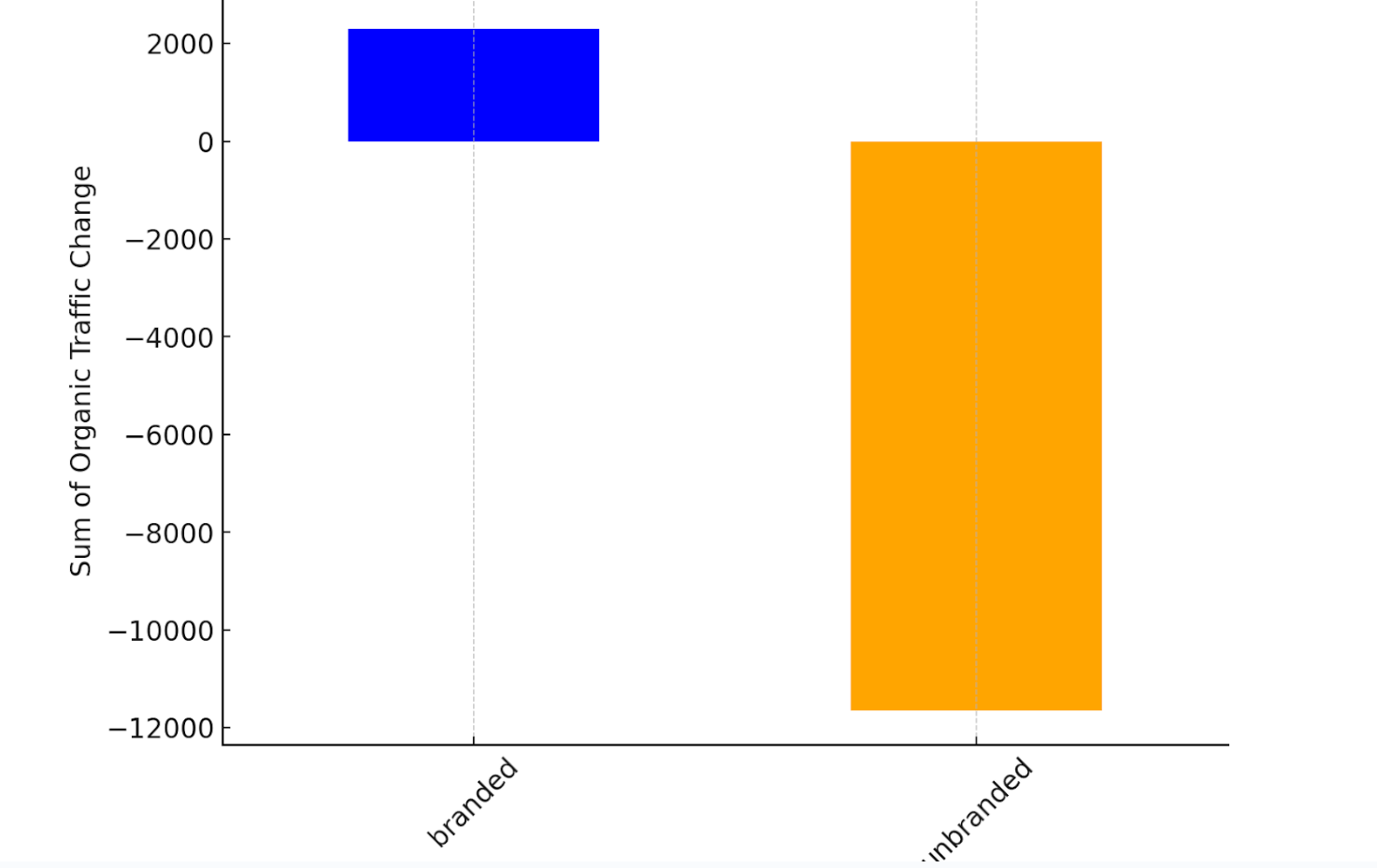
See if you’re gaining or losing clicks for branded or unbranded terms between two dates. You need to have compare mode enabled for this to work.
Data source:
Like the previous one, download your keyword rankings from the Organic Keywords report in Site Explorer and upload the file.
Prompt:
Label each keyword in the “Keyword” column as branded or unbranded.
Create a visual that shows me how the organic traffic changed overall for branded and unbranded keywords based on the sum of the data for each in the “Organic traffic change” column.
Use case:
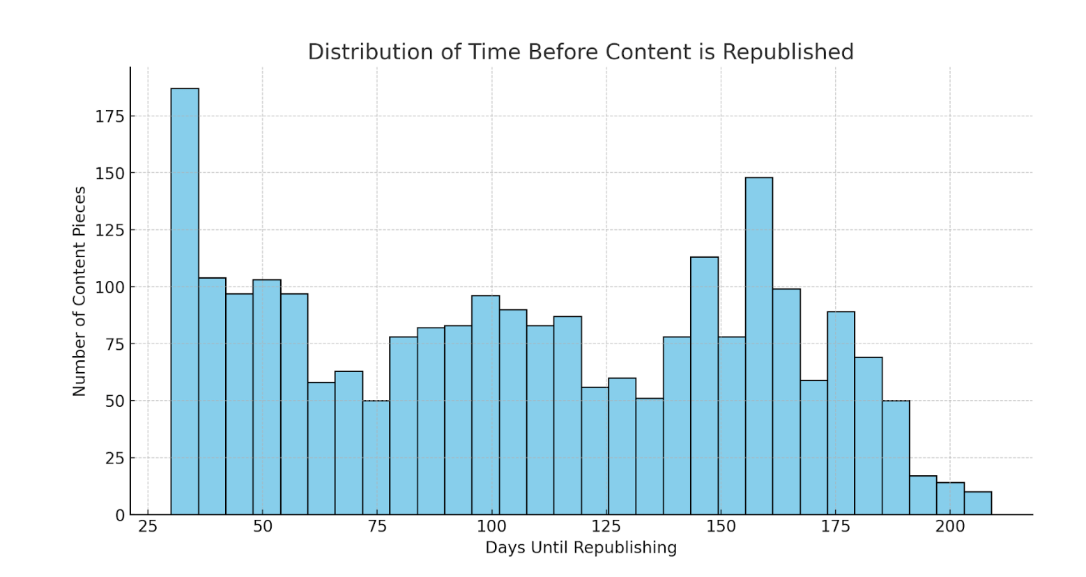
See the last time competing content was updated. If competitors are updating their content a lot, it can indicate a more competitive market.
Data source:
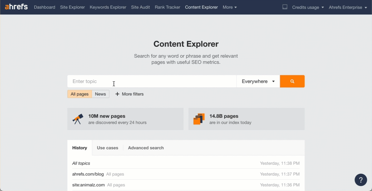
Enter a competitor’s website into Content Explorer and export the list of pages (choose UTF-8 as the export format). This can also be done with a keyword or topic.
Prompt:
Show me how many days since the content was updated.
Use case:
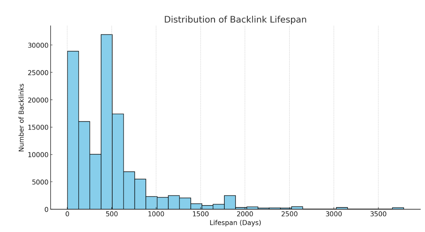
See how long backlinks were live on average. If you’re losing a lot of backlinks early, you may want to look into the reasons why. Read our study on link rot to see many of the common reasons.
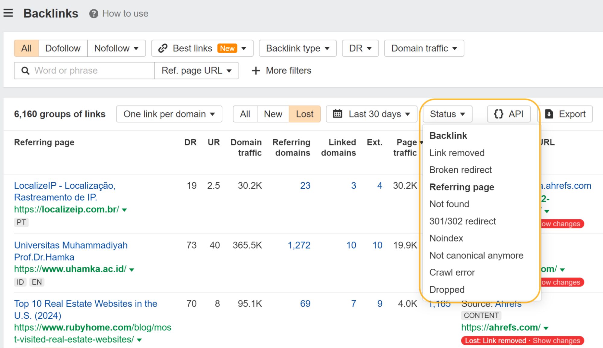
You can filter the Backlinks report for many of the common reasons why links are lost.
Data source:
Export your link profile from the Backlinks report in Site Explorer (choose UTF-8 as the file format). Upload this to ChatGPT.
Prompt:
Read this file and give me a histogram to show the distribution of backlink lifespans.
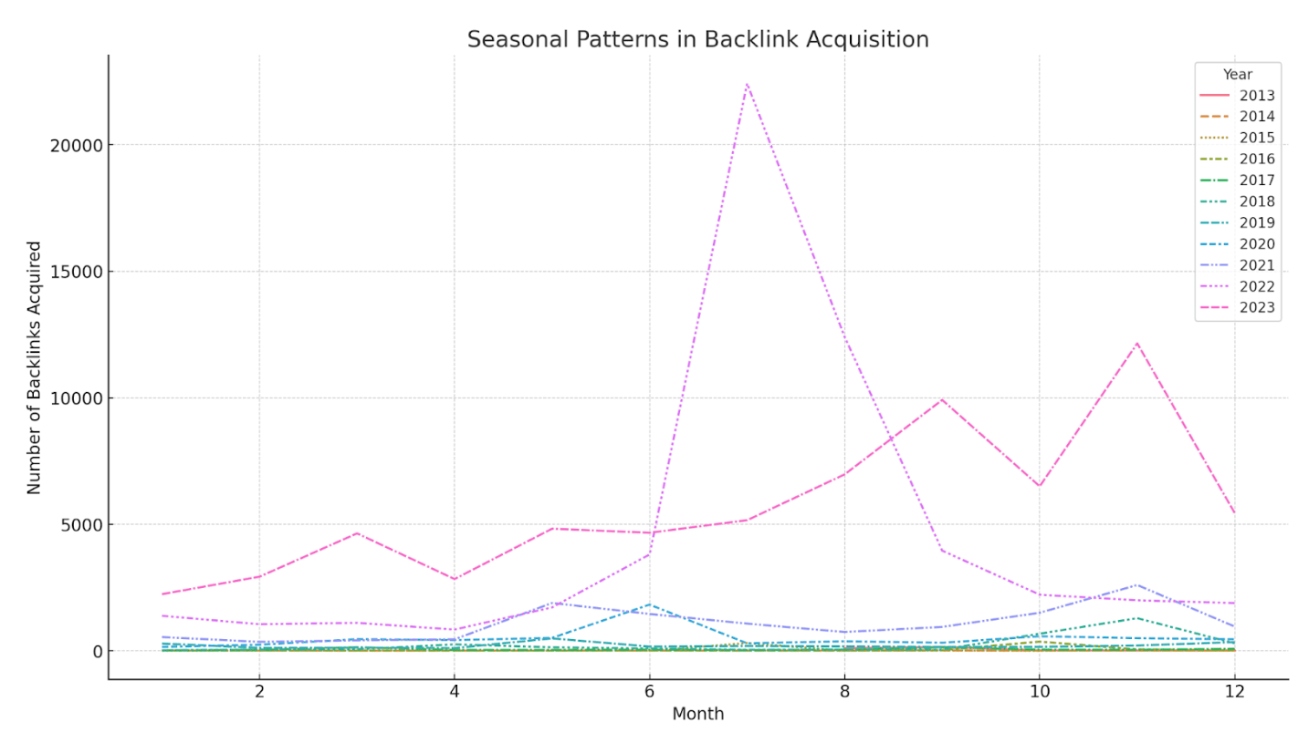
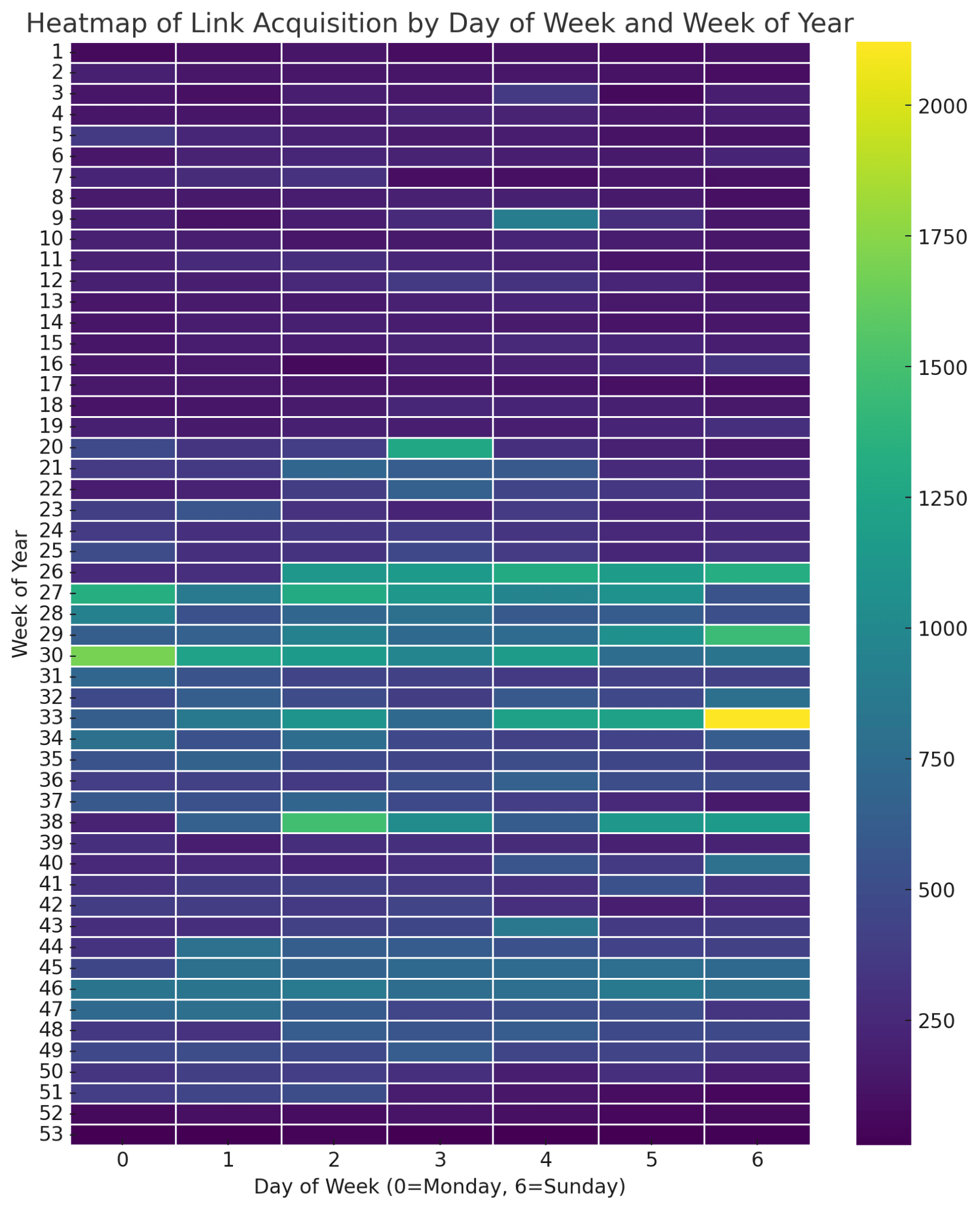
Use case:
See any seasonal patterns for your acquired links. Here, I see a big spike in the middle of 2022 and what seems to be a bit of a spike in November the last few years.
Data source:
Like the previous one, export your link profile from the Backlinks report in Site Explorer. Upload this to ChatGPT.
Prompt:
Look for seasonal patterns in backlink acquisition.
If you’d prefer a heatmap like the one below, use this prompt instead:
Analyze patterns in link acquisition (e.g., weekdays vs. weekends, monthly trends) using line charts or heatmaps to identify when most backlinks are acquired.
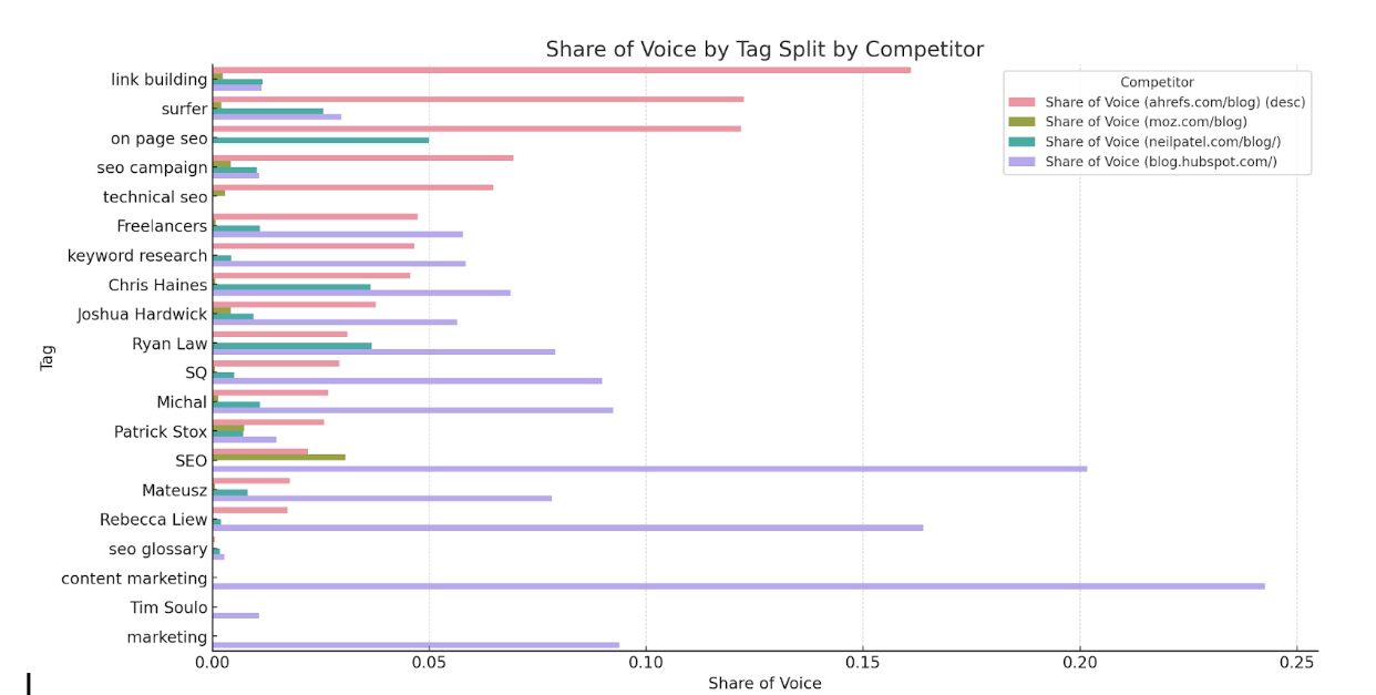
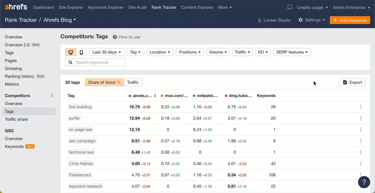
Use case:
See which tag groups are strong or weak vs competitors. I can quickly see we dominate for things like link building, but we’re weak for the terms in our general marketing bucket, probably because we mostly focus on SEO.
Data source:
Export the data from the Competitors - Tags report in Rank Tracker (use UTF-8 format).
Prompt:
Show me share of voice by tag and split it by competitor as well.
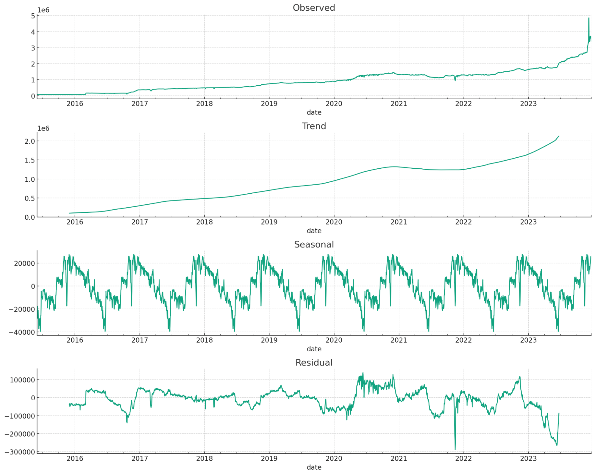
Use case:
Forecasting traffic or other metrics forward. This is great for getting buy-in.
Data source:
Export graph data from the Overview report in Site Explorer. You can choose any time-series graph you like (organic traffic, referring domains, etc.)
Prompt:
Forecast this time series data forward one year
Long story short on this one. I had a version that wasn’t as good as what Marie Haynes came up with, but I added to her visualization to make it even better.
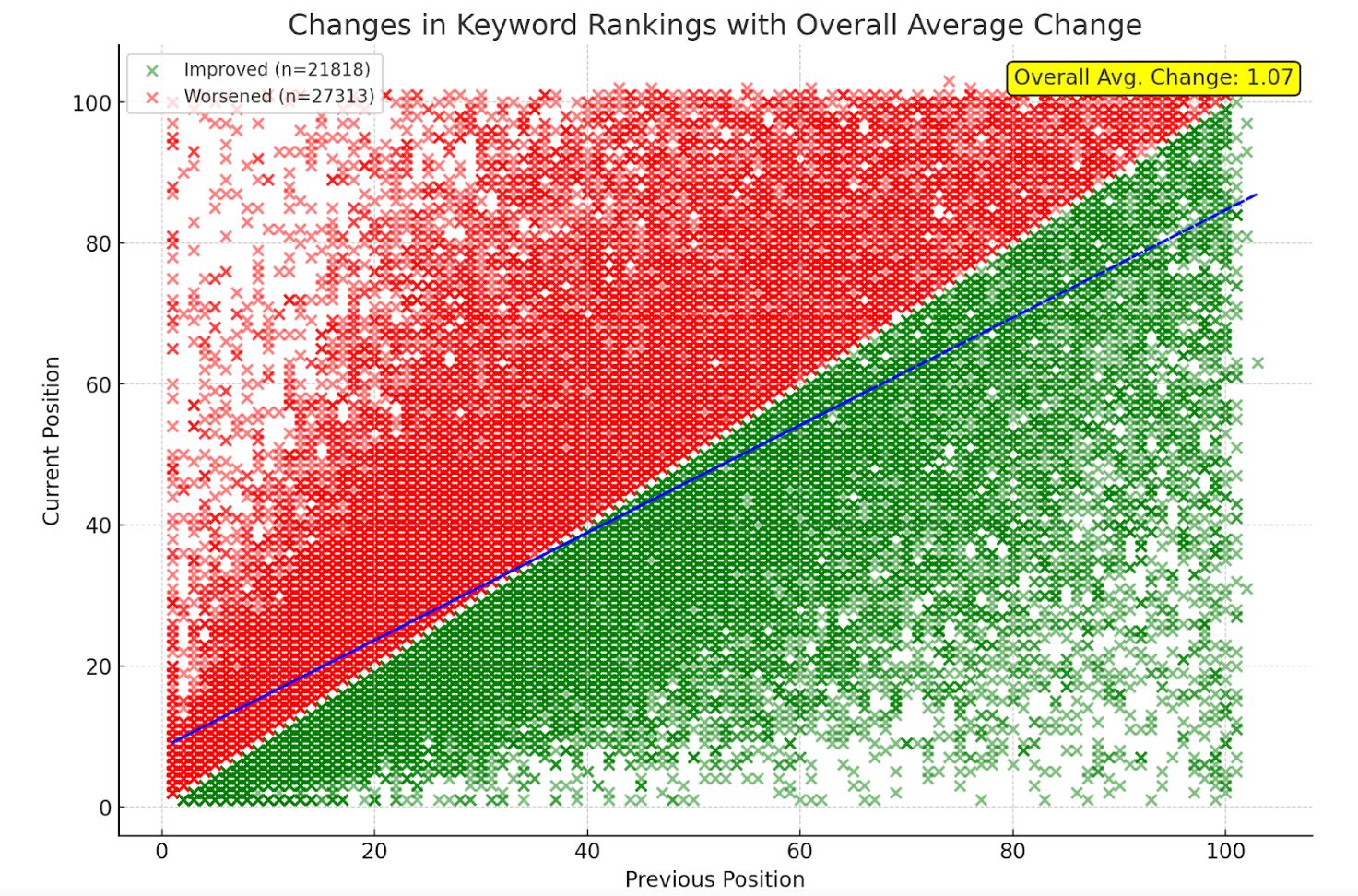
Use case:
The chart visualizes winners/losers for keyword rankings and shows me overall if I’m doing better or worse. From this image, I can see that more keywords overall are ranking worse, but overall rankings are up, so the positive ones moved up a lot more than the negative ones lost.
Data source:
Download your keyword rankings from the Organic Keywords report in Site Explorer and upload the file.
Prompt:
I used multiple prompts to get the final chart, but they might be able to be simplified into one.
Show me a scatter plot that shows the changes from the previous position and the current position. Include changes to a lower position as green and changes to a higher position as red. Include a legend and trendline.
Add a count for improved and worsened on the previous chart. Also show me on the chart on average, how much did rankings improve or decline
Remove the averages as they are. I want the overall average change in ranking position as one number.
Move the average to the right side of the chart so it’s readable
Use case:
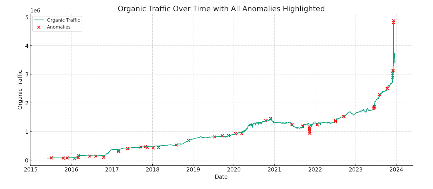
Find anomalies in time series data. In this case, most of the anomalies line up with major website changes and Google algorithm updates.
Data source:
Export organic traffic graph data from the Overview report in Site Explorer.

Prompt:
Identify anomalies in this traffic chart
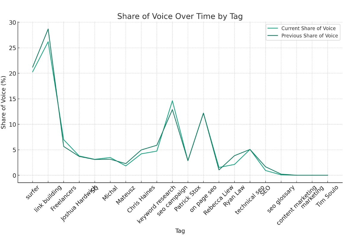
Use case:
This tells me if certain tagged groups are doing better or worse between the dates.
Data source:
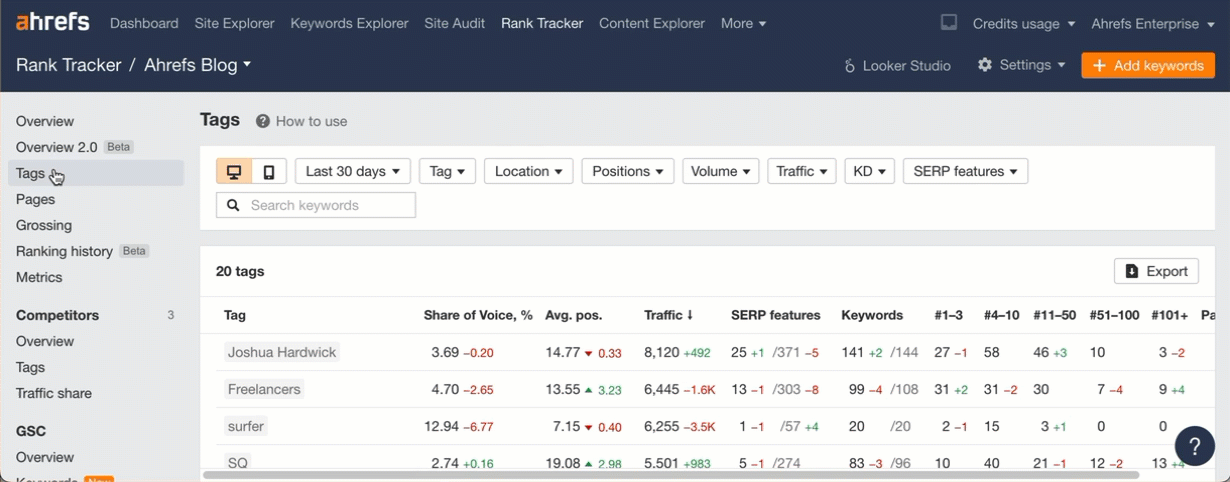
Export data from the Tags report in Rank Tracker.
Prompt:
Show me share of voice over time by tag.
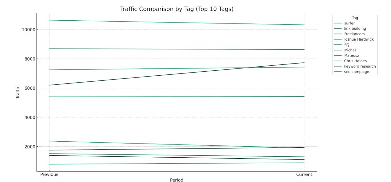
Use case:
See how traffic changed for each tag between two dates. We have a better view for this coming in Rank Tracker that will show the evolution over time.
Data source:
Like the previous one, export data from the Tags report in Rank Tracker.
Prompt:
Show me how traffic is evolving for each tag.
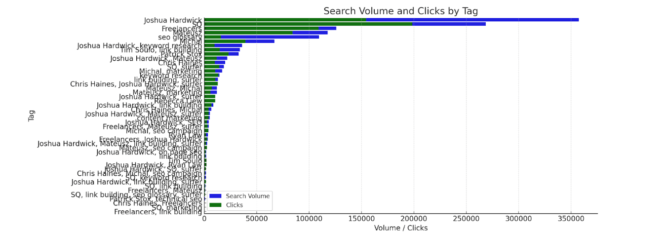
Use case:
See which groups of terms have the most volume vs the clicks that they’re getting. High total volume and low clicks means you have a lot to work on.
Data source:
Export keywords from the Overview report in Rank Tracker. (You can choose between desktop or mobile ranking data with the toggle).
Prompt:
Visualize search volume and clicks by tag.
Use case:
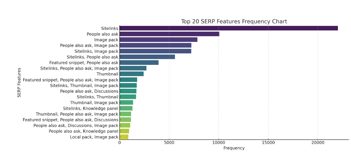
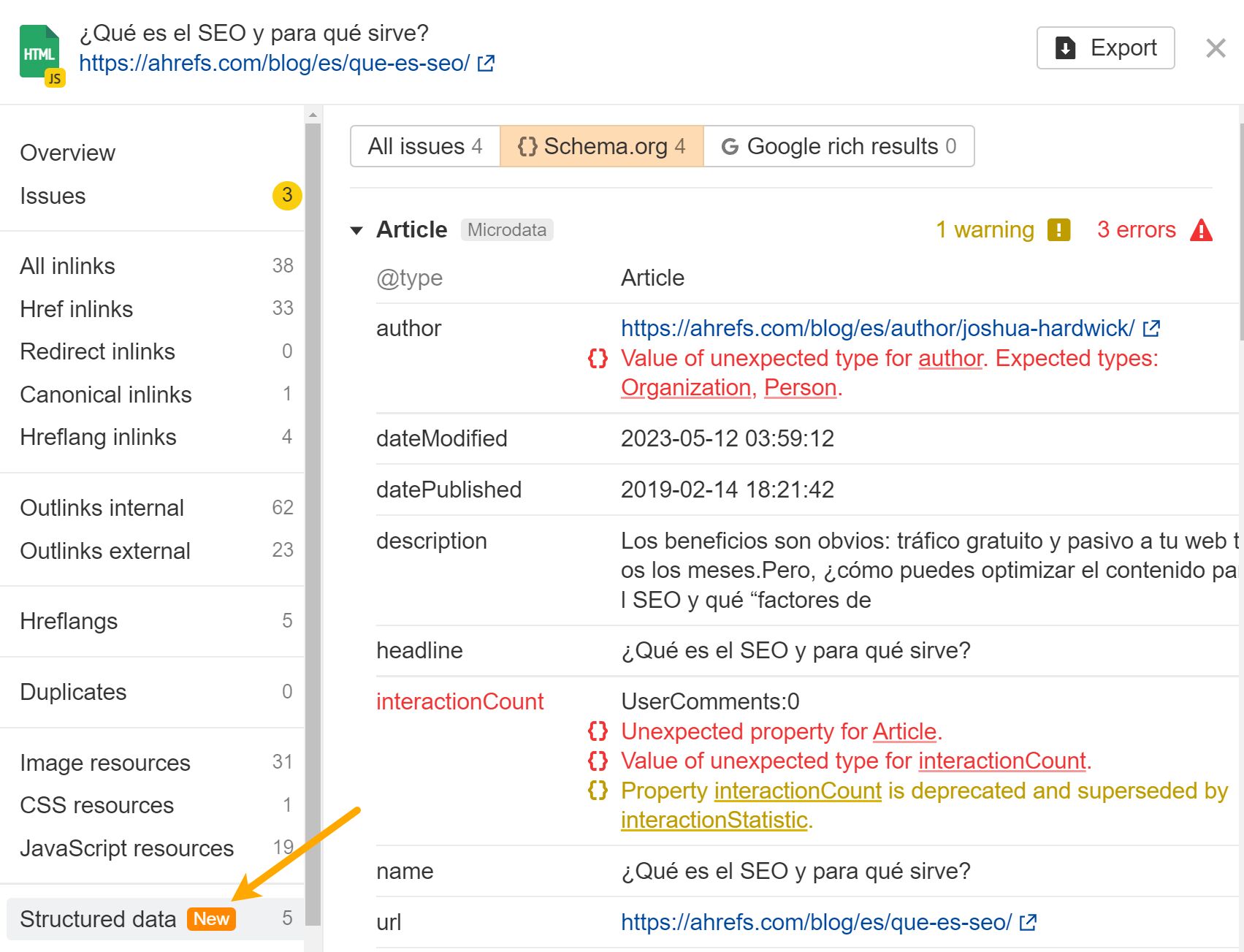
Shows common SERP features for you and competitors that you may want to target. If certain schema markup is required but you’re not using it, it can lead to an easy win.
You may also have an issue with your schema markup. Ahrefs’ Site Audit validates against both schema.org and Google standards.
Data source:
Export the data from the Content Gap report in our Competitive Analysis tool.
Prompt:
Show me which SERP features are most common.
Final thoughts
I hope this has sparked some ideas for other SEOs out there. I want to see what you all will create.
Have a cool idea you want to share? Let me know on X or LinkedIn.


