
If your website has separate mobile and desktop URLs, Google will show the mobile URL to mobile users and the desktop URL to desktop users. However, the indexed content used to rank the page for both versions will be taken from the mobile version.
In this guide, I’ll cover more information about mobile-first indexing, as well as mobile-friendly best practices and troubleshooting tips.

Mobile-first indexing timeline
Google announced the shift to mobile-first indexing in 2016. All the sites that are going to move over to mobile-first indexing are moved as of May 2023. That’s right, it took over 6 years for it to roll out!
Here’s a more detailed timeline:
April 2015 - Google launches the Mobilegeddon update which uses mobile-friendliness as a ranking factor.
November 2016 - Mobile-first indexing announced and being tested on some sites.
March 2018 - Mobile-first indexing being rolled out.
December 2018 - Over 50% of crawled sites now on mobile-first indexing.
July 2019 - Mobile-first indexing by default for new sites.
March 2020 - Over 70% of crawled sites now on Mobile-first indexing. They also announced mobile-first indexing would be used on 100% of sites by September 2020.
July 2020 - Coronavirus delays 100% mobile-first indexing to March 2021.
March 2021 - Tentative launch of 100% mobile-first indexing.
February 2023 - There are still some sites moving over to mobile-first indexing and some that will remain on desktop-only indexing for technical reasons.
May 2023 - The last sites have moved to mobile-first indexing. A few sites will remain on desktop crawling because they don’t work on mobile.
July 2024 - If your site’s content is not accessible at all with a mobile device, it will no longer be indexable.
You can check if you’ve moved to mobile-first indexing in Google Search Console. Just go to “Settings” where they identify the crawler in the “About” section and tell you if and when your website switched to mobile indexing.
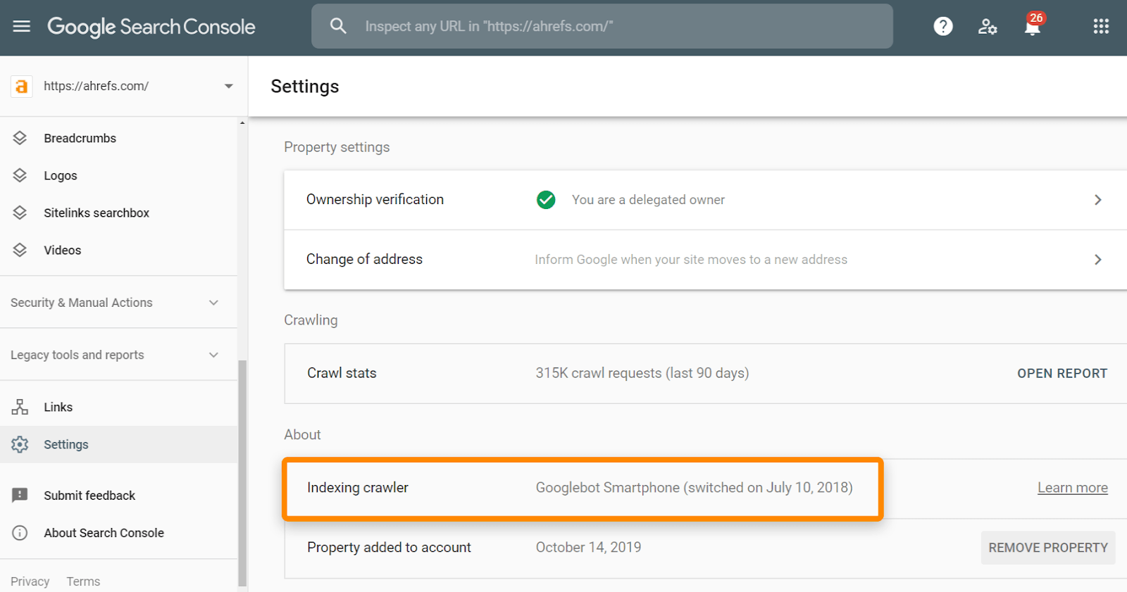
The URL inspection tool in Google Search Console will also identify which user-agent is used for crawling. If you click the page indexing section, you should see “Crawled as” and a user agent such as Googlebot smartphone.
There is only one index and you can’t opt out of mobile-first indexing.
Google does still crawl with the desktop user-agent, so don’t be surprised if you see that. They still need to check on some things like establishing the relationship between the desktop and mobile versions of pages.
Mobile-first indexing best practices
Let’s run through some of the things you may need to check to have a smooth transition.
Create a mobile-friendly website
There is a lot that goes into creating a mobile-friendly website. Here are 10 tips to get you started:
- Use responsive design
- Optimize for page speed on mobile devices
- Test and monitor your site for errors
- Make your content mobile-friendly
- Optimize for mobile SERPs
- Include mobile-friendly navigation
- Keep your content the same
- Avoid intrusive interstitials
- Review mobile performance
- Track rankings on a mobile device
There are more details for each in our post on mobile SEO.
You can also run a crawl in Site Audit to identify mobile SEO issues.
Keep important content
There are usually some differences between how a site appears on mobile vs. desktop. That’s because it’s harder to show everything from a desktop site on mobile due to smaller screen sizes. There’s no space for things like sidebars or mega-menus, so mobile sites often exclude or hide bits of content present on desktop sites.
Your mobile site’s content doesn’t have to be identical to your desktop site’s content, but any important content must be present on mobile. Excluding things like email opt-ins won’t be a big deal from an SEO point of view, but excluding things purely because someone felt it was too long for mobile can have a negative impact.
Previously, if content didn’t show on mobile by default, it would count less than visible content. That changed with mobile-first indexing, and you now have more design options like tabbed content. Google no longer discounts content hidden to improve the user experience.

I’ve noticed that many ecommerce sites are doing an excellent job of using these design elements. They often manage to create simplified pages that provide additional details to users when they request them, such as additional product details, Q&A, user reviews, etc.
Navigation and Links
You probably don’t need to worry about external links to your site. They should consolidate properly and be counted for your mobile pages as long as your canonical tags are correct.
With internal links, you want to make sure that all the important links still exist on your mobile version. For instance, a mobile site may have skipped breadcrumbs to save space. Some sites use a smaller menu for mobile than they use for their desktop site. These could impact your rankings as they may change how PageRank flows through your site.
Technical checks
You’ll want to make sure that many technical elements are in place on your mobile site. If you haven’t already done so, create a free Ahrefs Webmaster Tools account and crawl your website in Site Audit. By default, we’ll crawl your website using a desktop user-agent, meaning that we’ll see how it appears on desktop. You can change this in the “Crawl Settings” tab when setting up a project or edit it within your “Project Settings.” Just change the user-agent from Desktop to Mobile.
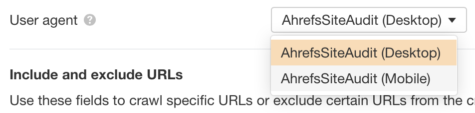
Our advice is to crawl your website using the desktop user-agent before crawling it again with a mobile user-agent. If you do this, our comparison feature will compare your mobile and desktop site and tell you anything that has changed or if any ‘new’ issues have come up (i.e., problems that exist on mobile but not desktop).
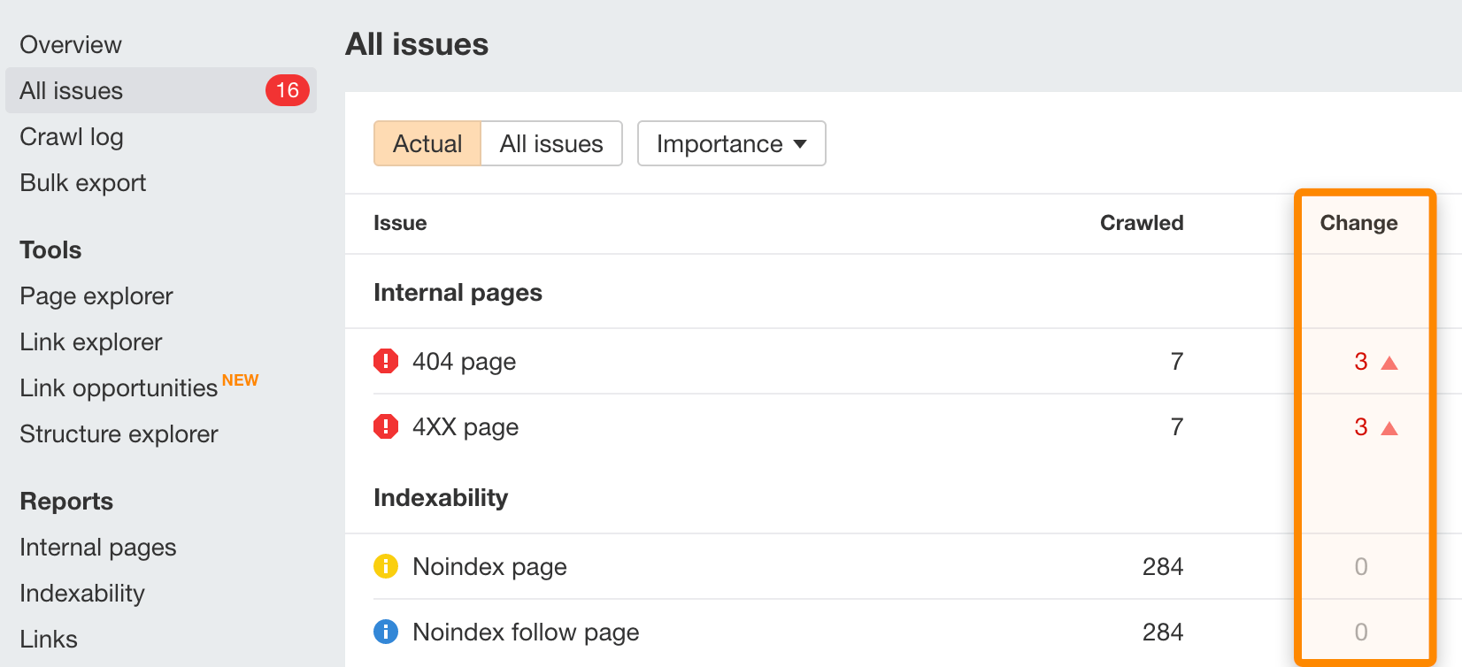
If you click on an issue, there’s a “Show changes” option that will highlight what is different.
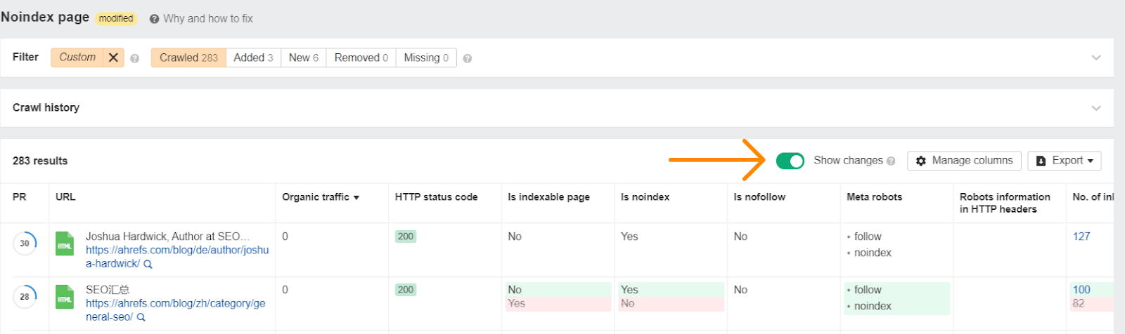
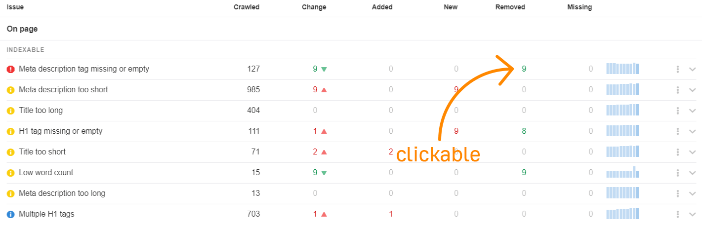
Alternatively, click on any of the Added, New, or Removed numbers to see what specifically has changed with regards to each issue.
You’ll want to check what changed with any issues, but you may want to start with some of the on-page tags such as title tags, meta descriptions, canonical tags, meta robots tags, hreflang tags, structured data, and alt attributes on images.
Other things to check:
Robots.txt
With m-dot sites, you’ll want to check if the robots.txt file for this subdomain has different rules. To do that, go to yourwebsite.com/robots.txt and m.yourwebsite.com/robots.txt and look for differences. If you’re struggling, paste both files into a text comparison tool like this one.
You’ll also want to make sure your CSS, JavaScript, and images are crawlable on all sites.
Speed
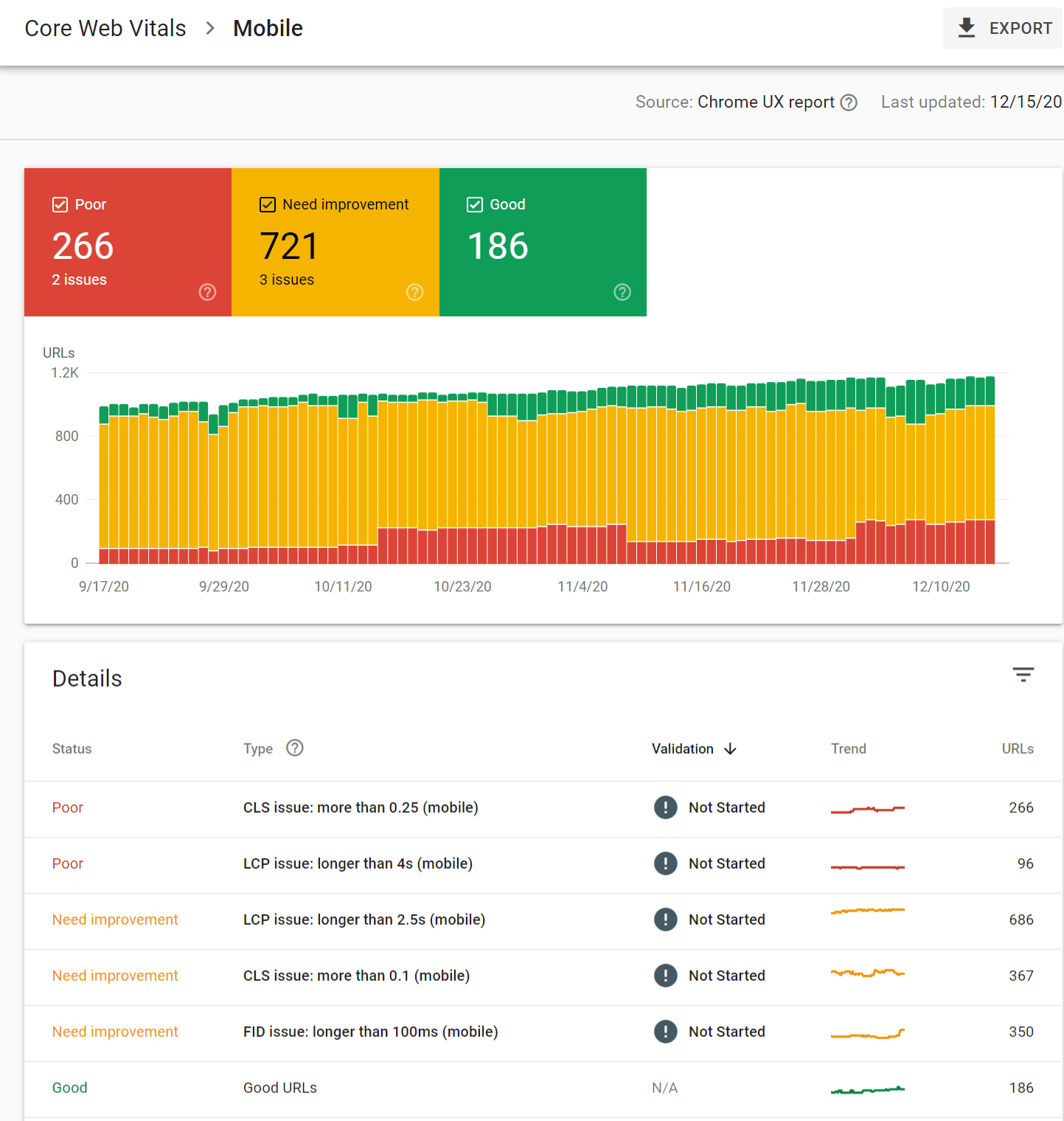
Google will measure your Core Web Vitals based on your mobile version. The best place to check this is in Google Search Console under “Enhancements” > “Core Web Vitals” > “Mobile”.
Pop-ups, interstitials, and ads
For this, you’ll need to visually check and make sure that you don’t have too many interstitials and that they don’t take up too much of the screen. Google has some guidelines for interstitials.
Mobile design best practices
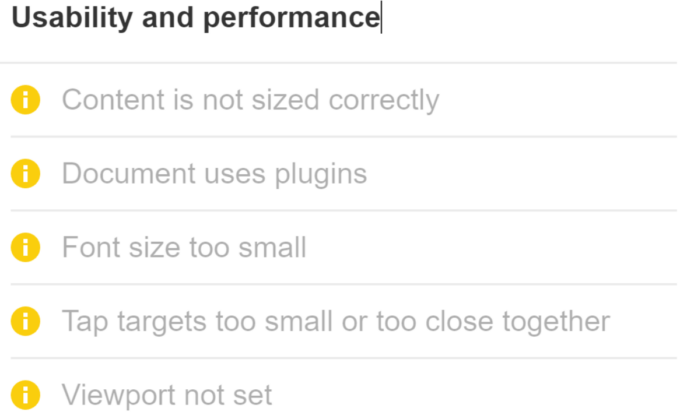
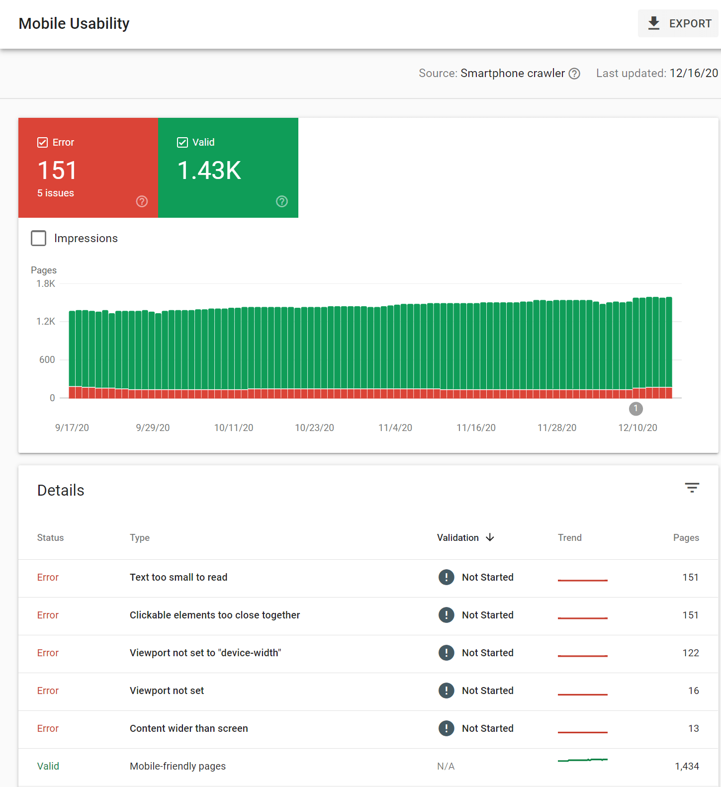
Text size, tap targets, padding, etc. You can get information on these from Google’s Mobile-Friendly Test or within Google Search Console under “Enhancements” > “Mobile Usability”.
Google has a helpful article with even more mobile-first indexing best practices that’s also worth checking out. It includes issues such as:
- Missing structured data
- noindex tag on pages
- Missing image
- Blocked image
- Low quality image
- Missing alt text
- Missing page title
- Missing meta description
- Mobile URL is an error page
- Mobile URL has anchor fragment
- Mobile page blocked by robots.txt
- Duplicate mobile page target
- Desktop site redirects to the mobile home page
- Page quality issues
- Video issues
- Hostload issues
Final thoughts
Mobile is the new normal and it’s here to stay, so check your site for any issues and make sure your site is optimized for mobile and SEO.


