And this is for one key reason: SEOs tend to want to add more content and links, and UX experts want to prioritize clicks to products.
However, there is a middle ground where we can retain the commercial nature of categories and include content to help users make their purchase decision.
Throughout this guide, I’ll show how to improve your e-commerce category pages for SEO while ensuring the user remains at the core of your decisions.
The importance of great categories cannot be understated.
They’re the site area where you’ll often capture “The Fat Head” and “The Chunky Middle” of search queries—the high-volume, less-specific queries that most bosses/clients want to rank for.
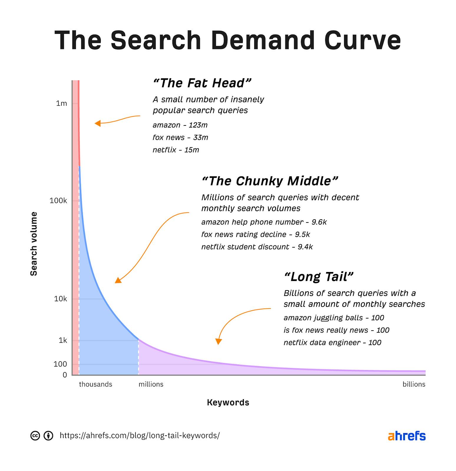
That’s not to say categories can’t target long-tail keywords. But unless you have a lot of SKUs, sites often target the long-tail with product pages.
In addition to categories being essential for capturing traffic from high-volume terms, they also help:
- Users discover your products when navigating your site.
- You effectively distribute PageRank to important subcategories and products via your internal linking.
- Users and search engines understand your information architecture (IA), i.e., how you’ve organized your content.
Before we move on with some tips, I’ll introduce the two types of category pages you’ll find on e-commerce stores:
- Category listing pages (CLP) – Categories that predominantly list categories.
- Product listing pages (PLP) – Categories that predominantly list products.
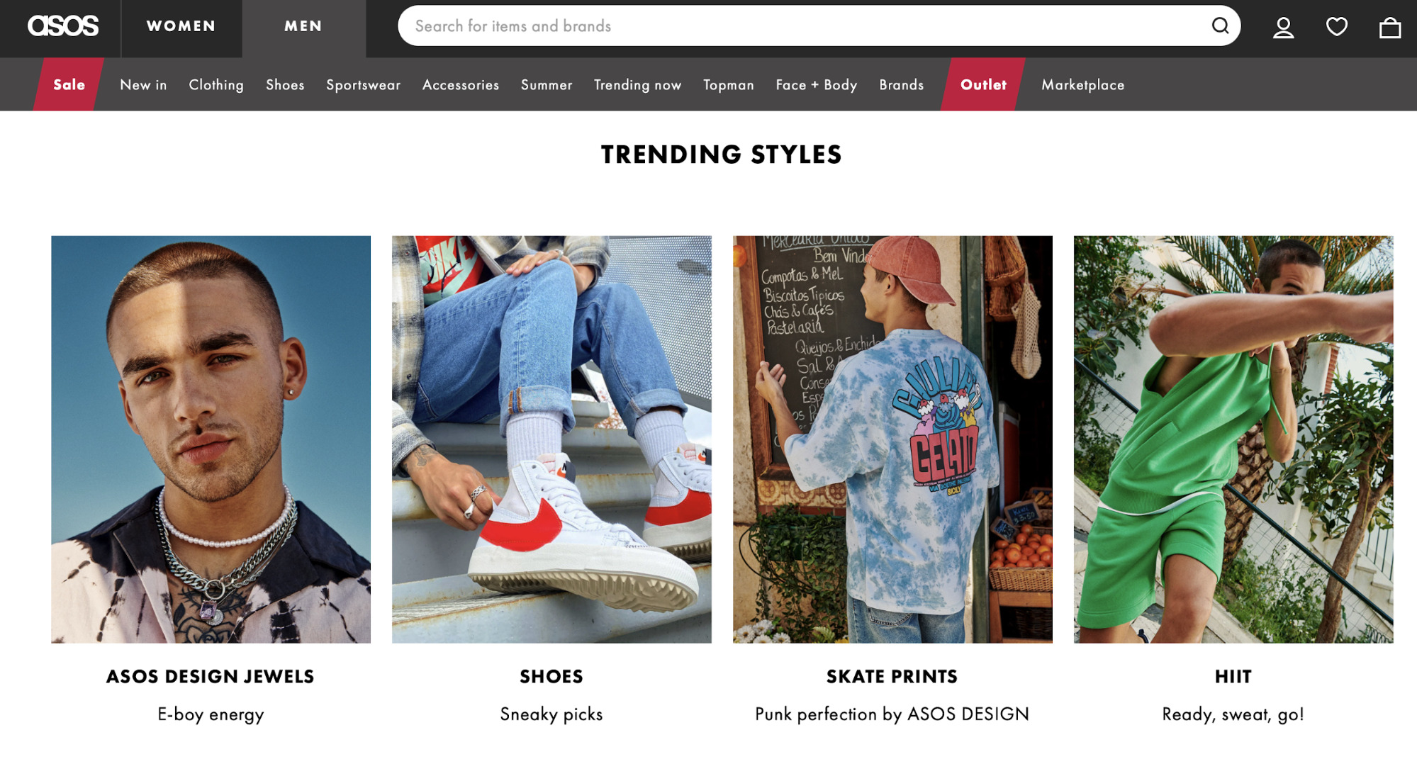
You’ll see CLPs across many popular e-commerce stores, and they’re often found in categories higher up within a site’s hierarchy.
For example, here is a CLP on ASOS:
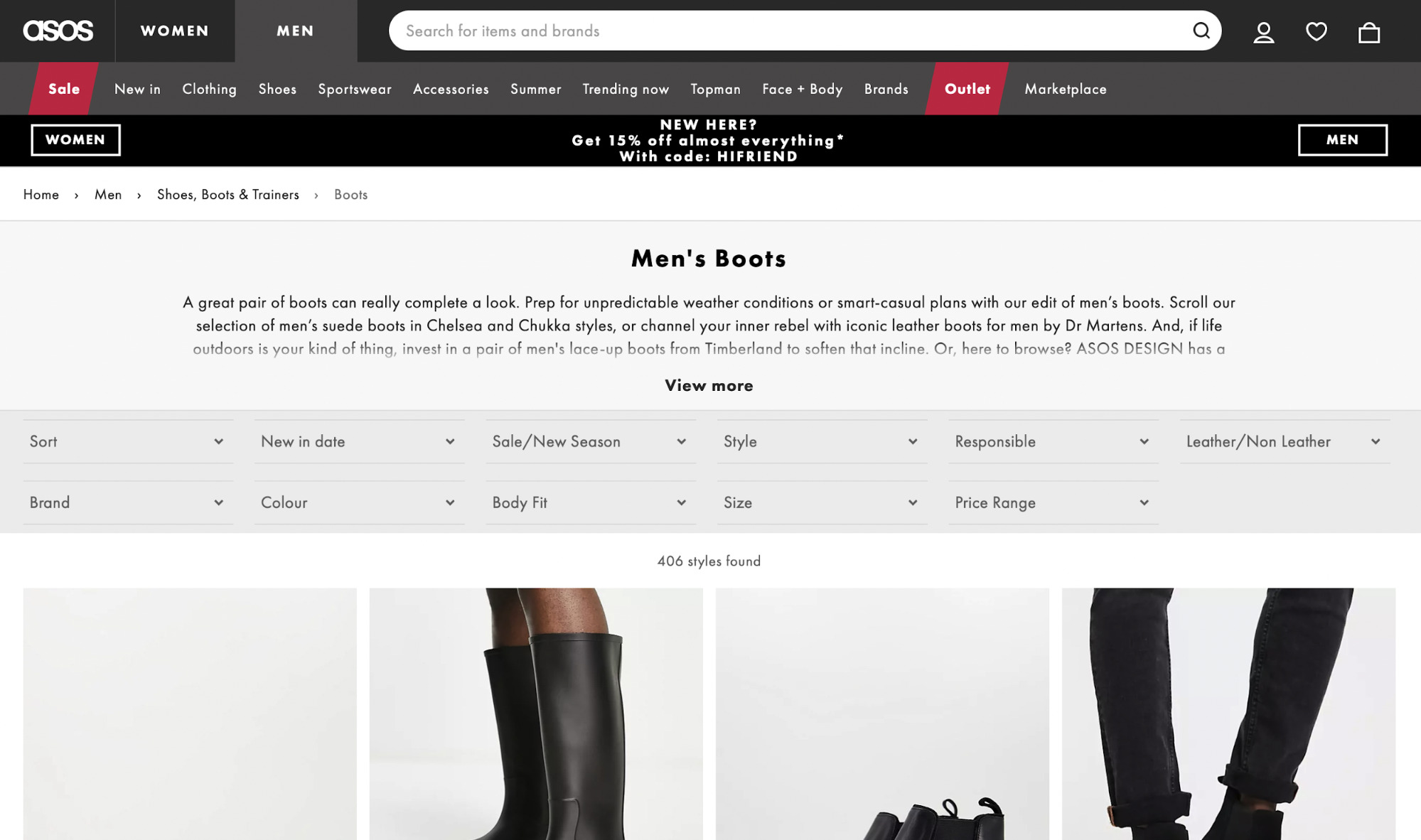
And here is ASOS’ PLP:
So why is understanding the difference between CLPs and PLPs significant?
CLPs target very broad topics. A site is unlikely to service the user’s requirements by displaying one product type. For example, on ASOS’ men’s clothing CLP, it doesn’t know the specific type of men’s clothing a user wants to see, so it links to a mixture of different types of products.
CLPs exist to help users navigate to a more specific page. Sites do this, as they won’t be sure specifically what the user wants yet—so they show them a selection of all relevant product types.
With PLPs, on the other hand, sites know what a user wants. If a user searches for “men’s black boots,” the intent is clear—so they show them black boots.
While we should still help users navigate to a more specific category (if possible), we know showing a list of black boots for them to purchase will fulfill their requirements.
Your typical category page is simple and looks like the PLPs I’ve just described. They’ll likely have:
- An H1.
- A section under the H1 with some intro copy.
- A list of products, likely with pagination.
- Faceted navigation to help users filter the products.
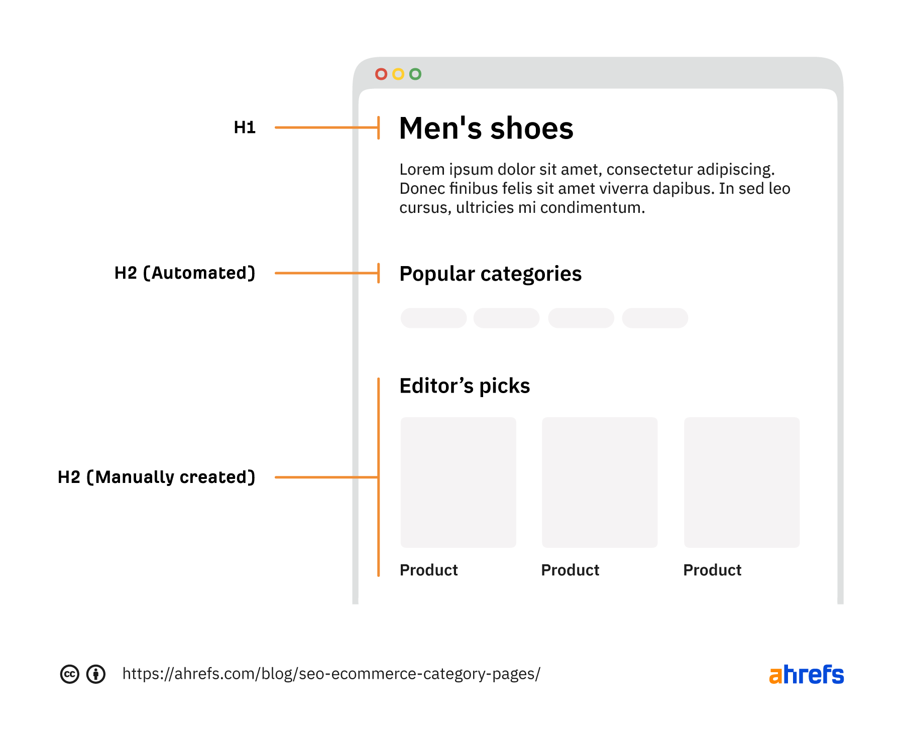
However, there are far more elements you can include to help users and SEO on both PLPs and CLPs.
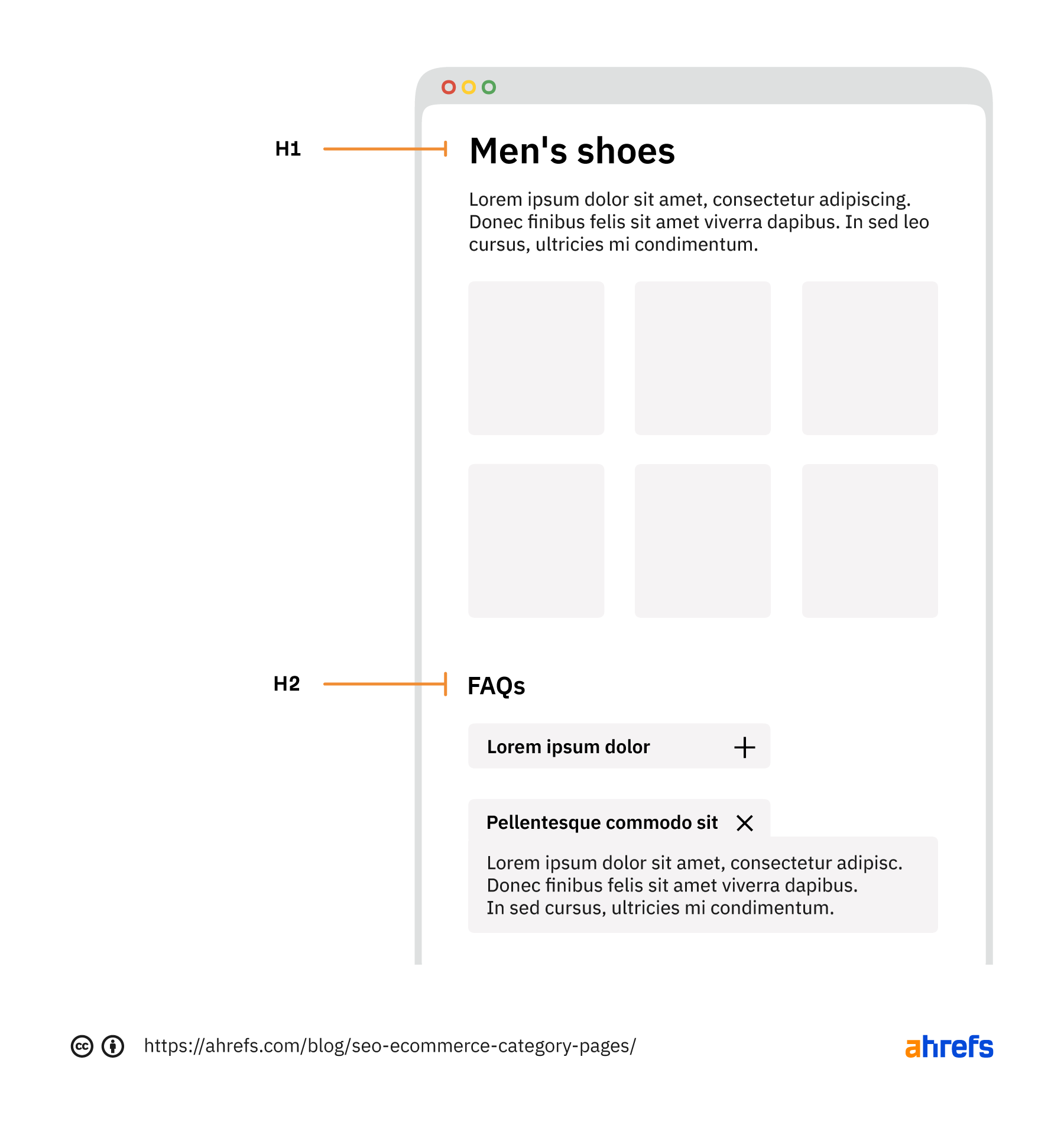
Here’s a mockup of the critical elements you should consider for both types of categories that both users and search engines will love.
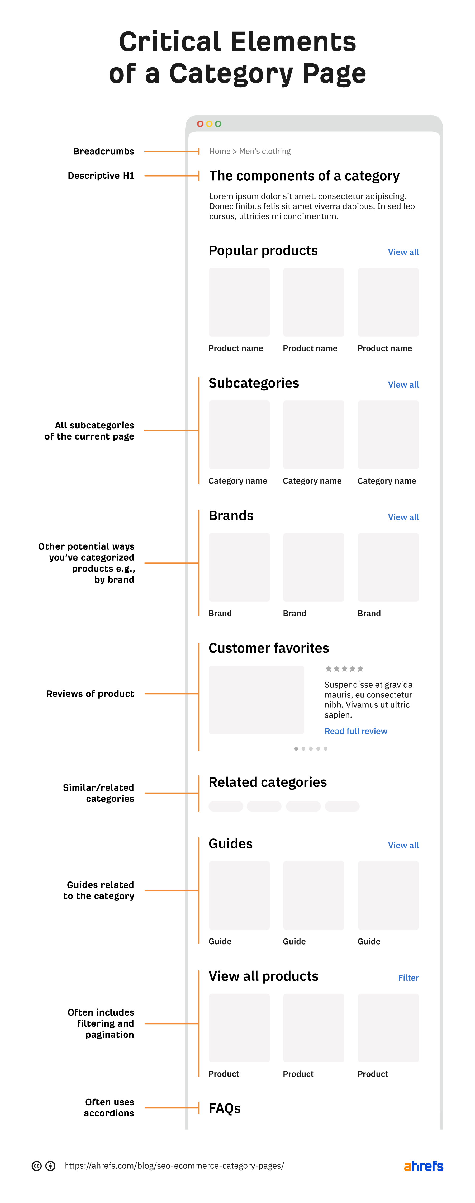
I’ll now expand on the above points throughout the rest of the article to help you improve your category pages.
In this scenario, helpful content will help the user make a purchasing decision.
If you have an “engagement ring” category, writing about the history of engagement rings isn’t helpful.
Valuable supplementary content in this scenario will be answering questions like:
- How have you sourced your diamonds/metals?
- Are your diamonds lab-grown or natural?
- Why did you select these? Metals available? What makes yours better?
- What’s the most popular style?
You can briefly answer key pain points below the H1, usually in around 30–60 words. But then you can also add further information lower down the page, either in a generic content block or an FAQ section.
Not only is this useful for a user, but it also helps you rank.
In an interview with Marie Haynes, Google Search Advocate John Mueller said:
When the ecommerce category pages don’t have any other content at all, other than links to the products, then it’s really hard for us to rank those pages.
Google needs some content to understand the page’s content, and users who don’t know your brand need something to help them decide whether you’re the best choice.
So we know valuable content helps. However, this is sometimes taken to the extreme, resulting in a large amount of content that nobody will read below the fold.
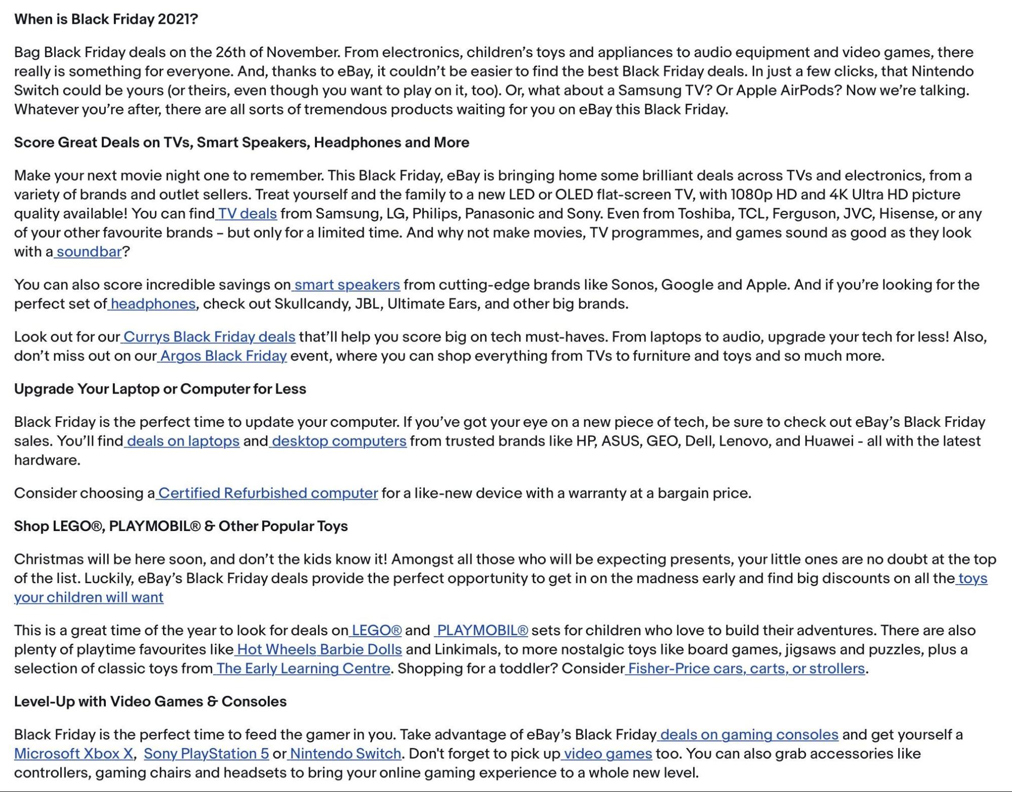
One of the worst offenders is eBay, with many pages including over 1,000 words of text placed at the bottom of the category.
In the same interview, John said this about that practice.
I’m not saying all of that text at the bottom of your page is bad, but maybe 90%, 95% of that text is unnecessary. But some amount of text is useful to have on a page so that we can understand what this page is about.
So it’s likely not helping. But is it harming? The answer is likely—yes.
Our algorithms sometimes get confused when they have a list of products on top and essentially a giant article on the bottom when our algorithms have to figure out the intent of this page.
Still not convinced about removing the content?
Here’s a case study.
At the end of June 2021, I finished a four-week rollout of new category page content.
I updated 191 pages with 70 words of content above the fold. Previously, up to 800 words were above the fold, hidden by a “read more” toggle.
Here’s the traffic for the following weeks (“A” marks the point the rollout finished):

Here are some snapshots of the ranking for key terms on the top traffic pages. Each of these moved from 800 words to around 70 words (they previously were instructed more content equals better, so they added more content to their top pages).
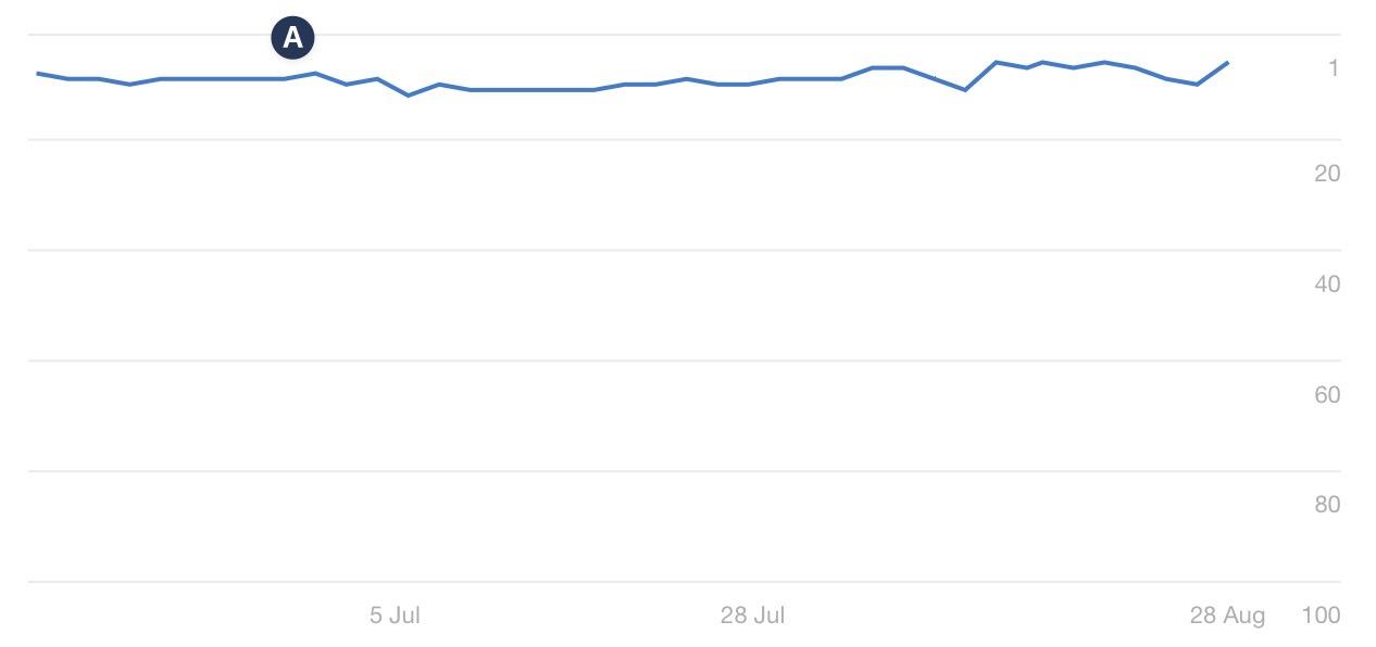
Here’s the fifth-largest, non-brand query:
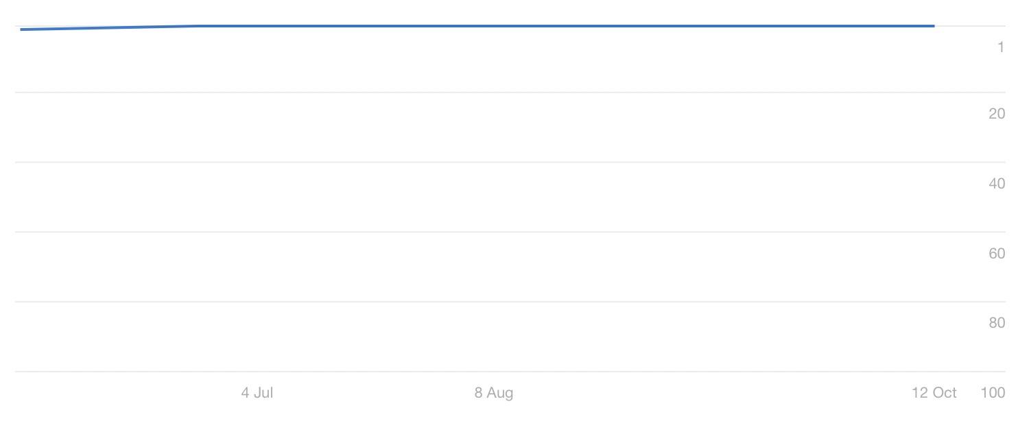
And here’s the sixth-largest, non-brand query:
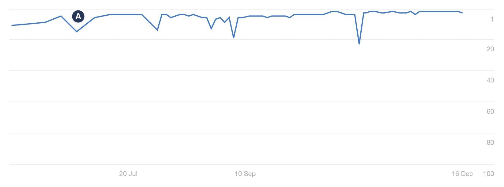
And the long-term impact?
The site has been steadily growing.
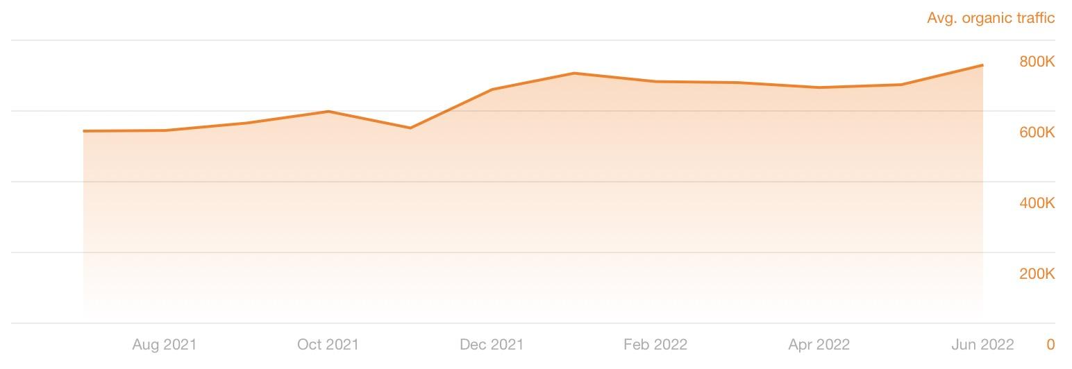
There is never one single reason for SEO growth—but this change certainly did no harm.
As always, do your own testing. But my experience and comments from John have shown that filler content on categories doesn’t help.
To summarize category content:
- Answer questions that help users make purchase decisions
- Answer questions succinctly
- Don’t stuff content
Most e-commerce solutions provide a way for you to set parent/child relationships between categories.
Here’s an example of that functionality for a WooCommerce product category:
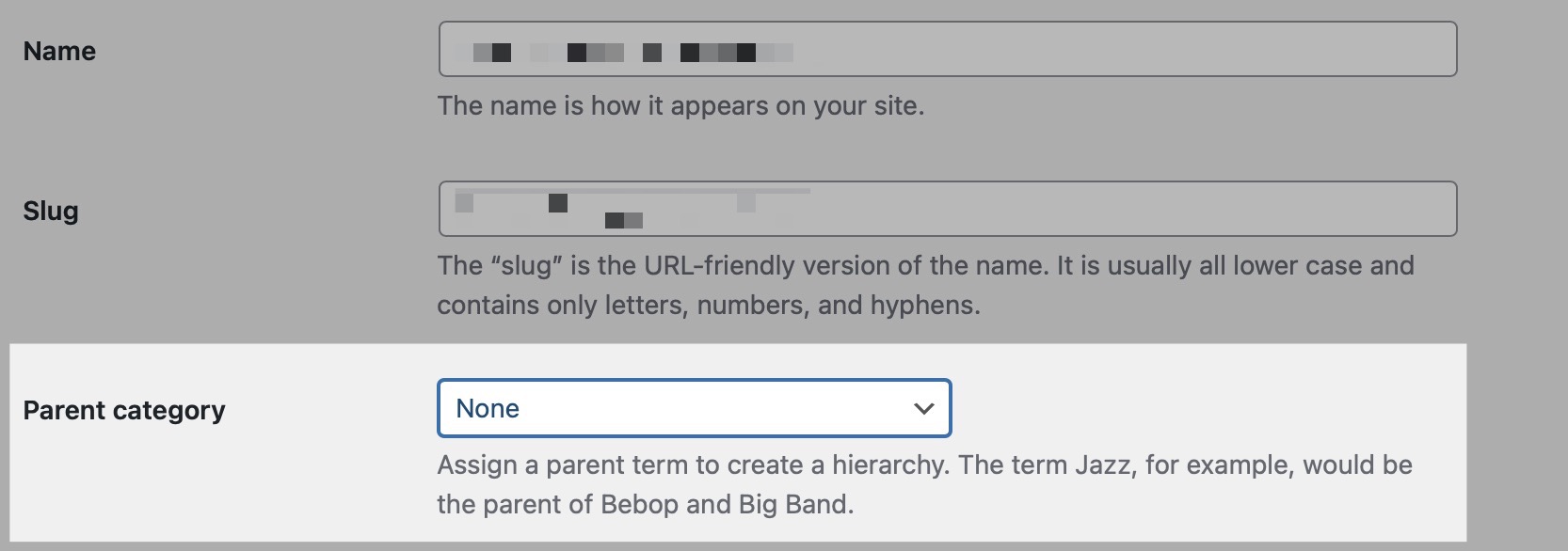
Organizing your categories into a logical hierarchy results in your site outputting breadcrumbs correctly; here is an example on my SEO Toolbelt resource:
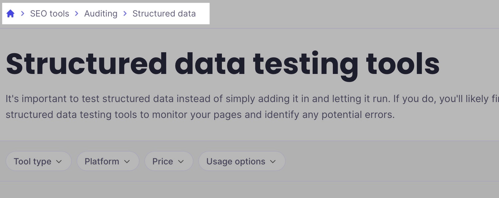
Breadcrumbs help users by indicating where they are on your site, and they aid SEO by distributing PageRank to the categories within the breadcrumbs.
We likes them. We treat them as normal links in e.g. PageRank computation
— Gary 鯨理/경리 Illyes (so official, trust me) (@methode) June 22, 2017
They also help Google, as it uses internal links to understand site structure.
We do use the internal links to better understand the structure of a page.
However, breadcrumbs are something a lot of UX professionals are reluctant to introduce, usually because they:
- Take up lots of room.
- Tend to be quite ugly.
- Promote users to navigate to categories rather than products where they’ll convert.
The good news is that breadcrumb placement doesn’t matter for SEO.
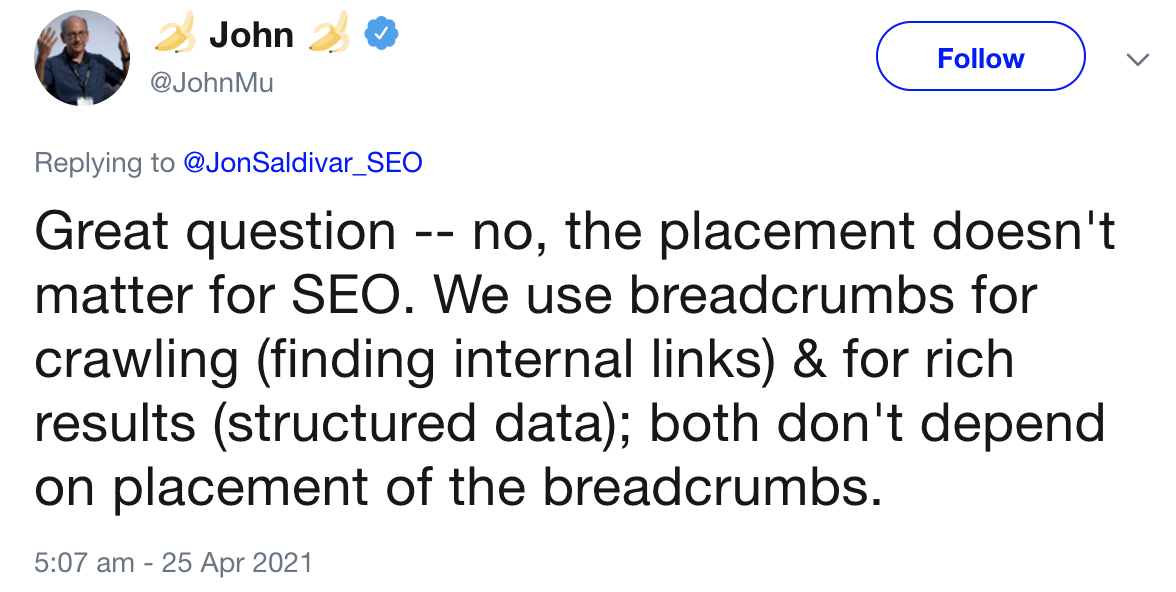
I’m always cautious about introducing breadcrumbs, as experience has shown UX experts are right. Whenever I’ve clients run an A/B test, breadcrumbs have negatively impacted conversion rates.
However, the workaround is simple: move breadcrumbs lower down the page.
On both CLP and PLP pages, you should ensure you’re linking to other relevant categories the user may find helpful. On e-commerce sites, I advocate for a mixture of automated internal linking and manually placed links.
Automate links to parent/child categories
For large e-commerce stores, without automation, managing links will be an admin nightmare.
Take GetYourGuide, for example. On its “things to do” on the U.S. page, it has a block of internal links lower down the page to different regions in the U.S.

If we head to Colorado, scroll down to the same area. Now, it displays cities.

Once you go to Boulder, you’ll see links to activity categories.

It most undoubtedly automates these links.
How? The site understands the parent/child relationship between categories. That’s how it can also display static breadcrumbs above the footer.

It’ll be dynamically querying a database for the child pages of the current page and then displaying those to users.
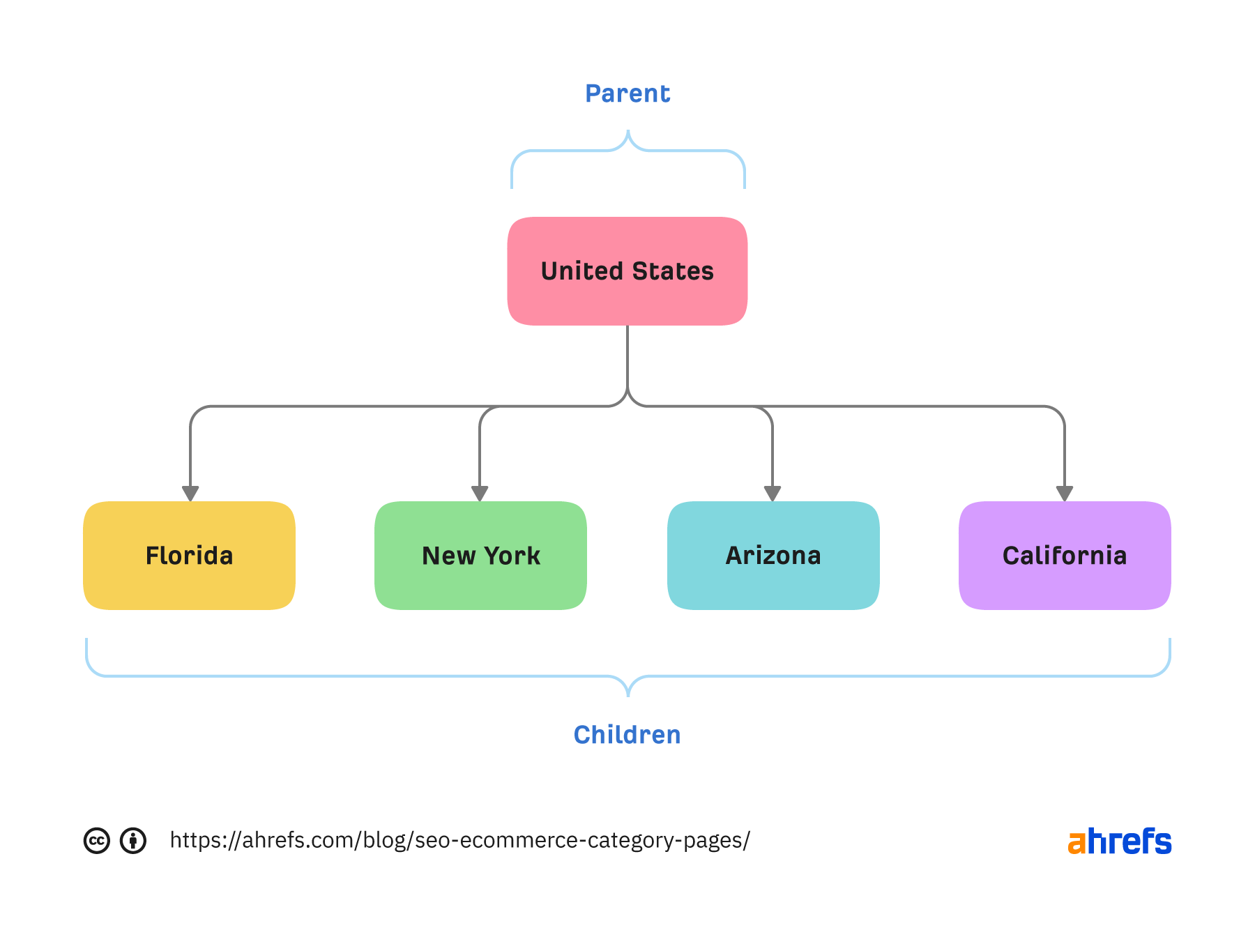
The reason why this is so useful is that:
- You know you won’t get orphan categories due to a human error.
- If you create a new subcategory and set the parent category, the parent category will link to the subcategory automatically.
- Your internal links will always indicate your site structure, e.g., Google will understand that Louisiana is a subcategory of the U.S. category, as you link to Louisiana on your U.S. page.
Another considerable benefit is that you’ll automatically create a pyramid site structure, where broader pages link to more specific ones.
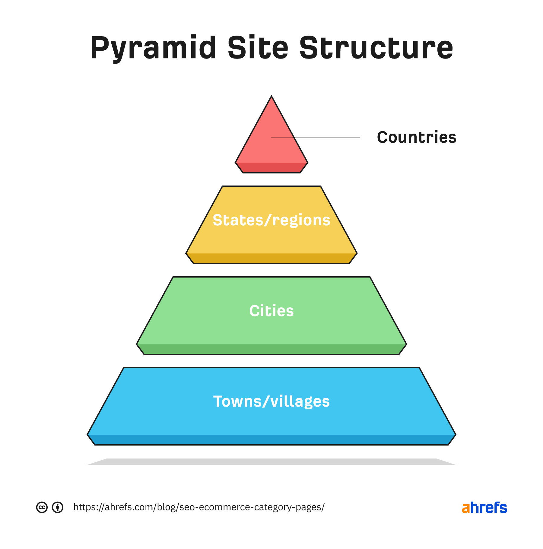
We know this helps Google understand site structure, as confirmed by John.
The top-down approach or pyramid structure helps us a lot more to understand the context of individual pages within the site.
Automate links to similar categories
Similar to the above, you’ll also want to link similar categories. You can automate this, but it doesn’t suit every site.
Back to the Boulder page on GetYourGuide, it also links to other popular cities.

For these links, it will be querying a database, getting the parent category of the current page, and then listing the parents’ child pages.
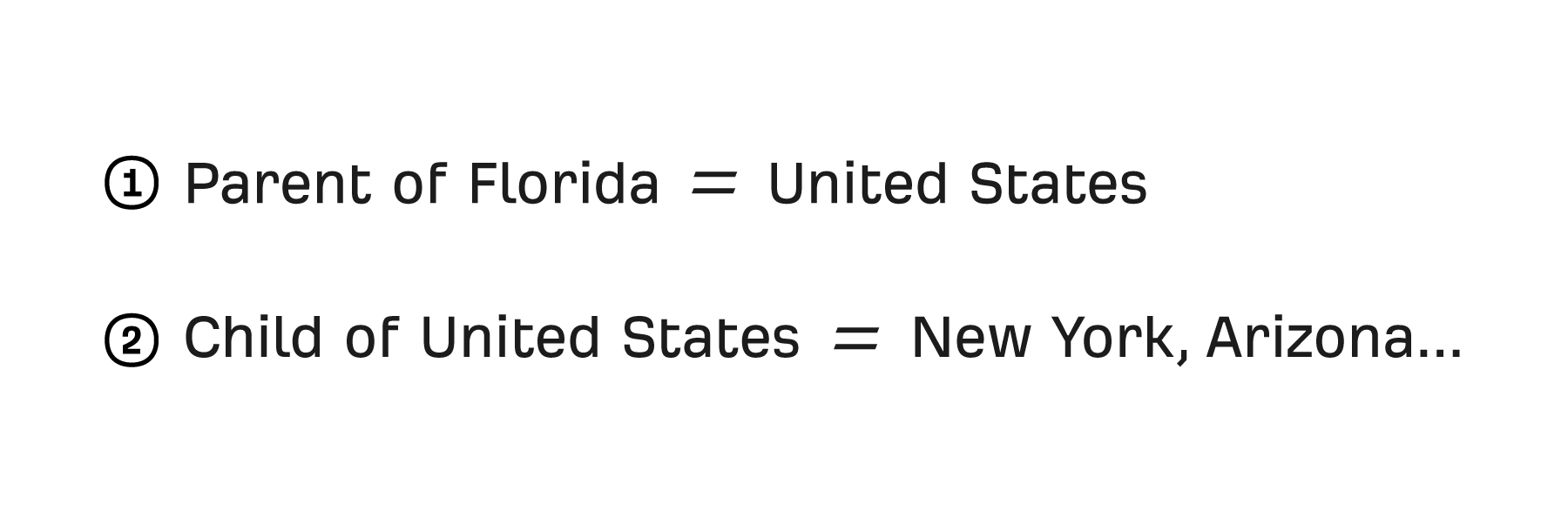
Subcategories of the parent are likely relevant to the current page, which will help users find other pertinent categories and help SEO by sharing PageRank between them.
Manually link popular categories
You’ll now have a good baseline for internal linking. But it’s also essential to take editorial control of links, especially on CLP pages.
Sometimes, you can have a high search opportunity page deep within the site hierarchy, so relying on parent categories linking to child categories can result in “high opportunity” categories being too deep.
Therefore, you must also ensure you manually add links to popular/important categories to pages closer to the homepage, such as your CLP pages.
A fundamental purpose of categories is to link to products, but there are a few nuances on how to do this best.
Link to popular products
For larger stores, prioritizing linking to popular products is often better than linking to all products with pagination.
Take Sports Direct in the U.K., for example. On its broad CLP pages, rather than linking lots of products, it includes links to only its best sellers.
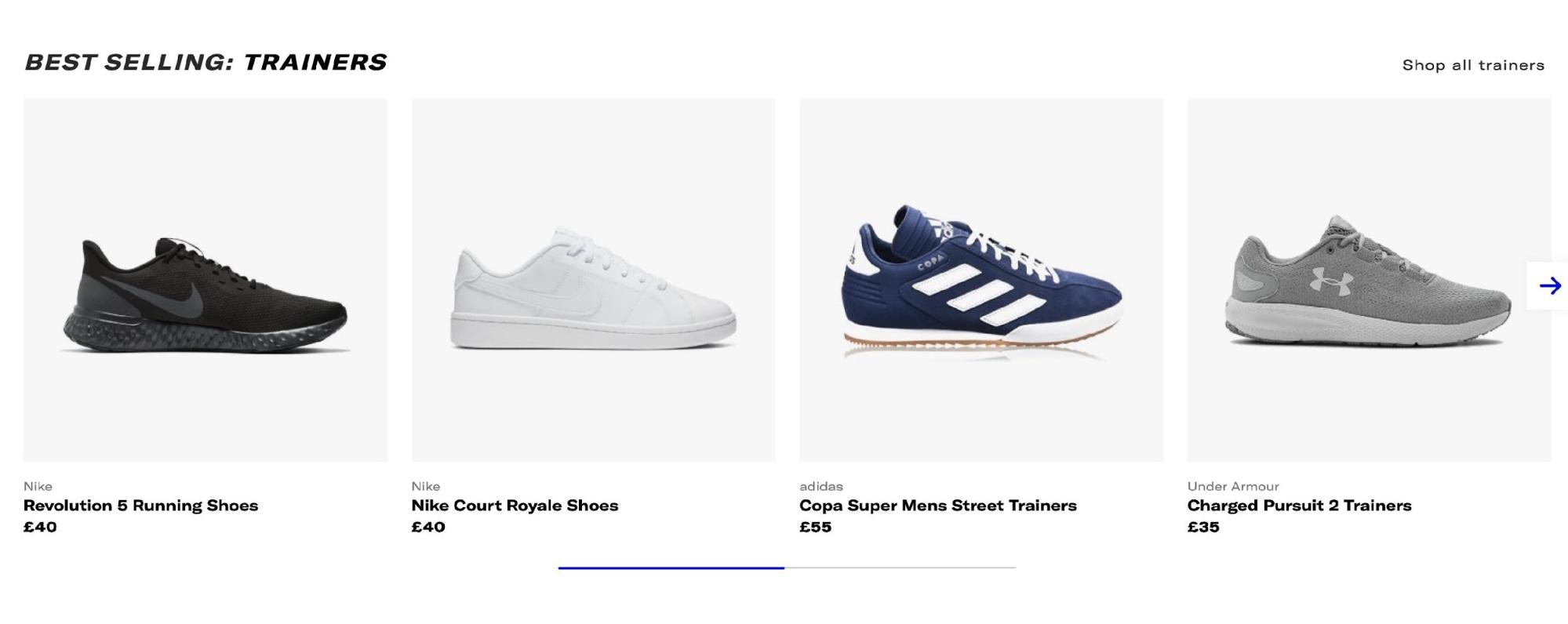
This is helpful for users and also consolidates PageRank into those URLs, improving how well they rank.
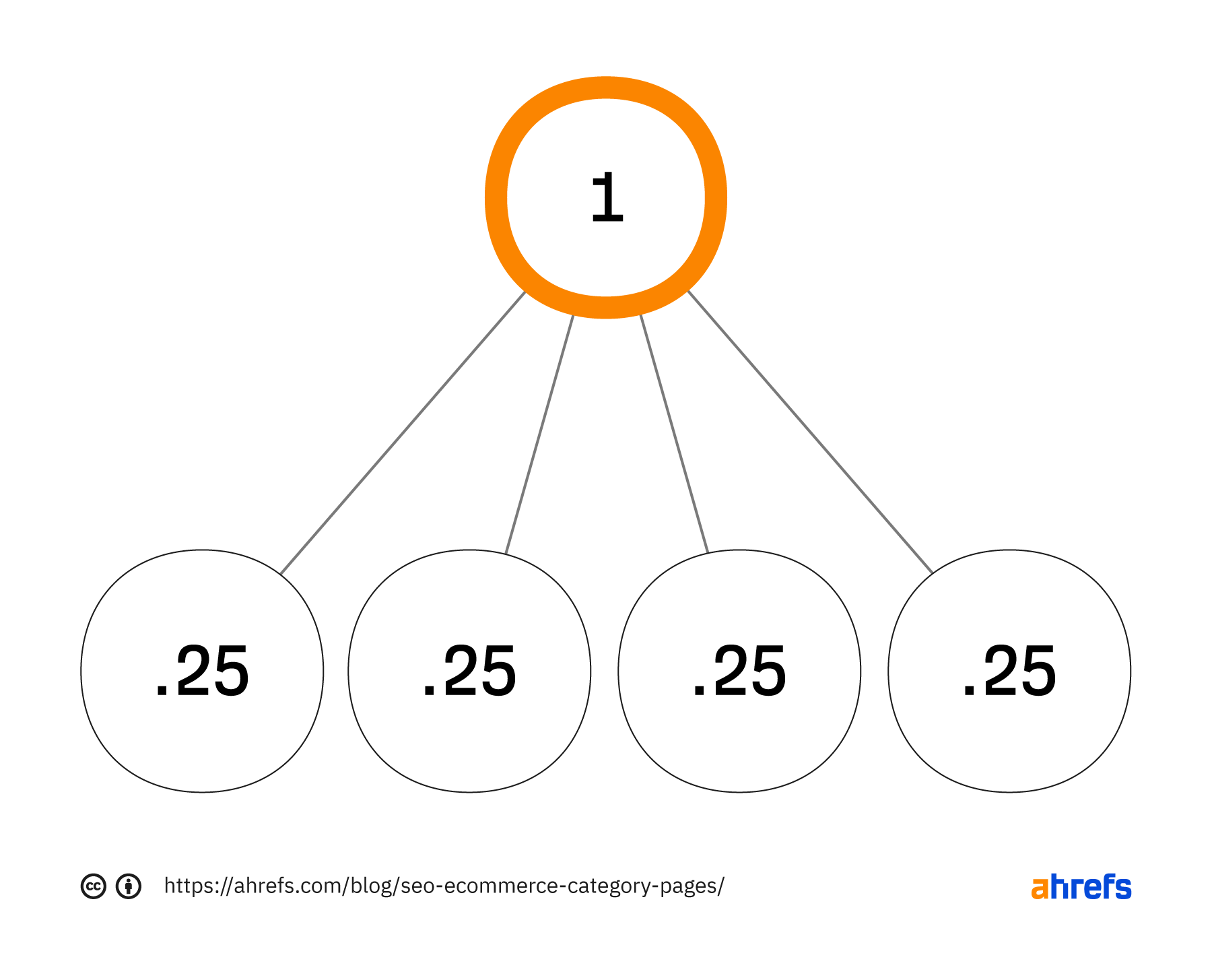
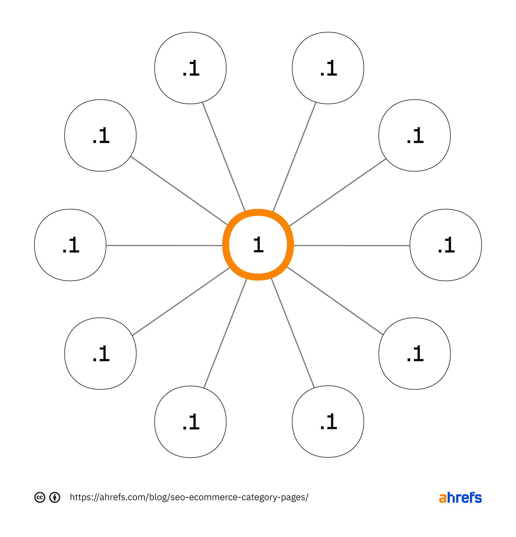
Doing this is a much better option than linking to more products (but ones that are less popular), which results in the popular traffic-driving products receiving less PageRank and ranking worse.
Consider view-all pages
While you should aim to link to popular products for pages higher up in your category hierarchy, as you get deeper into the site, users tend to want to see as many products as possible.
Often, the best way to achieve this is by using view-all pages, which is something Google found users prefer (albeit back in 2011).

The main caveat with a view-all page is that users want fast load times (as mentioned in Google’s view-all article), and Core Web Vitals can impact rankings.

If you’re going to implement view-all pages, consider that it will cause PageRank to be diluted between all the pages you link to from that category.
Don’t go overboard with pagination
You don’t need to show all your products within your pagination.
Instead, link to more specific variants of the current category, especially if you can match that to search demand (more on that shortly).
For example, on ASOS, its “women’s dresses” category has 176 pagination component pages.
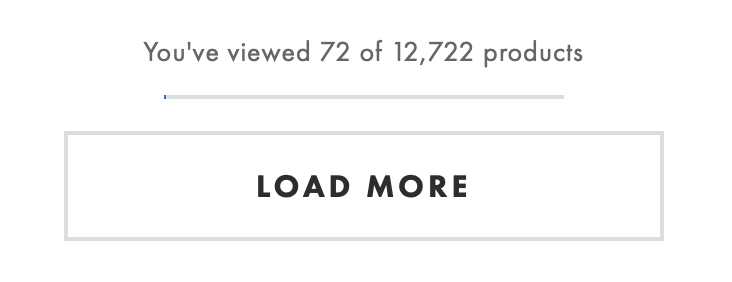
Every time it links to a “women’s dress” component page, it dilutes PageRank. This effectively causes ASOS to lose some PageRank to deep component pages that are very unlikely to rank.
Rather than linking to 176 component URLs, it could limit the pagination and consolidate PageRank into other more specific categories by linking to them instead.
Generally, this will also be beneficial for UX.
If a user reaches page #20 of your pagination, you likely need to help them refine what they’re looking for—maybe by linking to “women’s dress” categories by type or color—as suggested by John.
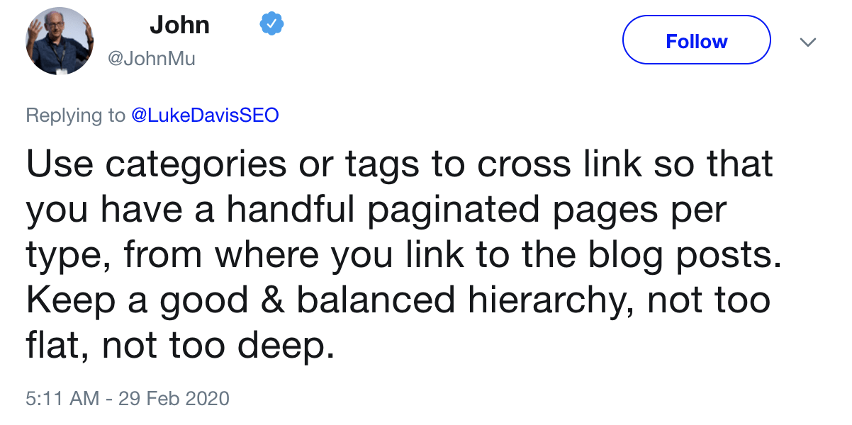
When creating your pagination strategy, you should consider whether sequential linking like ASOS or linking to multiple component pages is the better choice.
Sequential linking causes the first set of component pages to have stronger signals, which will result in the product pages they link to also having stronger signals, as confirmed by John.
If you link sequentially, what will generally happen is the first page of your site will have a lot stronger signals in the sense that your main content links to the first page, and then it kind of like incrementally drops and drops and drops as it goes through the pagination set.
Therefore, if you want ranking signals to be spread across all products in a category, link to more component pages. If you want to consolidate signals into products earlier within pagination, link to fewer.
Aren’t sure which approach you should take? Do some testing!
A well-known tactic to improve your categories is to create long-tail, more specific variations of broader categories.
Here’s my favorite way of doing that using Ahrefs’ Keywords Explorer.
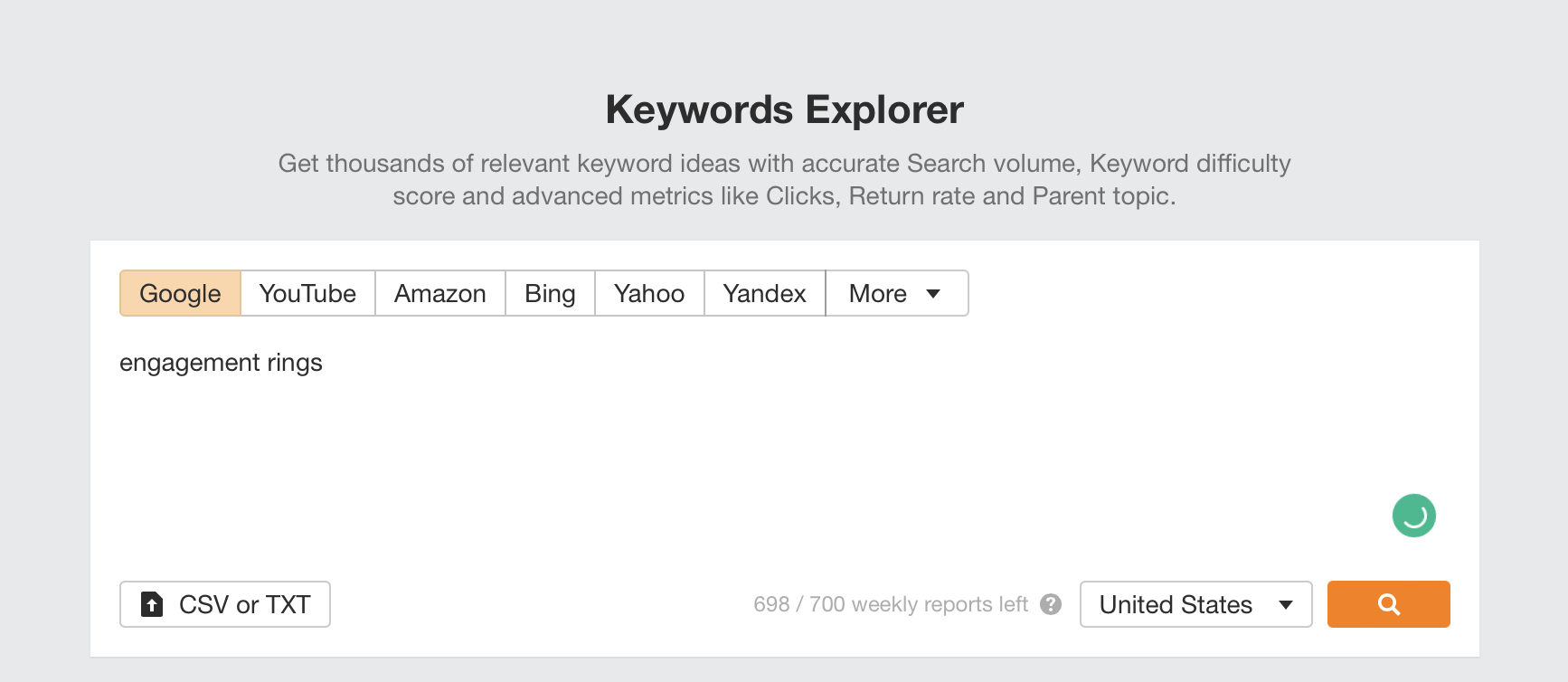
First, enter the query a broader category is targeting, e.g., “engagement rings,” and search for it in the tool.
Next, head to the Matching terms report.
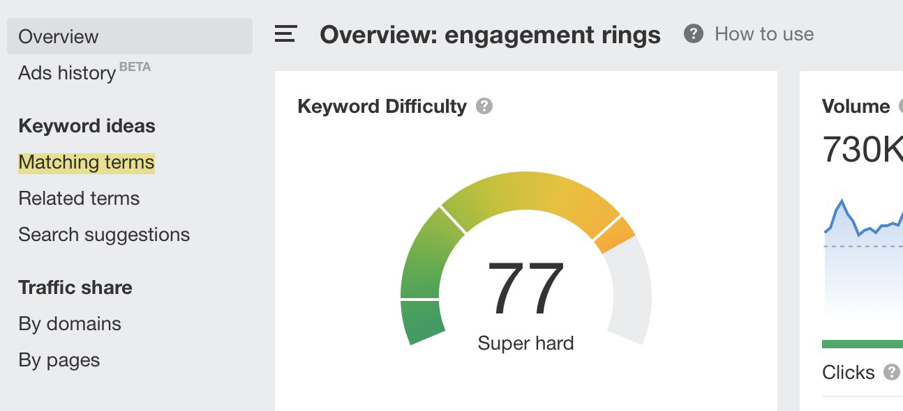
In the second left sidebar that now appears, click “Parent Topics.” This will group keywords with similar search results into the highest volume keyword.
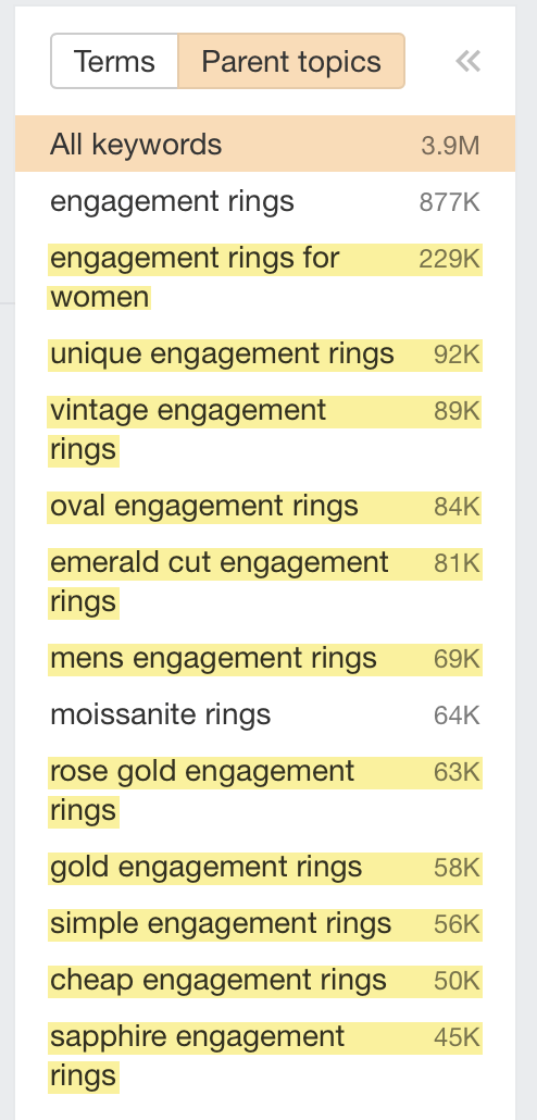
We’ve now discovered many long-tail variants of our “engagement rings” pages that we can create on our site.
By creating pages targeting these queries and better covering the topic area of “engagement rings,” we’ll rank better for broad queries within that topic.
SEOs often refer to this as “topic expertise”—and we did not make this up.
John confirmed it’s part of Google’s algorithms.
It’s something where if we can recognize that this website is really good for this broader topic area, then if someone is searching for that broader topic area, we can try to show that website as well. We don’t have to purely focus on individual pages, but we’ll say oh, like, it looks like you’re looking for a new laptop like this website has a lot of information on various facets around laptops.
Want to know more? Read Ahrefs CMO Tim Soulo’s guide on the long-tail keyword strategy.
A critical element that can go wrong on category pages is how you deal with faceted navigation (often referred to as “filters”).
Here’s an example of one on the Nike store:
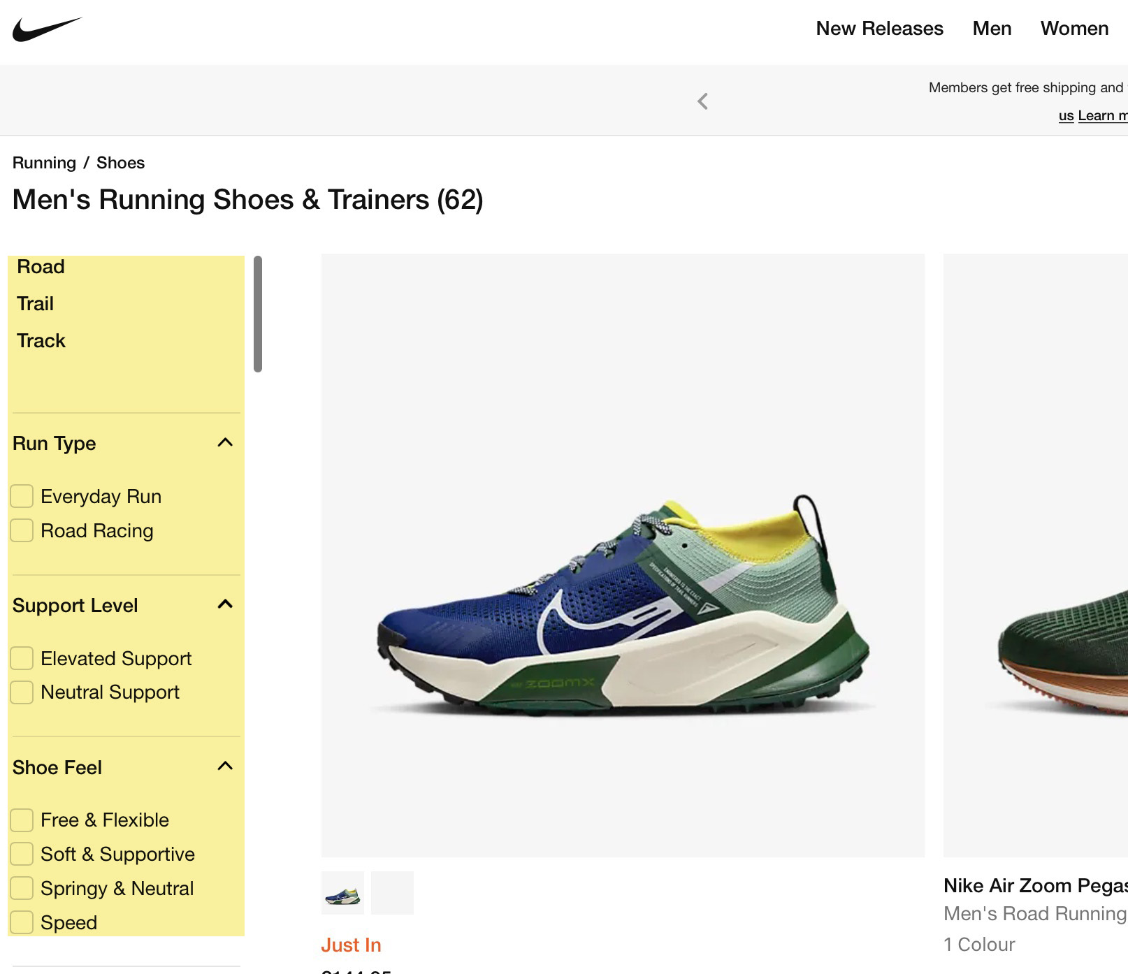
I recommend reading my faceted navigation guide for all the details, but the primary SEO considerations are to:
- Restrict crawling – Do ensure you prevent Google from crawling all facet links (as there can be millions of potential combinations, wasting your crawl budget).
- Prevent indexing of low-value facets – If you don’t, Google can index hundreds of thousands to millions of essentially duplicate pages that aren’t useful for search.
If you’re going for an ideal implementation, you’re going to want to:
- Apply facets client-side with AJAX, and don’t include
<a href>links. - Provide alternate crawl paths to important facets you want to be indexed.
This topic is undoubtedly a technical one—and one you’ll want to get right. So I recommend you read my guide so you don’t just prevent SEO issues with facets but take advantage of the benefits.
Data from Reevoo suggests positive reviews result in an 18% uplift in revenue on average—so they’re pretty important.
Many sites restrict reviews to product pages, but they’re also great to include in categories.
Fanatical is a great example, an e-commerce store selling Steam Keys for PC games.

It includes recommendations from other gamers throughout its categories.
This adds unique content to categories and helps users find well-reviewed games. Crucially, well-reviewed games (which are more likely to convert) get more PageRank and rank better.
As mentioned, one element often missed in categories is that you should provide content to help users make a purchasing decision.
While adding written content to the page helps, it isn’t meant to be overly detailed. This is why you should also link to in-depth guides.
Take Sephora, for example. Its CLPs have links to guides to help users decide on a product.
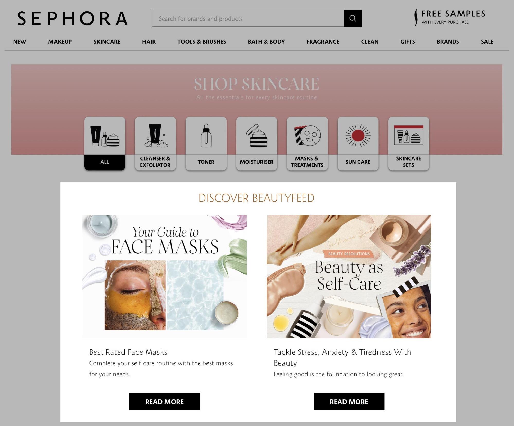
For SEO, this also helps the blog posts rank, as they’ll receive more PageRank. Also, it helps Google better understand your topic expertise, as you have lots of interlinked content.
There is plenty of advice on URL structure already available, but the main element to consider is to pick a format you won’t need to change.
John stated that URLs are identifiers for content.
For the most part, we treat URLs as identifiers of content.
Changing URLs (and redirecting them) is often deemed risky activity—you can’t be sure how long it’ll take Google to consolidate signals into the new URL.
Therefore, it’s best not to change URLs unless you have a good reason (like you’re rebranding).
Preventing URL changes for categories comes down to keeping them simple and pre-planning.
For example, you may tell your developers to structure URLs based on the parent/child relationships between categories:
www.example.com/mens/www.example.com/mens/trainers/www.example.com/mens/trainers/white/
But what happens if you change your site hierarchy?
Say the business starts selling boots. You’ll likely want to introduce a “Shoes” category into the hierarchy as the parent of the “Trainers” page and the new “Boots” page.
Your URLs will now change to be:
www.example.com/mens/www.example.com/mens/shoes/www.example.com/mens/shoes/trainers/www.example.com/mens/shoes/trainers/white/www.example.com/mens/shoes/boots/
We’ve now just caused redirects for the “Trainer” URL and any subcategories it had.
Herein lies the issues with hierarchical structured URLs.
But what’s the solution?
Keep them as simple as possible to reduce the need for changes.
Here’s an example: If for the “white trainers” URL above, we instruct developers to take the very top-level category (which is less likely to change) and then include the last category, the URL will be this: www.example.com/mens/white-trainers/
Now, if any of the parent categories of the white trainer’s category change, it won’t impact the URL but will still affect the breadcrumbs.
But wouldn’t it be better to remove the structure and have a flat URL like this: www.example.com/mens-white-trainers/?
My personal experience here is that structured URLs impact rankings, despite what Google said on the topic.
Here’s a recent example:
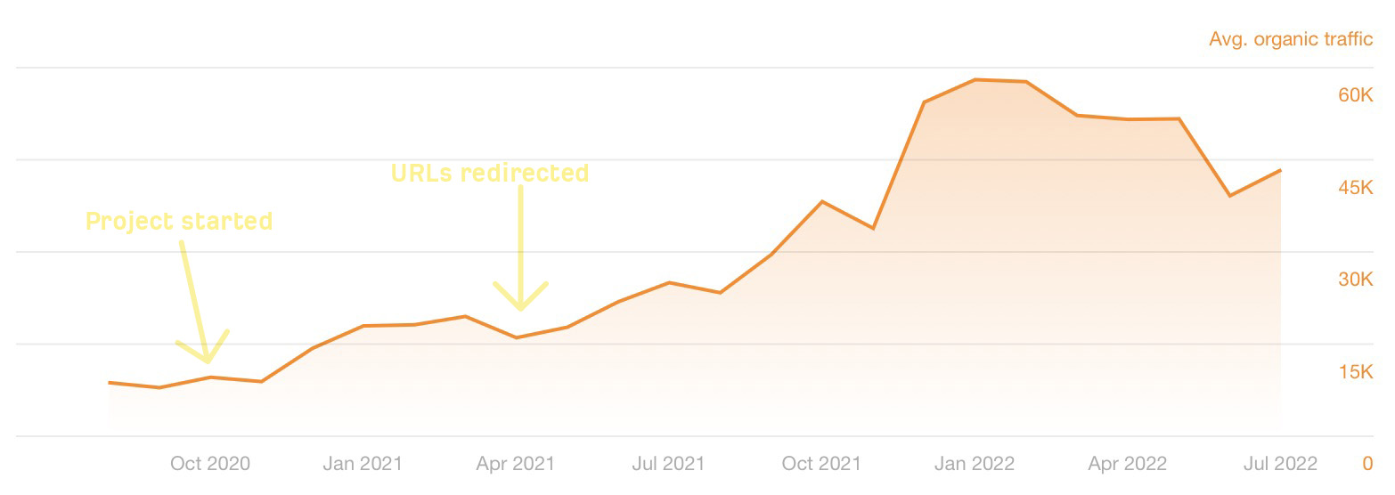
This uplift only impacted the changed URLs. We altered nothing else but saw an immediate impact.
Test this yourself. But also, as I’ve mentioned, changing URLs is risky.
Thankfully, for my above example, we didn’t need to change too many URLs, and the revenue risk to the business wasn’t significant vs. the reward I’d had doing this for other clients.
I’m not writing a keyword research article, and you need to start there before you decide on H1s and title tags. But the advice here is that you should use H1s and title tags on your site that match the language users use to find your product.
For both H1s and title tags, you should test and learn what works best for your site. But there are some general guides and things you can try out.
Use templates
Generally, you will want to have a templated title tag structure that closely matches your H1.
Why?
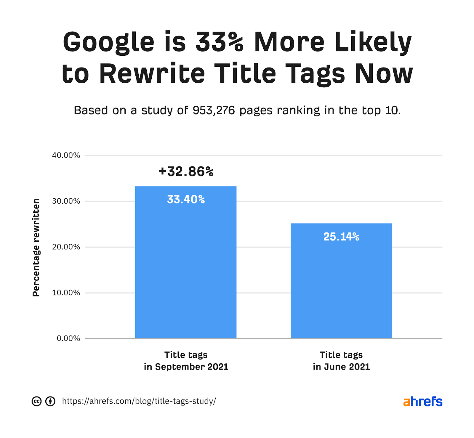
Ahrefs data shows Google will rewrite your title tag in 33.4% of cases after changing how it created page titles in August 2021.
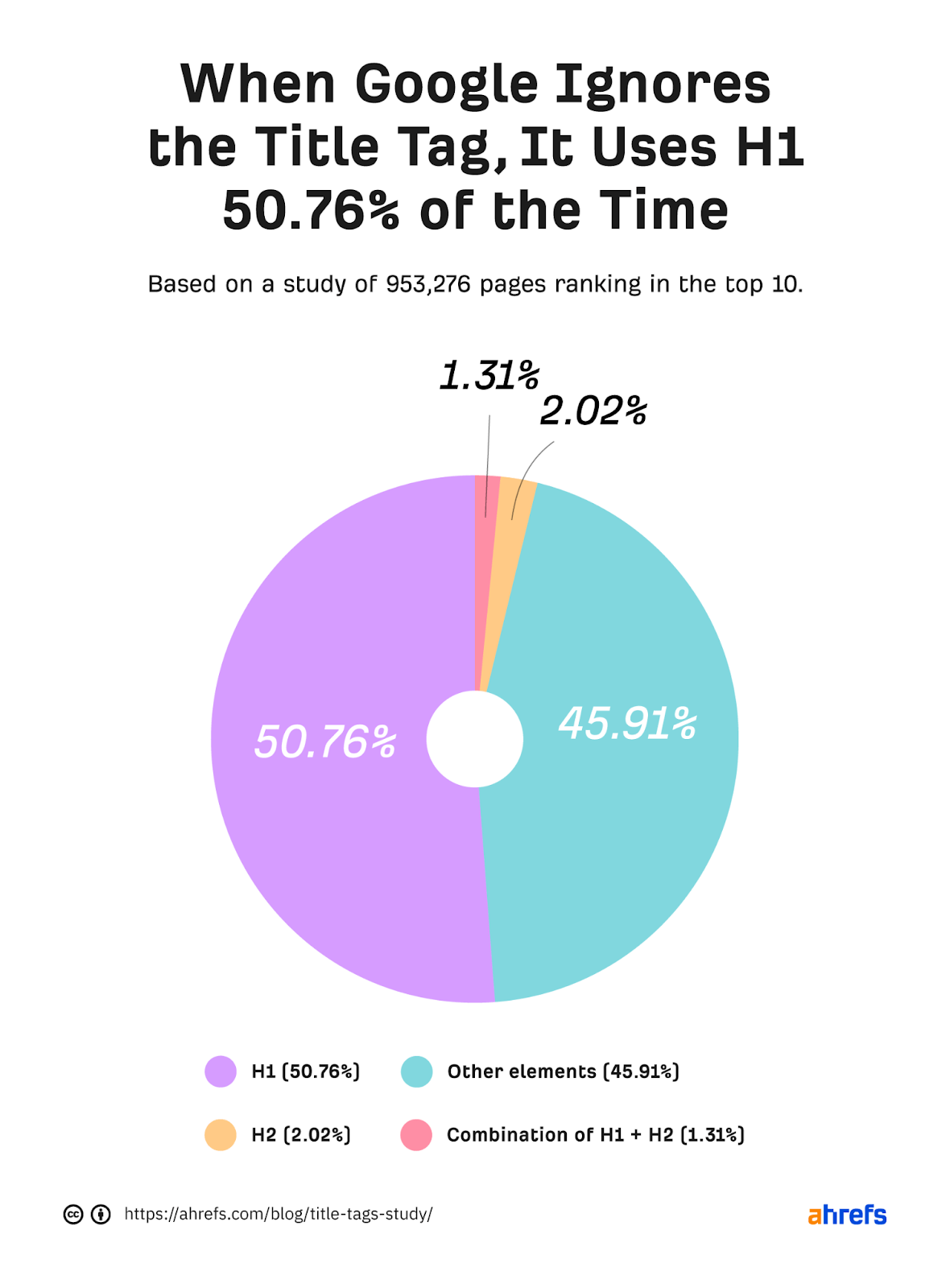
When Google rewrites your title tag, Ahrefs data shows Google will change it to your H1 tag 50.76% of the time.
The best way to ensure you have a title tag that Google won’t rewrite is by templating it so it is generated based on your page’s H1.
Here’s an example: [Page H1] - [Brand Name].
You may want to add some variety to the page title, but what works best comes down to testing.
Test, test, test
There are many different tests you can run to see what works best for you; here are some examples:
- Use dashes (-) over pipes (|)
- Include a price – [Page H1] starting from X - [Brand name]
- Add “Buy” at the start of your title tag – Buy [Page H1] - [Brand name]
- Add secondary keywords – [Page H1] - [Secondary Keyword] - [Brand Name]
You’ll also want to consider how templates may vary by length. Google is 57% more likely to rewrite titles over 600 px.
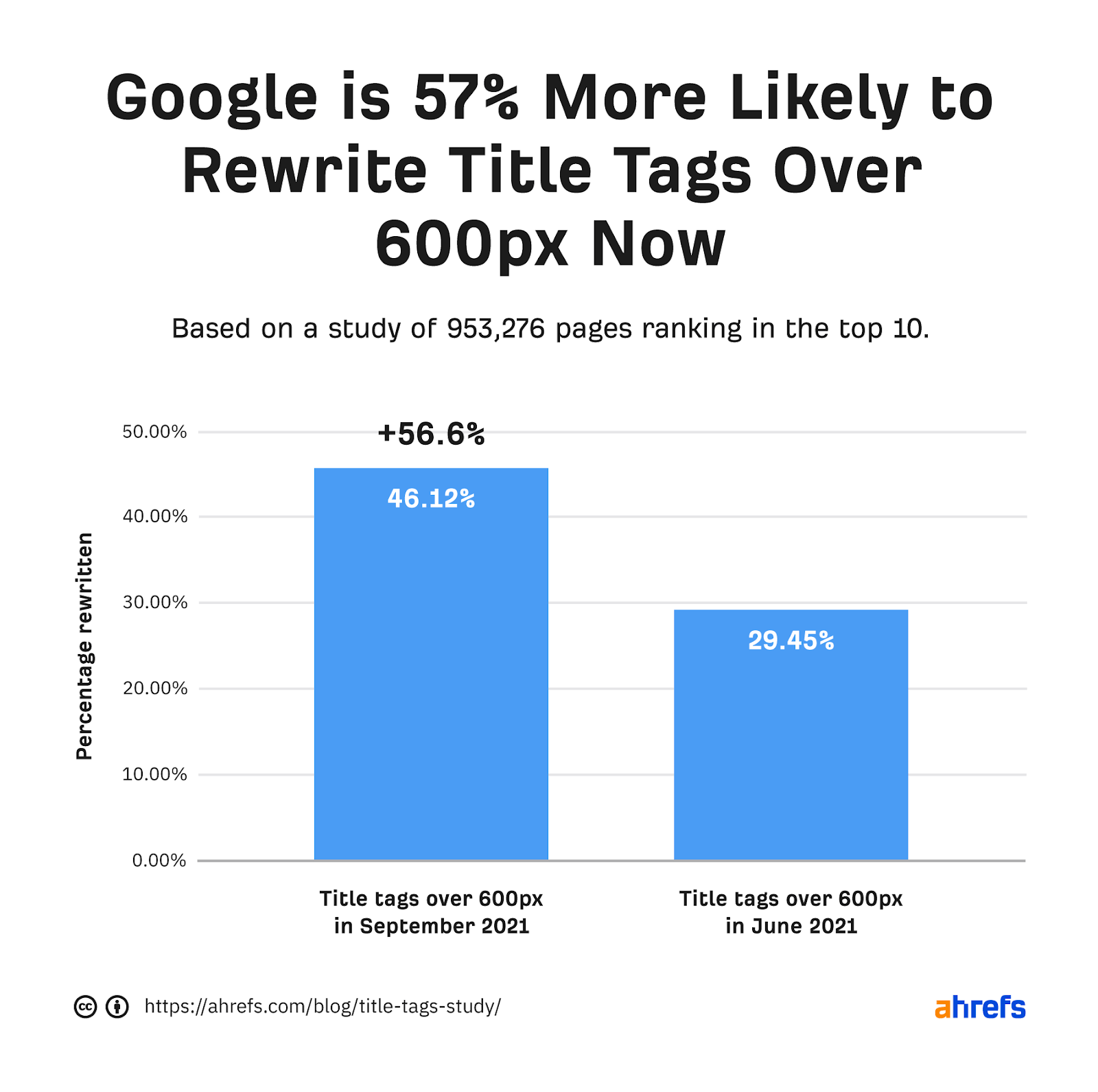
According to Google, long titles are also a reason why it’ll rewrite the ones you add to your pages.

I’ve tackled this before by individually customizing a template for a long category name or using different templates—depending on the length of the generated title tag.
You can add multiple structured data types to your category pages to help Google better understand your content and acquire rich results.
The main applicable types Google recommends in its search gallery are:
Adding these will directly impact your SERP snippet.
For FAQs, it enhances them by displaying the FAQs on the SERPs, which is the strategy Trip Advisor takes.

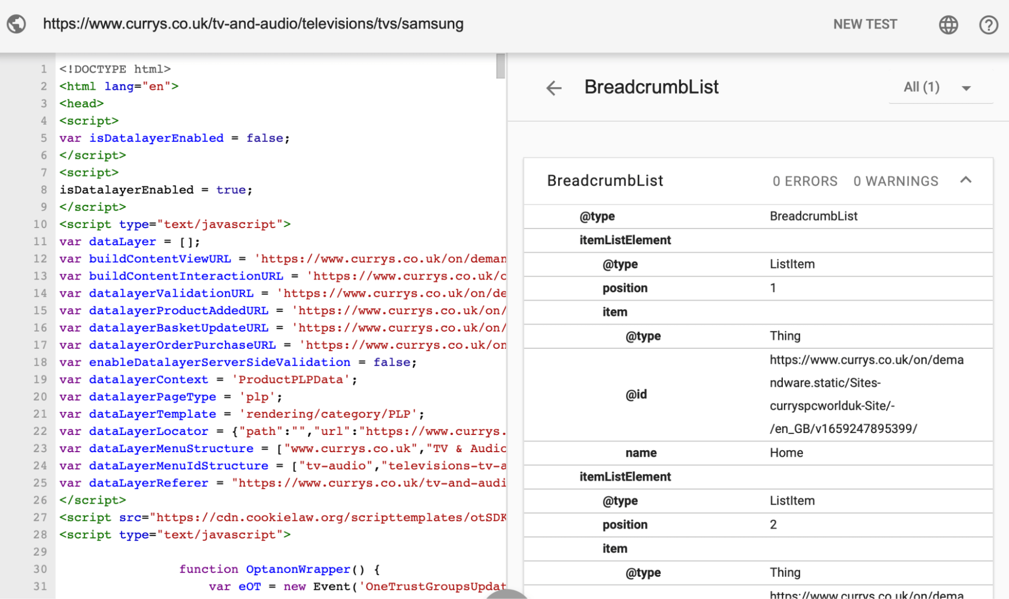
For breadcrumb structured data, Google shows the breadcrumbs on the SERPs. Here’s an example of Google doing that for Currys in the U.K.

You can see the structured data it’s added in the Schema Markup validator:
Outside of those two types, Google has no recommendations for product category structured data.
But you don’t have to stop there.
On a “Search Off the Record” podcast, Ryan Levering (staff software engineer working on structured data at Google) answered whether structured data beyond what Google recommends is valuable (like what you can find on schema.org).
So it’s hard to convey that in some of our reporting and stuff that we actually find this [structured data] useful because it’s a nuanced calculation.
But when there is problems detecting it [what the page’s content is about], we can use it as an extra signal.
So it’s usually on the edge cases where we find that stuff useful.
While adding further structured data should be a secondary focus, I tend to take the approach of leaving as little for Google to figure out as possible.
The two main additional things I’d consider adding are:
- CollectionPage – This is a more specific type than the generic WebPage.
- ItemList – It informs Google there is a list of items on the page.
In addition, you can also add mainEntity to CollectionPage and add the ItemList within that. By doing this, you tell Google the main part of the page is the list of products, helping it better understand that this is a category page.
Here’s a simple example of what that can look like:
{
"@context": "http://schema.org",
"@type": "CollectionPage",
"mainEntity": {
"@type": "ItemList",
"numberOfItems": "[number of products]",
"itemListElement": [
{
"@type": "ListItem",
"position": 1,
"url": "[Item URL]",
"name": "[Item Name]"
},
{
"@type": "ListItem",
"position": 2,
"url": "[Item URL]",
"name": "[Item Name]"
},
{
"@type": "ListItem",
"position": 3,
"url": "[Item URL]",
"name": "[Item Name]"
}
]
}
}
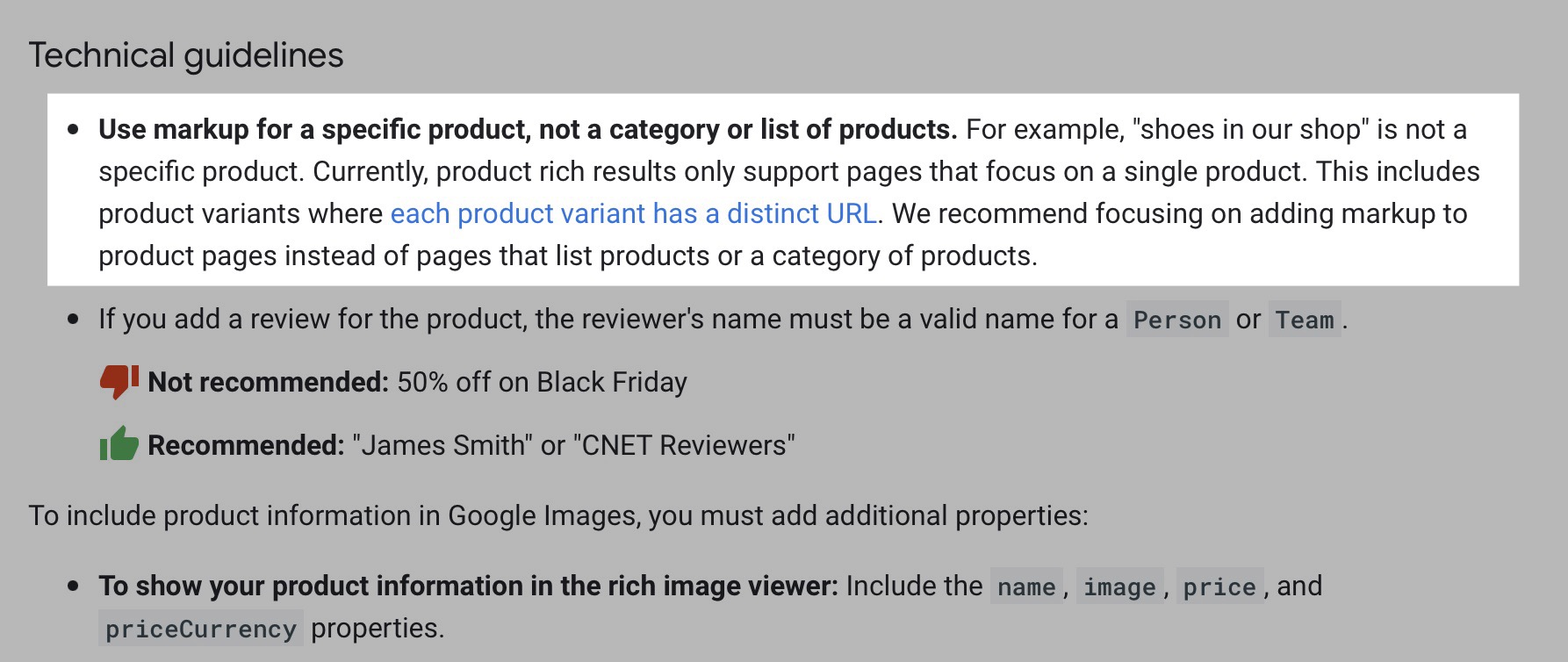
For reviews, Google mentions explicitly in the technical guidelines not to add review markup if the main content is a category listing items.

It provides the same instruction for product structured data.
Final thoughts
There’s a lot to consider to make excellent category pages for SEO. But hopefully, this guide has made that process more painless.
Got a question about optimizing e-commerce categories? Tweet me.
