Creating an SEO reporting dashboard is often an easier way to share your SEO performance results than a text-heavy SEO report. So, what’s the best way to create one?
The type of dashboard you create often depends on who you’re making it for—your own website, a small business, or an enterprise business.
In this article, I’ll explain the basics of SEO reporting dashboards and how to tailor them for your particular audience.
Ahrefs Report Builder helps you create custom SEO reports and dashboards that effectively translate your efforts into business results.
An SEO reporting dashboard is a visual interface that displays key performance indicators (KPIs) and other metrics that show a website’s SEO performance in search engines like Google. Its main job is to communicate SEO performance over time.
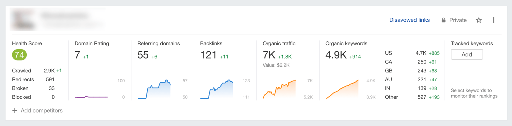
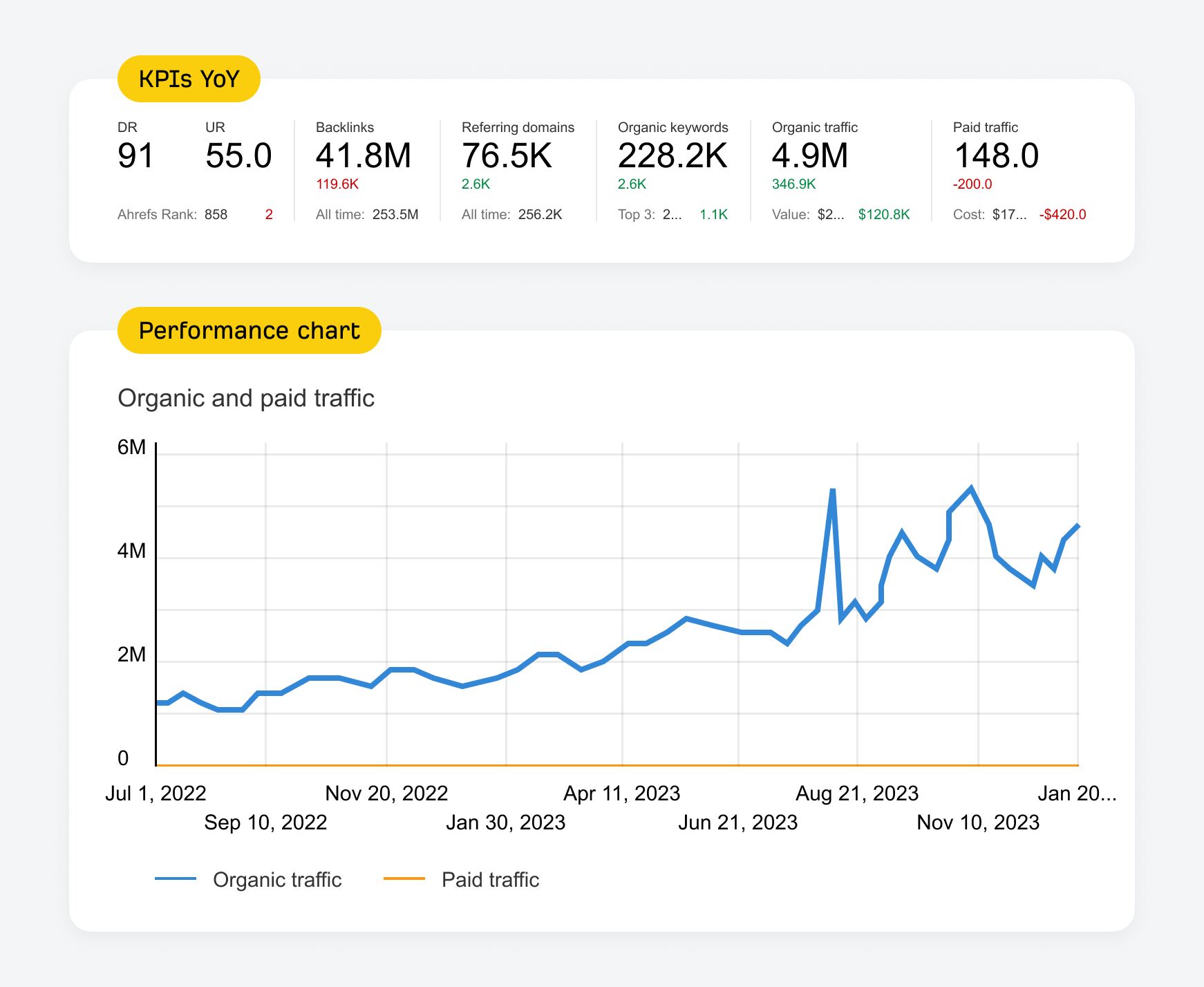
Here’s an example of what an SEO reporting dashboard looks like for Ahrefs.com.
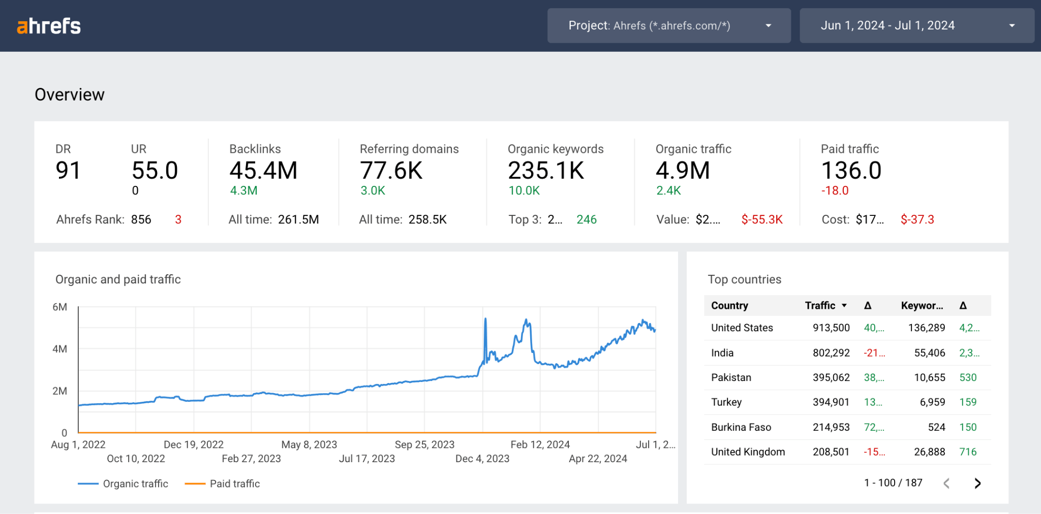
Ahrefs’ Looker Studio Integration – Site Explorer Template
In the above example, we can see the results are positive because the line chart goes up, and the KPI comparisons are also mostly green, showing positive yearly growth.
This is the power of an effective SEO reporting dashboard—you can instantly communicate SEO performance at-a-glance.
The simple answer is anything you want. But it’s best to include SEO metrics that matter to the website you‘re reporting on.
This could include metrics like:
- Clicks
- Sessions
- Click-through-rate (CTR)
- Conversions
- Conversion rate (CR)
- Organic Traffic
- Average Position
- Referring domains
- And so on…
Let’s simplify this further.
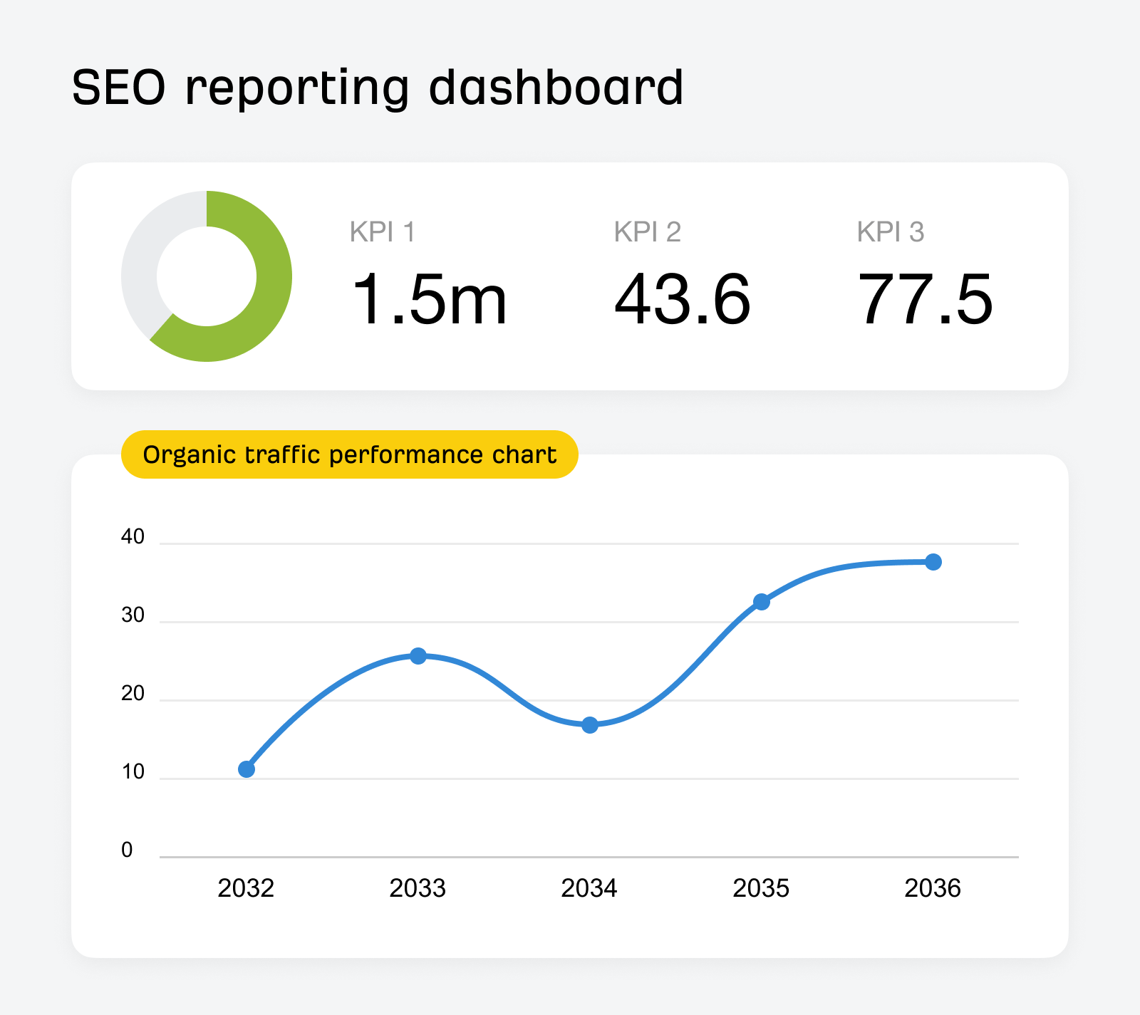
At the most basic level, there are two core elements you should include in an SEO reporting dashboard:
- Key Performance Indicators (KPIs) – KPIs can be anything that is important to report on for your business and could include conversions, revenue, leads, orders, or any other SEO metrics
- Organic traffic performance chart – Tracking your traffic performance across the year
So, how can you create your very own SEO reporting dashboard?
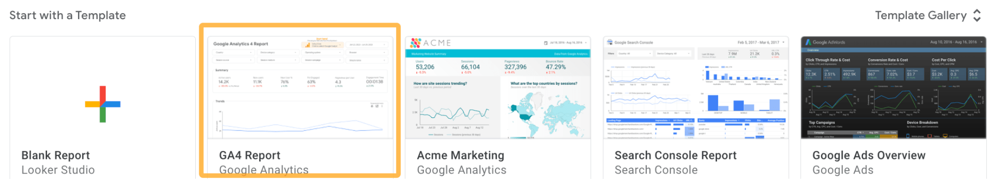
One of the most popular methods is to use a tool called Google Looker Studio (GLS). Dashboard solutions like GLS integrate with many popular data sources for free out of the box, making them perfect for most websites looking to create an SEO reporting dashboard.
Here’s an example of the basic GLS connectors, with some useful ones for SEO highlighted.
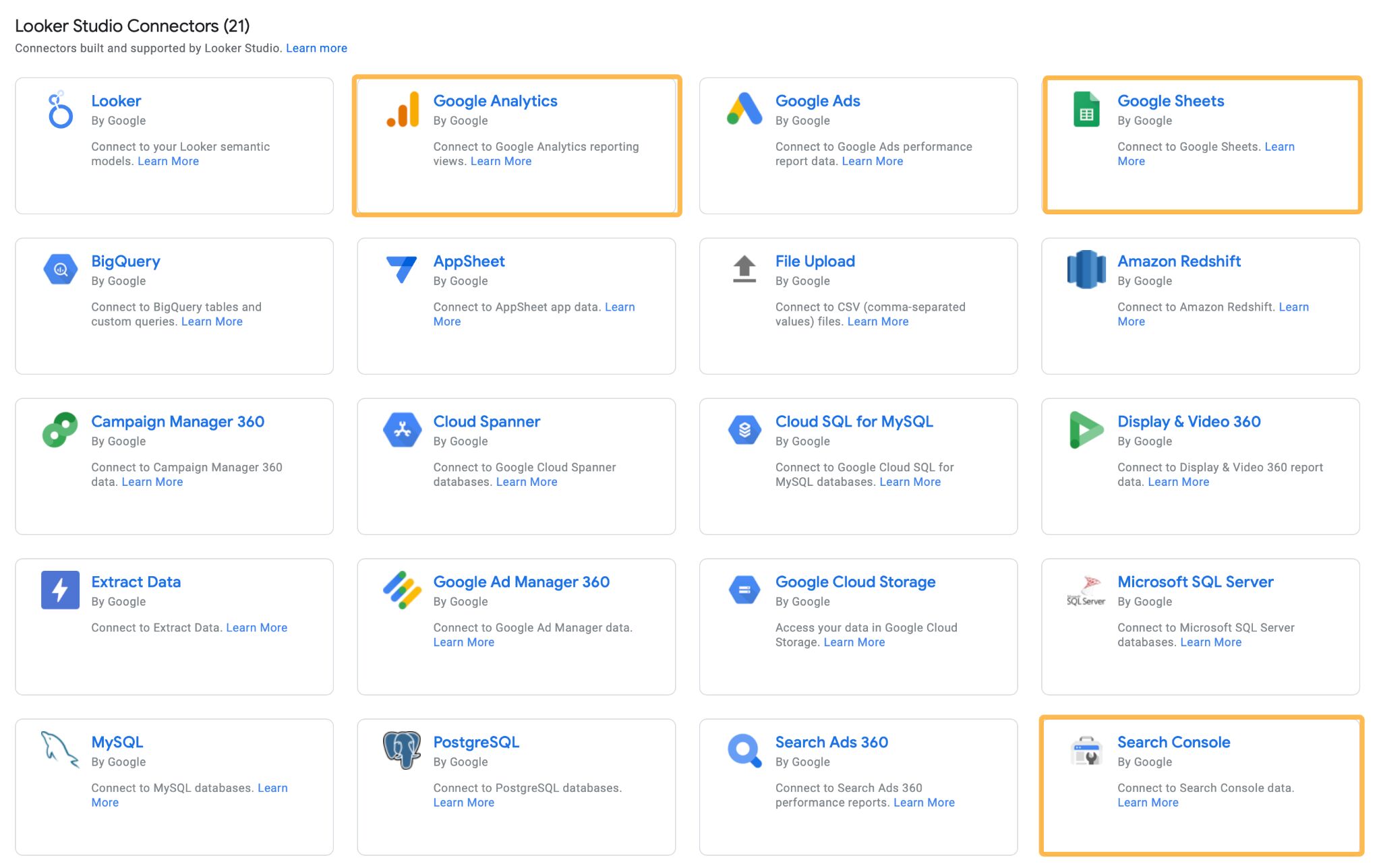
Although GLS is great for small personal websites or small-medium businesses (SMBs), in my experience, enterprise businesses usually require more powerful alternatives, as they have more complex demands.
So, based on this, we can say there are three broad categories of websites you can build for:
- Small personal websites
- SMB websites
- Enterprise websites
Let’s explore these further.
Creating an SEO reporting dashboard for a small personal website is a good option if you want to monitor SEO performance but don’t want the hassle of logging into lots of different tools regularly.
This was the conclusion I came to when I wanted to monitor my portfolio of affiliate sites with the least amount of effort possible.
There was no way I was prepared to check every single site’s performance manually. So, I decided to create a mini SEO reporting dashboard in GLS that looked something like this:
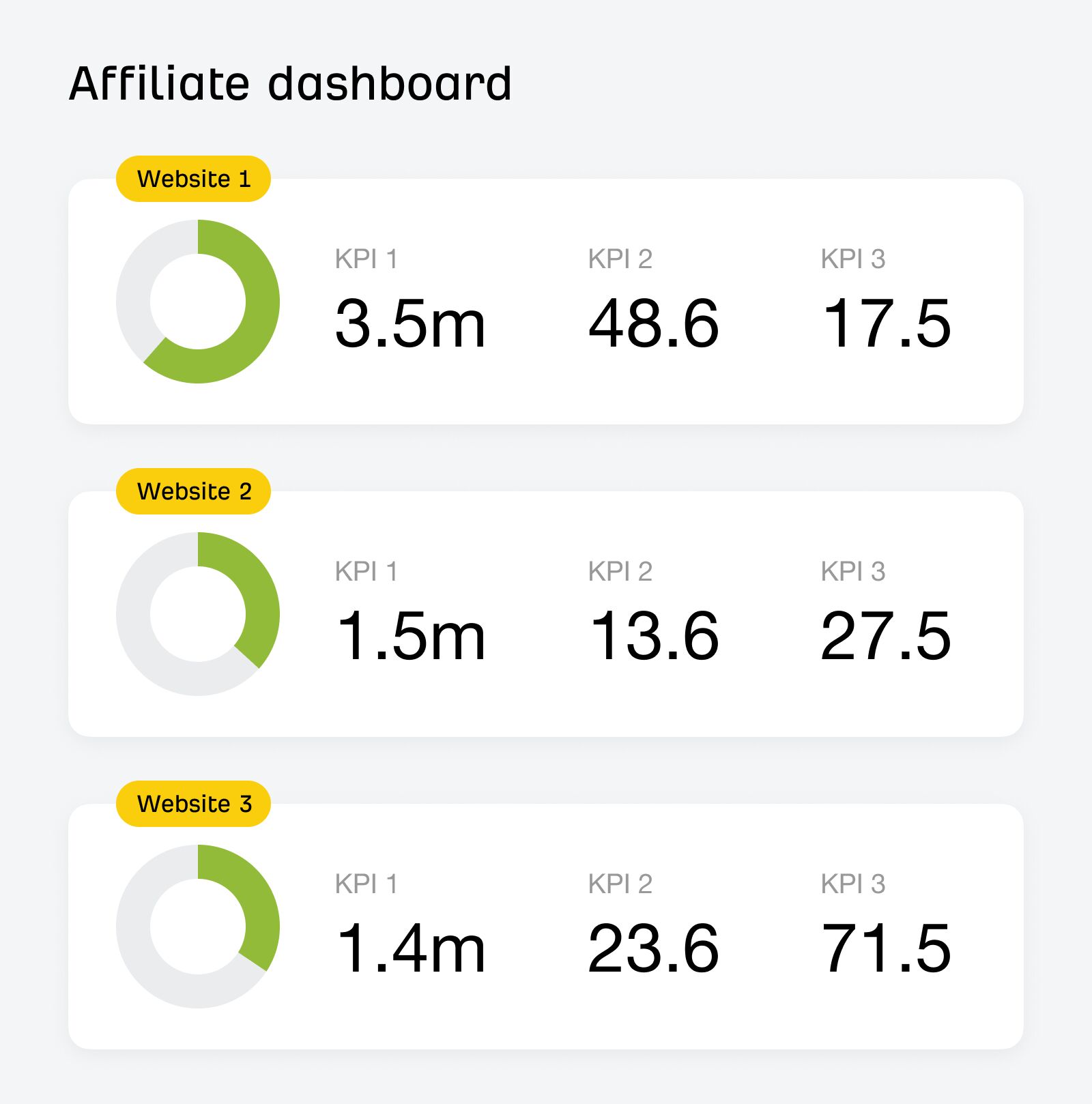
This dashboard wasn’t visually impressive, but it was functional and displayed SEO performance at a glance.
It combined two data sources: Sessions from Google Analytics and clicks, impressions, and CTR from Google Search Console. Checking this data manually is possible, but it would be an inefficient use of time, especially across more than one website.
Having this setup meant I could:
- Spend more time improving the websites rather than obsessing over the details and not doing anything that improves performance
- Understand where to focus my efforts in the portfolio – I had many sites in the dashboard, so checking them all wasn’t feasible or efficient use of time
- Identify performance patterns between websites—for example, if there was a Google update, I could get a bird’s-eye view of performance across the website portfolio to see if there were any common performance drops or increases following the roll-out of the update
- View year-over-year (YoY) comparisons: green if they were positive and red if they were negative – this way, I could quickly scan many websites and understand whether SEO performance had increased or decreased for each website
- Able to check quickly – if you’ve used GLS before, you’ll know that the more charts and visualizations you add, the longer it can take to load the page
Even though I felt proud I’d created a minimal dashboard that saved time. I realized afterward that I’d re-created Ahrefs’ Webmaster Tools dashboard with a few added metrics—oh dear.
- It’s free if you are a webmaster
- It’s easy to set up if you have GSC access
- You can view both GSC data and Ahrefs data
Another option for a personal website is to use Ahrefs’ Reports.
Ahrefs’ report builder allows you to create reports using widgets from Ahrefs’ Site Explorer and Rank Tracker data.
So, when creating an SEO reporting dashboard for a small personal website, it’s best to consider what metrics you want to track before you start. This will help you determine the best solution for your reporting demands.
In short:
- If it’s just GSC and for your personal use, use AWT with GSC connected
- If you want to report on Ahrefs’ data from Site Explorer and Rank Tracker, use Ahrefs’ Report builder
- If you want to combine multiple data sources and share with others, then use GLS
If you need more detailed GA or GSC data, you can also visualize it quickly using GLS’ dedicated community templates. I used the GSC template below to provide detailed information on each site.
Here’s how you can set this up:
How to connect Google Search Console to Google Looker Studio
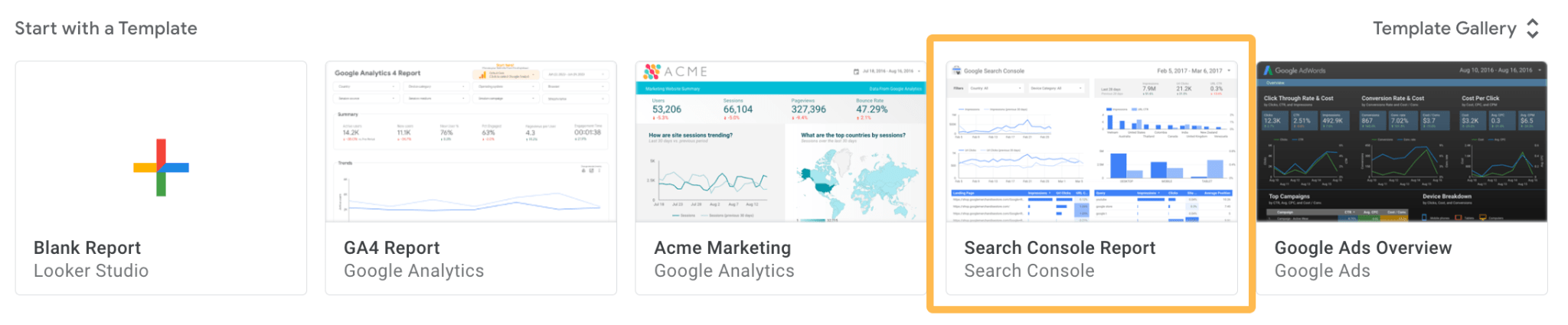
If you need more data from GSC or want to visualize performance, Google Looker Studio’s Search Console templates are your friend. A pre-built Google Looker Studio community template can get you up and running in a few minutes.
To do this, log into Google Looker Studio and connect to this template:
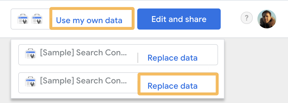
Then click on Use my own data and Replace data.
Then, select your site from the list.
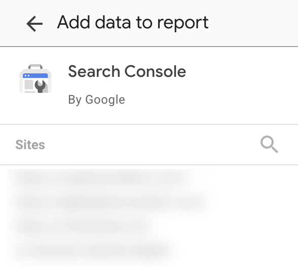
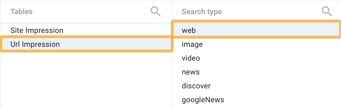
Then select either Site Impression and web or URL Impression and web, depending on your preference. I am using URL Impression and web in this example.
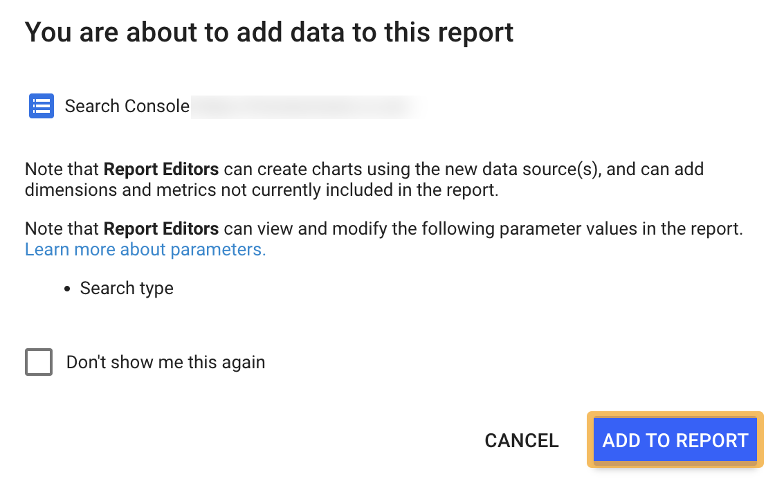
Click Add at the bottom right-hand corner. You’ll then probably get a pop-up—click Add to report.
Once that’s added, you should get something that looks like this but with your website’s data showing.
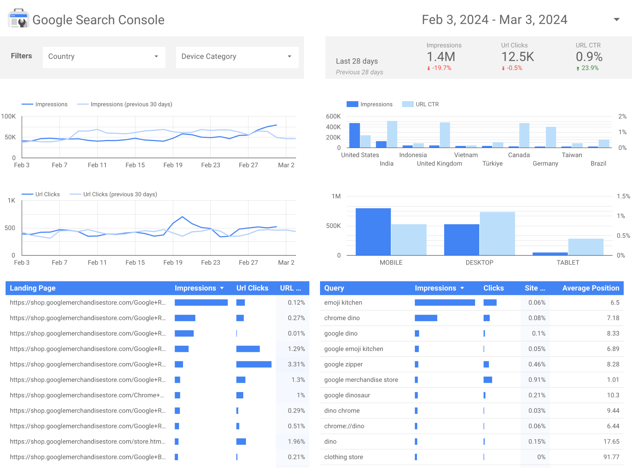
And there you go—your very own GSC-flavored SEO reporting dashboard.
This dashboard reports on:
- Impressions
- Clicks
- CTR
- Top Landing Pages
- Top Queries
- Device performance
- Country performance
Of course, you can customize it to your requirements, but I usually find this a good starting point for visualizing basic GSC data.
How to connect Google Analytics (GA4) to GLS
Similar to this, you can create a dedicated GA4 SEO reporting dashboard by using a GLS community template.
To do this, log into GLS and connect to this template.
Once you’ve done that, you’ll get a template that looks something like this:
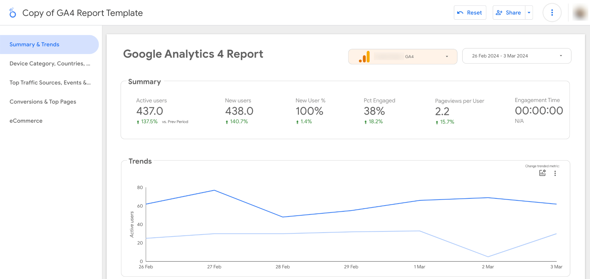
If GA4 reporting is important for your business, you’ll find a good selection of metrics to explore here. Again, you can customize or add new tabs to expand or reduce the report’s scope, depending on your website’s reporting requirements.
At its most basic level, most SMBs want to know whether their SEO campaign is moving positively.
If so, you only need to share the SEO performance chart and the year-over-year KPIs.
It’s straightforward to share this using Ahrefs’ Site Explorer Google Looker Studio integration.
Ahrefs’ SEO reporting dashboards
If you need more specific SEO data to report on, you might want to explore some of our other Ahrefs’ dashboards.
For example, our Site Audit dashboard is best for monitoring the technical SEO performance of any website.
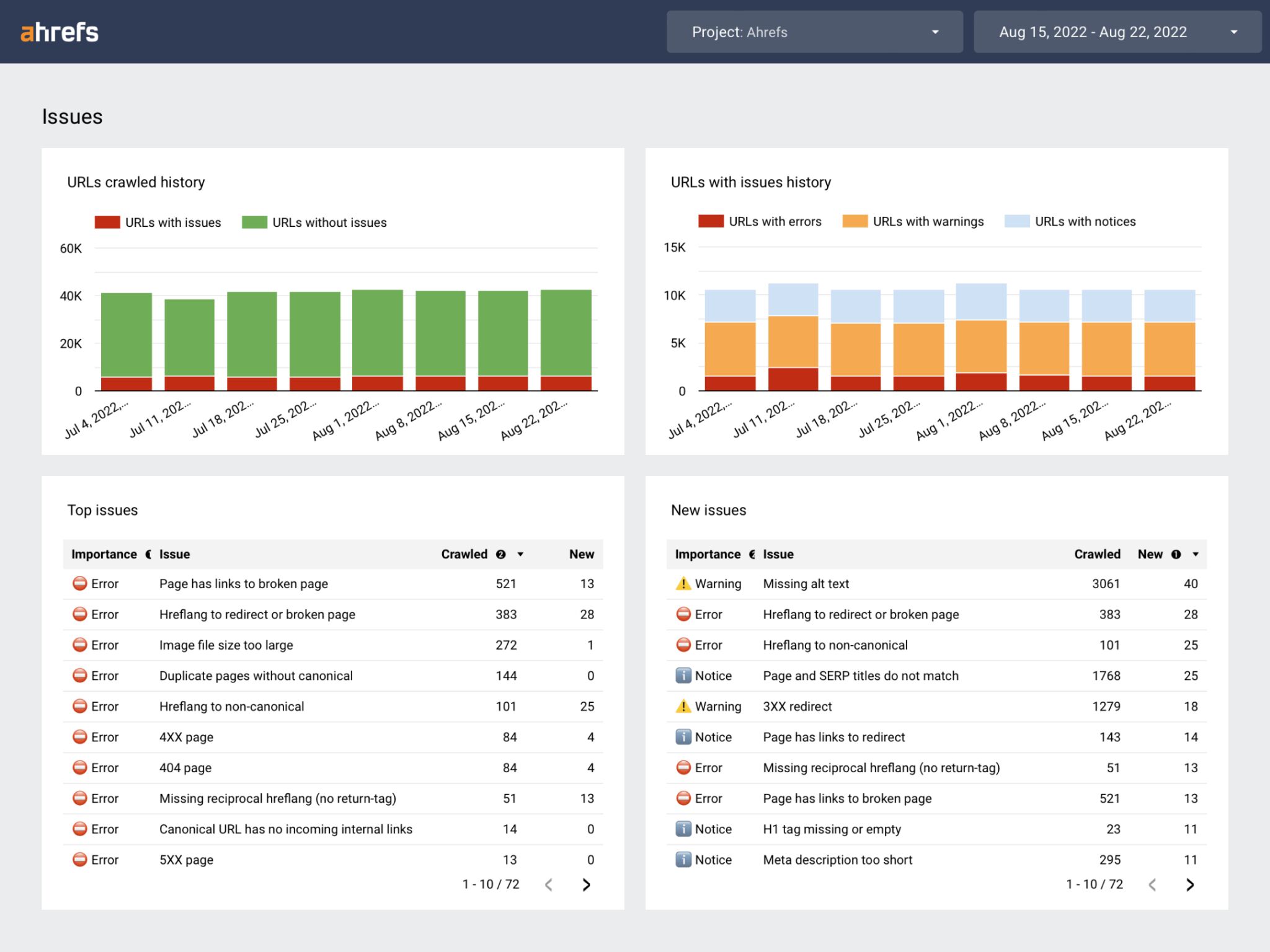
This would be a useful SEO reporting dashboard for development teams to track whether site improvements have been successfully implemented.
Our Rank Tracker dashboard is best for monitoring keyword rankings in Google for any website.
The most obvious choice for an SEO reporting dashboard is the Rank Tracker template. As it reports on positions, SERP features, competitors, tags, traffic share, and other keyword metrics.
This would be useful for sharing with SMBs that want to know more about SEO rankings and the specific performance of their keywords.
With so much SEO data available here, this usually covers most of an SMB’s reporting demands. And if you have any other custom data you can usually include it through Google Sheets on a custom dashboard.
Brand vs. non-brand traffic split
So far, we’ve explained the basics of using Ahrefs’ dashboards for SEO reporting, but sometimes, SMBs want something more specific. One area where they often request this is brand vs. non-brand traffic.
Growing businesses want to build their brands. Monitoring whether they are driving enough brand traffic is part of understanding whether they are doing this or not.
Although you can fiddle around with regex in GLS to get the brand/non-brand split for clicks and impressions, it’s often faster to use or modify an existing SEO reporting template.
Here’s a clean-looking GLS template created by John Reinesch that does exactly that.
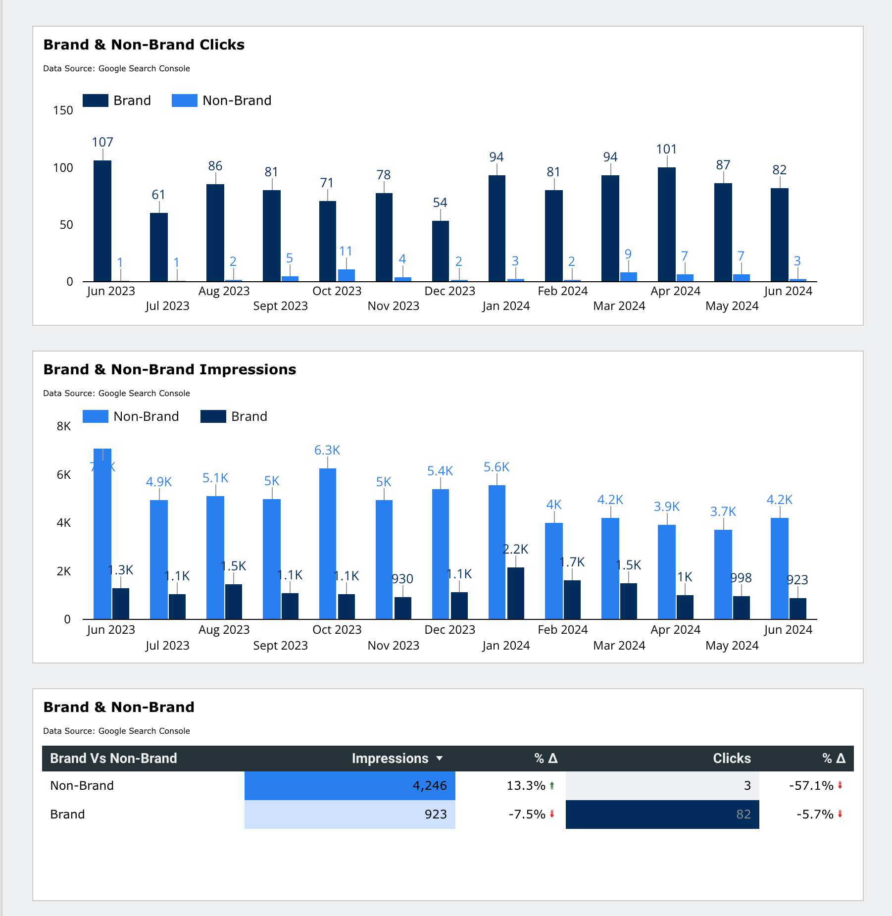
This template clearly shows brand vs. non-brand data over time using GSC data. If the SMB you’re working with wants to monitor brand activity closely, a separate brand and non-brand dashboard like the above could be a good option.
Unlike SMBs and personal websites, enterprise businesses face three specific SEO reporting challenges due to the scale and complexity of their operations and business.
First, we’ll consider what the most common SEO reporting challenges are, and then what tools you can use for creating an enterprise SEO reporting dashboard.
Common enterprise reporting challenges
- Vast amounts of data – Often, multiple data sources, multiple territories
- Complex segmentation demands – Customer type segmentation, behavioral segmentation, geographical segmentation
- Cross-team collaboration demands – For example, the C-suite should be able to understand whether SEO is providing a good ROI, development teams need to know where to focus their efforts, marketing heads need to know which channel to assign more budget to
Let’s explore these challenges in more detail.
Vast amounts of data
With GLS generally considered the de facto solution for dashboard SEO reporting for SMBs and small websites, it’s easy to assume you could roll out the same solution for enterprise businesses. However, this is not always possible.
At the enterprise level, the first major hurdle is data size. While many SMBs primarily focus on a single territory as their primary source of organic traffic, enterprise businesses are often multi-territory, which instantly increases the amount of number crunching required.
One of my former enterprise clients wanted an SEO reporting dashboard that displayed SEO performance data and other marketing data for the top 25 territories—it was critical for their business as a flight operator.
While this level of data may be possible to visualize with GLS, it’s often not practical across the entire enterprise website.
Added to this is the vast amount of data sources required to report on. Although enterprise businesses may have certain platforms they rely upon for core metrics, they will be interested in getting a second opinion from other data sources, which puts additional pressure on a reporting platform solution.
Complex data segmentation demands
Data segmentation at enterprise level is usually where things get complicated. At its most basic level, customer segmentation can be achieved by geographic region, but often, segmentation for enterprise businesses goes deeper into defining, analyzing, and recording consumer behaviors.
For example, performance analysis can be divided into different geographic regions, product categories, or business segments. An enterprise company I worked with wanted to understand the behavior of new and existing customers, so this formed a central part of their SEO reporting.
Advanced visualization of data segments helps communicate a story to other teams and senior stakeholders. This story could be used as part of a business case to secure more investment in SEO. So, the visualization, as well as the data, needs to be compelling.
My previous client wanted to understand the impact of the weather on certain product categories, and to break this down by the different types of customers they had defined. We used this visualization to get increased investment in SEO for certain parts of the website that needed improvement.
Cross-team collaboration demands
Enterprise companies work with multiple stakeholders in different teams, both internally and externally. Therefore, reporting platforms must be able to accommodate data sharing between many different teams.
- Different teams value different metrics, so the dashboard needs to reflect all of these different reporting demands
- Different teams must be able to understand the data that’s presented
- Dashboards in enterprise companies serve as a benchmark for performance, although they may be accompanied by a static report, the dashboards are often used to tell a story about a website’s performance in between times
What tools to use
Based on my experience of working with enterprise businesses, I’ve seen there are two tools often used to create SEO reporting dashboards at the enterprise level: Power BI and Tableau
Power BI
Power BI is a Microsoft tool for creating interactive dashboards from different data sources. It’s also useful for creating SEO reporting dashboards.
Here’s an example of a third-party SEO reporting dashboard created in Power BI.
By Coupler.io: Get the template here.
Power BI’s insights and rich visualization options help inform decision-making for enterprise businesses.
Here are the pros and cons of Power BI:
Pros
- Ability to connect to various data sources like Google Analytics, Search Console, rank tracking tools
- Powerful data visualization capabilities
- Easy sharing and collaboration features to distribute reports/dashboards
- Affordable pricing compared to some BI tools
- Good integration with Microsoft ecosystem (Excel, Azure, etc.)
Cons
- Limited native SEO data connectors may require additional tools or custom data prep
- A steep learning curve, especially for advanced analysis Performance, can degrade with very large datasets or complex visualizations
- The dashboard interface can appear cluttered or overwhelming for some users
- Time-consuming to process and transform data for optimal reporting
Tableau
I used Tableau with two different enterprise clients and found that, if set up properly, it’s one of the most powerful dashboarding tools for SEO dashboard reporting.
It’s a great choice if you work with an enterprise business that covers multiple territories, as I did a few years ago.
Here’s the overview page from an SEO reporting dashboard that reports over 20 territories.
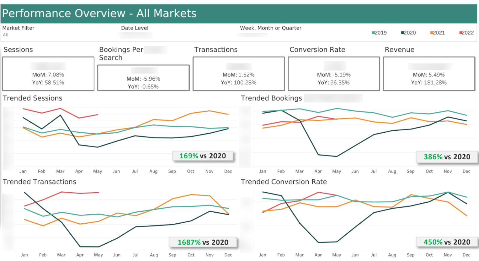
It may look simple, but the data behind this was pulled from multiple sources, and it was just one of many parts of the dashboard.
If you’re thinking of using Tableau, here’s my opinion on its pros and cons:
Pros
- Powerful data visualization capabilities
- Range of integrations like Google Analytics and Google Sheets
- The drag-and-drop interface makes it easy to analyze and visualize SEO data without coding
- Collaboration features allow teams to share and distribute reports/dashboards easily
- Tableau Server or Tableau Online enables secure sharing and deployment within the enterprise
- Useful for multiple territory reporting – I’ve personally tested it with 20+ territories
Cons
- A steep learning curve for advanced analysis and calculations
- Limited native SEO data connectors may require additional tools or custom data prep
- Customization of visualizations can be limited compared to custom solutions
As both of these solutions don’t always cover everything you need, as an enterprise SEO, you may need more SEO-specific tools to provide extra details about their website’s performance—like Ahrefs.
Combining tools
Although Tableau and Power BI are powerful dashboard reporting tools, they can often be less SEO-specific—especially if they’ve been built internally by the enterprise business.
Combining tools can help enhance your SEO reporting by providing a second opinion. I preferred this option when working with enterprise brands because it allowed me to gain insights from multiple sources rather than relying on one platform as a single source of truth.
The clients I worked with had access to Tableau and platforms like GA360 and Adobe Analytics, but to make sense of it all, I often returned to SEO tools like Ahrefs to get a more detailed SEO perspective.
Here’s an example of what a custom reporting solution could look like at its most basic level. You can use this to supplement your existing SEO reporting dashboard.
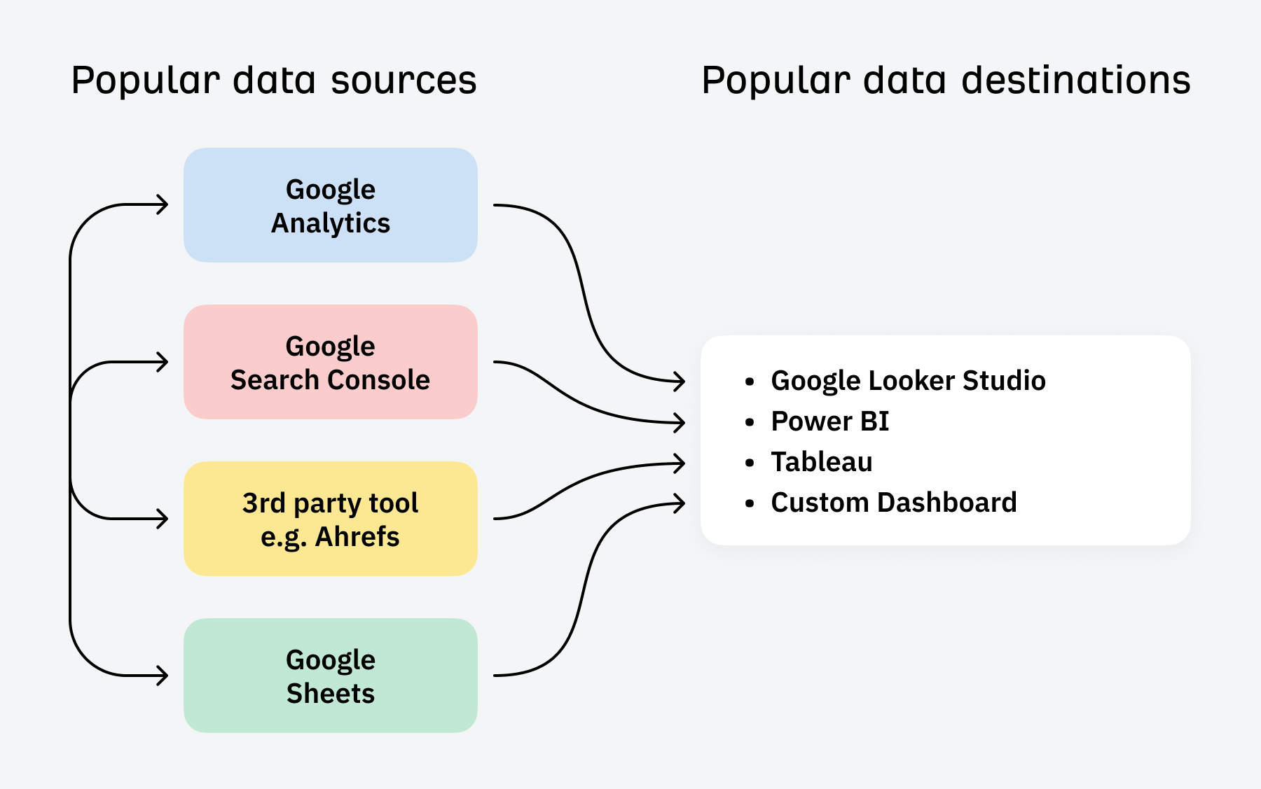
Creating a dashboard like this allows you to compare and contrast first and third-party data and add any other data you have.
- First-party data – Like Google Search Console and Google Analytics
- 3rd-party data – Like Ahrefs or another SEO tool
- Custom data – Like Google Sheets or any other database
Final thoughts
Creating an SEO reporting dashboard is a good investment for businesses that want to track their SEO performance, automate SEO reporting, and identify areas for improvement in their SEO campaign.
However, creating a dashboard isn’t always easy if you don’t have any experience building one. That’s why Ahrefs’ Looker Studio Integration is the perfect starting point for most businesses. With just a few clicks, you can have a fully functioning SEO reporting dashboard without the headache of designing and building one from scratch.
Got questions? Let me know on LinkedIn.


