Over the years, I’ve helped dozens of companies with content marketing, and filled my bookmarks folder with hundreds of articles, ebooks, and videos.
Amongst those bookmarks are a handful of hidden gems that stood out for being, well… fantastic. Here’s my selection of cutting-edge content marketing examples.
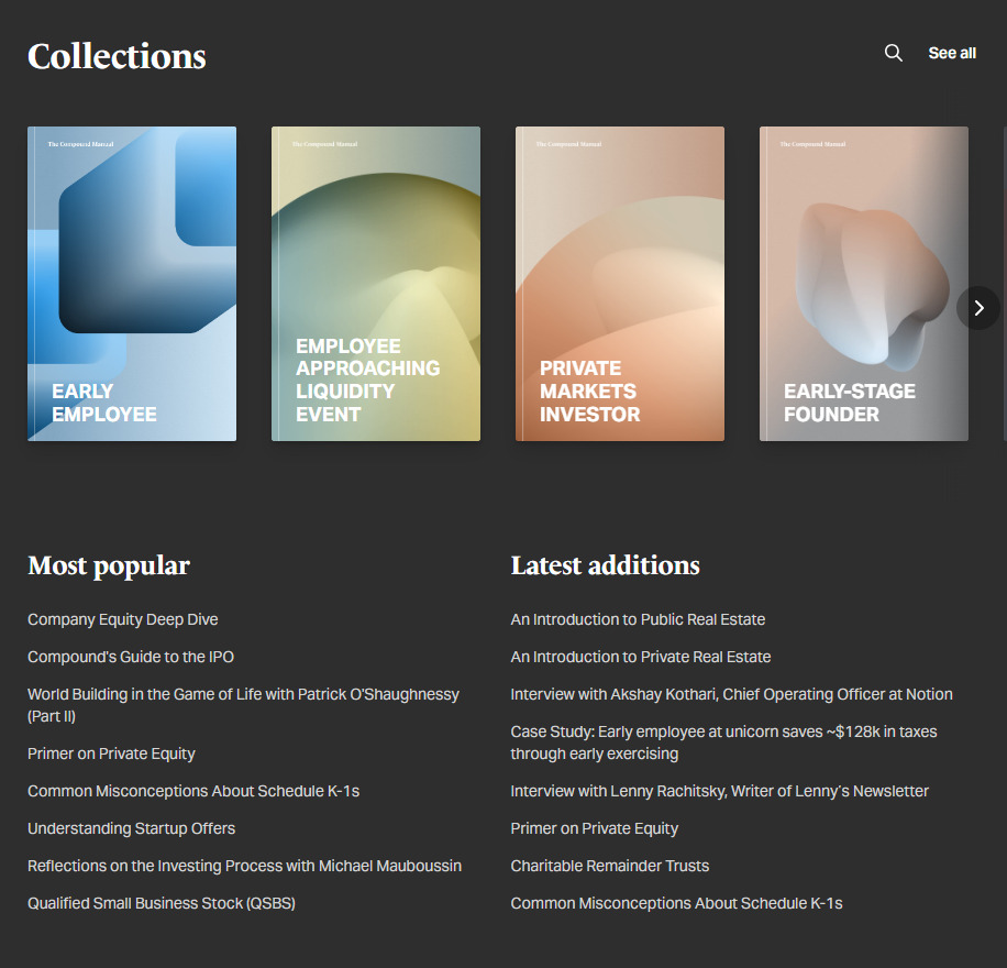
The Manual is a resource library of wealth-planning guides—and it really is a library. Each guide is structured as a virtual book, complete with clickable cover art, carefully-chosen chapters, and a beautifully minimalist reading experience. The Manual proves that reading online content can be (almost) as satisfying as turning the pages of a physical book.
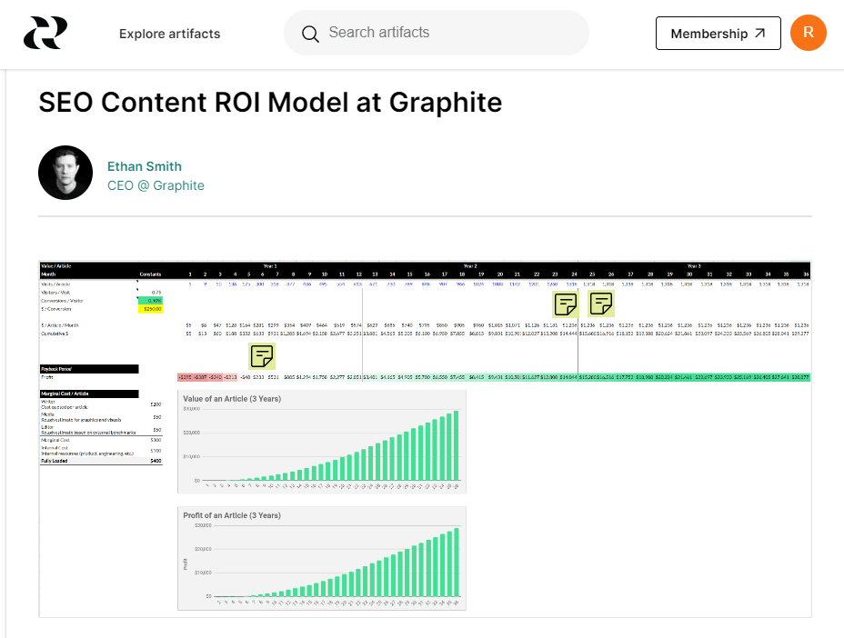
Artifacts is collection of business templates, but crucially, they contain the actual processes used by marketers, executives, and growth professionals at successful companies. Check out HubSpot’s product launch documentation, Lyft’s market health metrics, and Canva’s interview process.
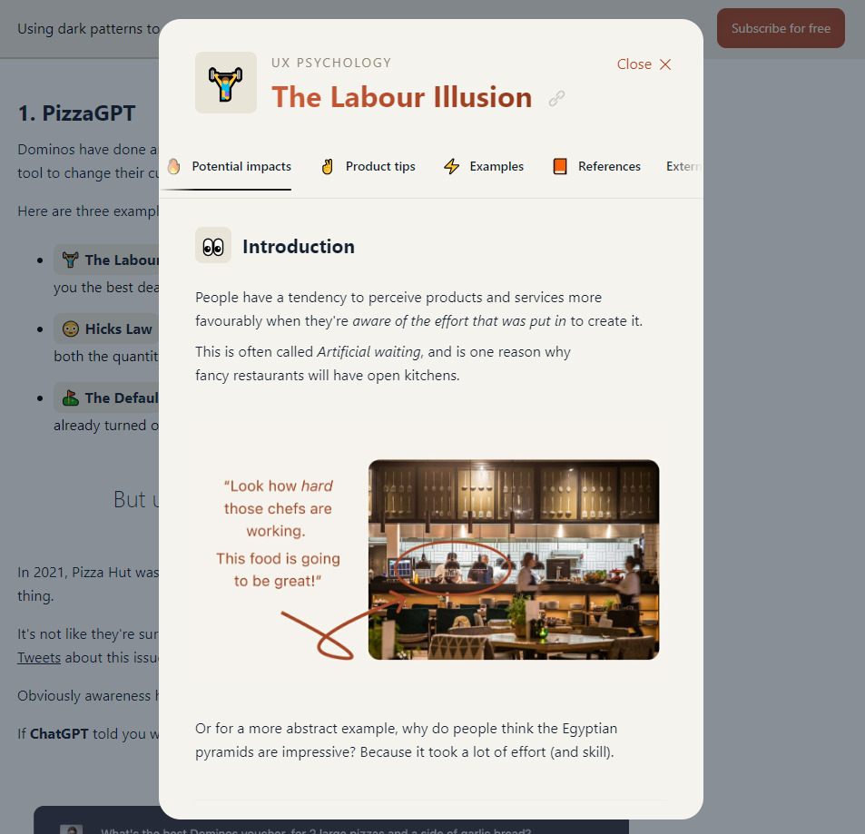
At its heart, Built For Mars is a collection of UX teardowns (answering questions like: “How does the Dominos app encourage users to buy more pizza?”). But it’s the design and on-page experience that stand out: every article is a treasure trove of interactive tooltips, slide decks, and auto-narrated content.
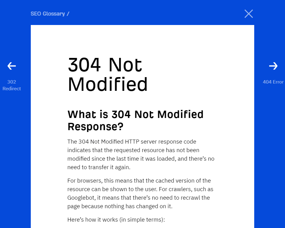
Who says that top-ranking search content has to be thousands of words long? Our SEO Glossary is a collection of ~200 straightforward definitions, from 10X Content to YMYL Pages. The glossary currently has 258 first-place rankings and generates around 66,000 monthly pageviews. Not bad.
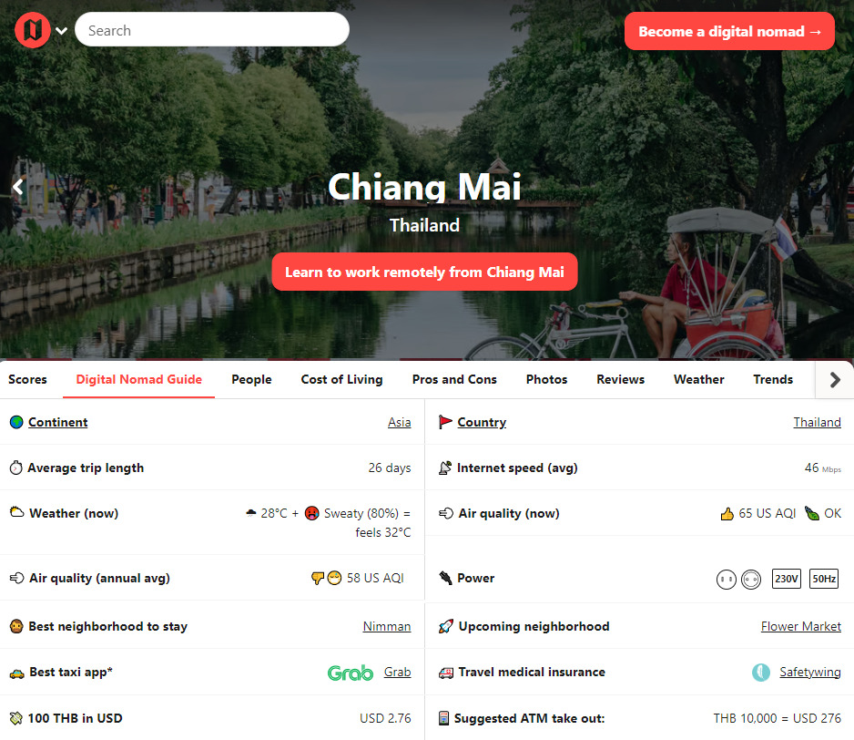
Nomad List is my favorite example of programmatic content: hundreds or thousands of content pages created automatically from data in a database. But while programmatic content is often thin and bordering on spammy, Nomad List earns a mention because of original data and great user experience.

Fraud Fighters is a free ebook about managing fraud risk. And if you think that sounds mind-numbingly dull… you’d be wrong. Unit21 manage to combine psychedelic visuals and expert commentary into the rarest of things: an ebook I enjoyed reading.
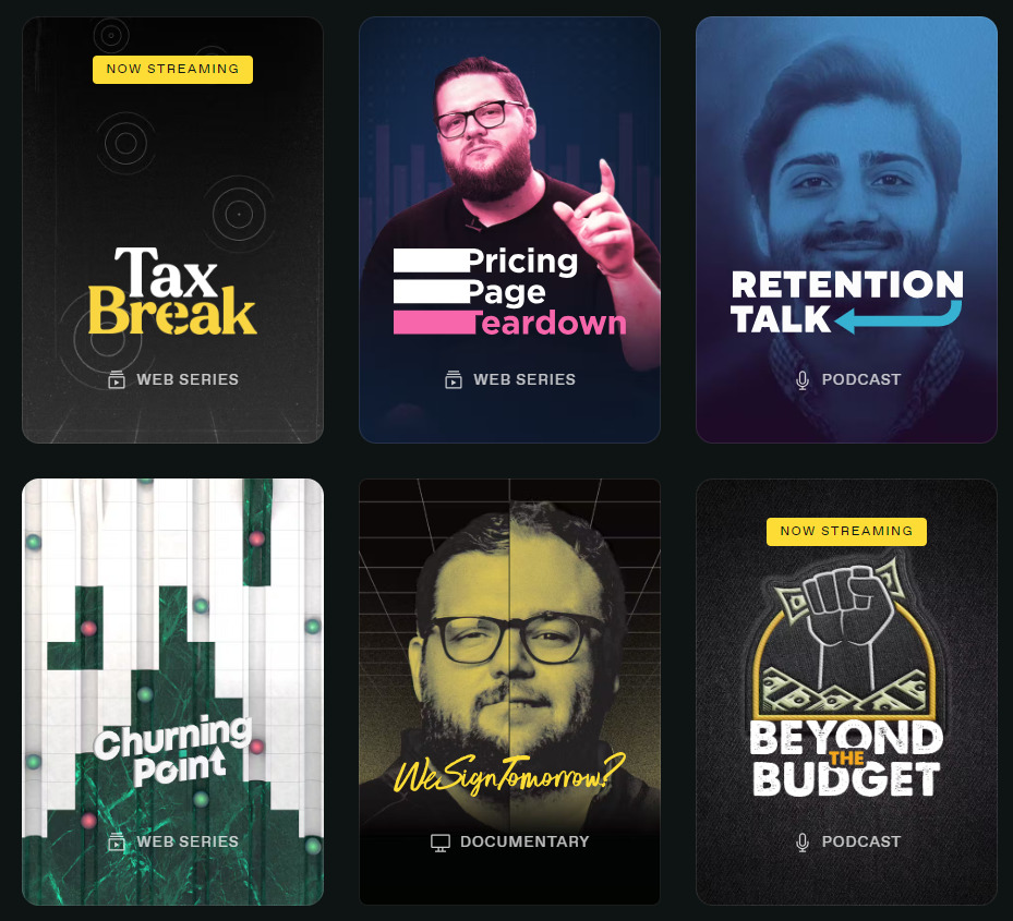
Tons of businesses publish podcasts and video content, but few go as far as Paddle: building a Netflix-style streaming service to house them all. Paddle Studios features limited series, documentaries, and thumbnail artwork straight out of a gritty Scandanavian detective drama.

Adobe. In case you’ve heard about its product but haven’t heard about the company, it’s responsible for putting the “photoshopped” in “this photo looks totally photoshopped.”
Its claim to fame on this list is a tool that automatically removes the background from any pic for free so you don’t have to. If you’ve ever tried to do this manually, you’ll know why such a tool is a lifesaver.
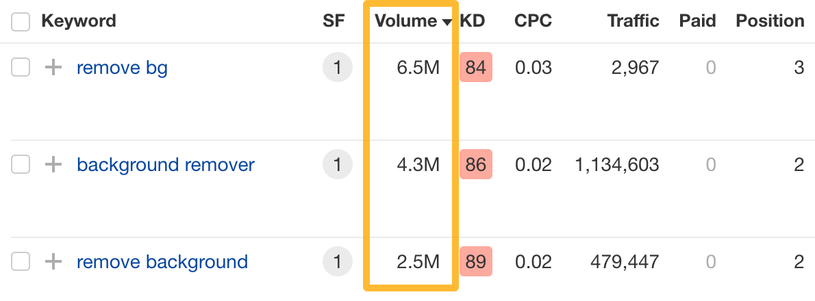
Millions of people search for a solution like this every month, and Adobe ranks in the top three every time.
To illustrate, here are some of their top-performing keywords and their search volume in the U.S. alone.
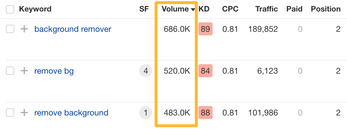
This site gets most of the traffic from India, where demand is even higher.
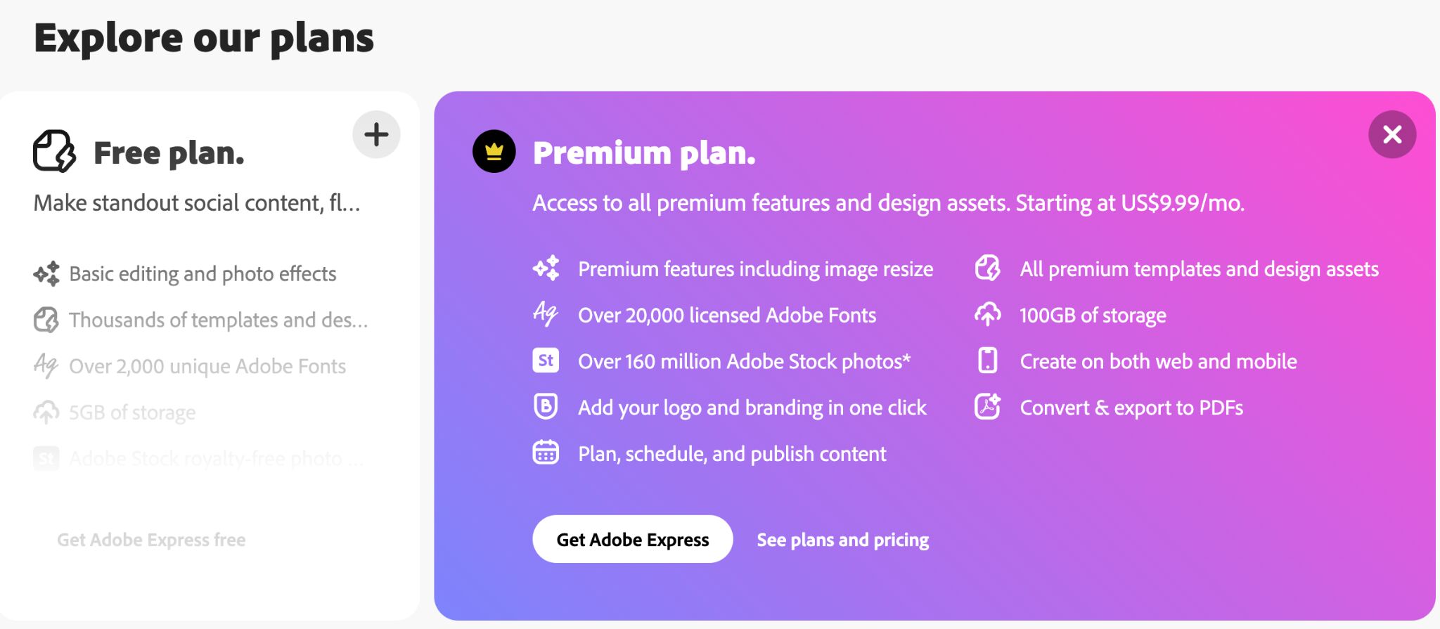
Naturally, it’s thought about a conversion path. Removing the background is free. But in case you need to resize the image too… Adobe always has a plan (pun intended).
This content marketing example is so effective that someone built an entire business on it.
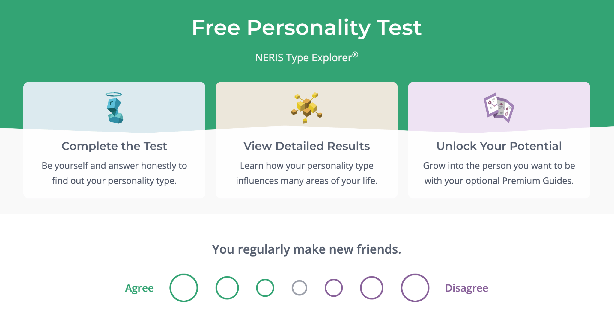
It’s a free personality test. The site sells premium content on personal growth, customized based on the test outcomes.
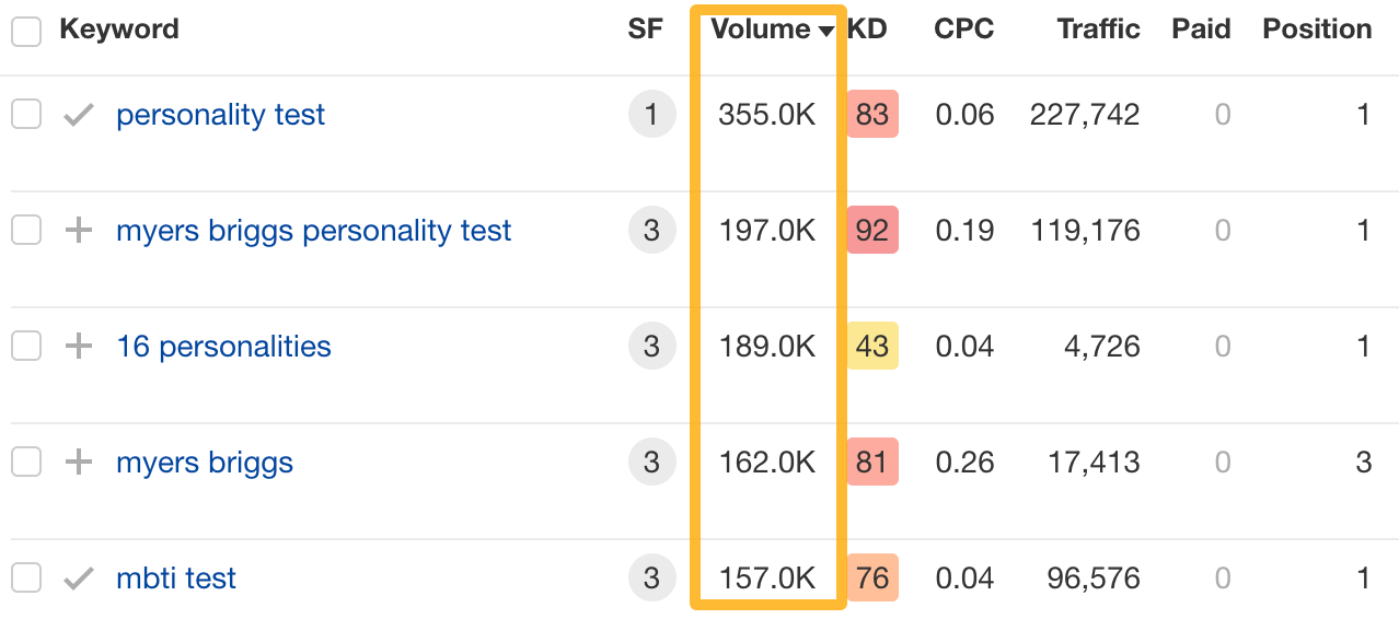
In short, many people want to learn more about themselves and the people in their surroundings, so they seek advice in personality tests like this one. This company created an experience that stands out in every aspect, which allowed it to take advantage of that demand.
This single page ranks for over 7K keywords, many of which have tens and even hundreds of thousands in search volume. This explains such surprisingly high traffic for “just” a personality test.
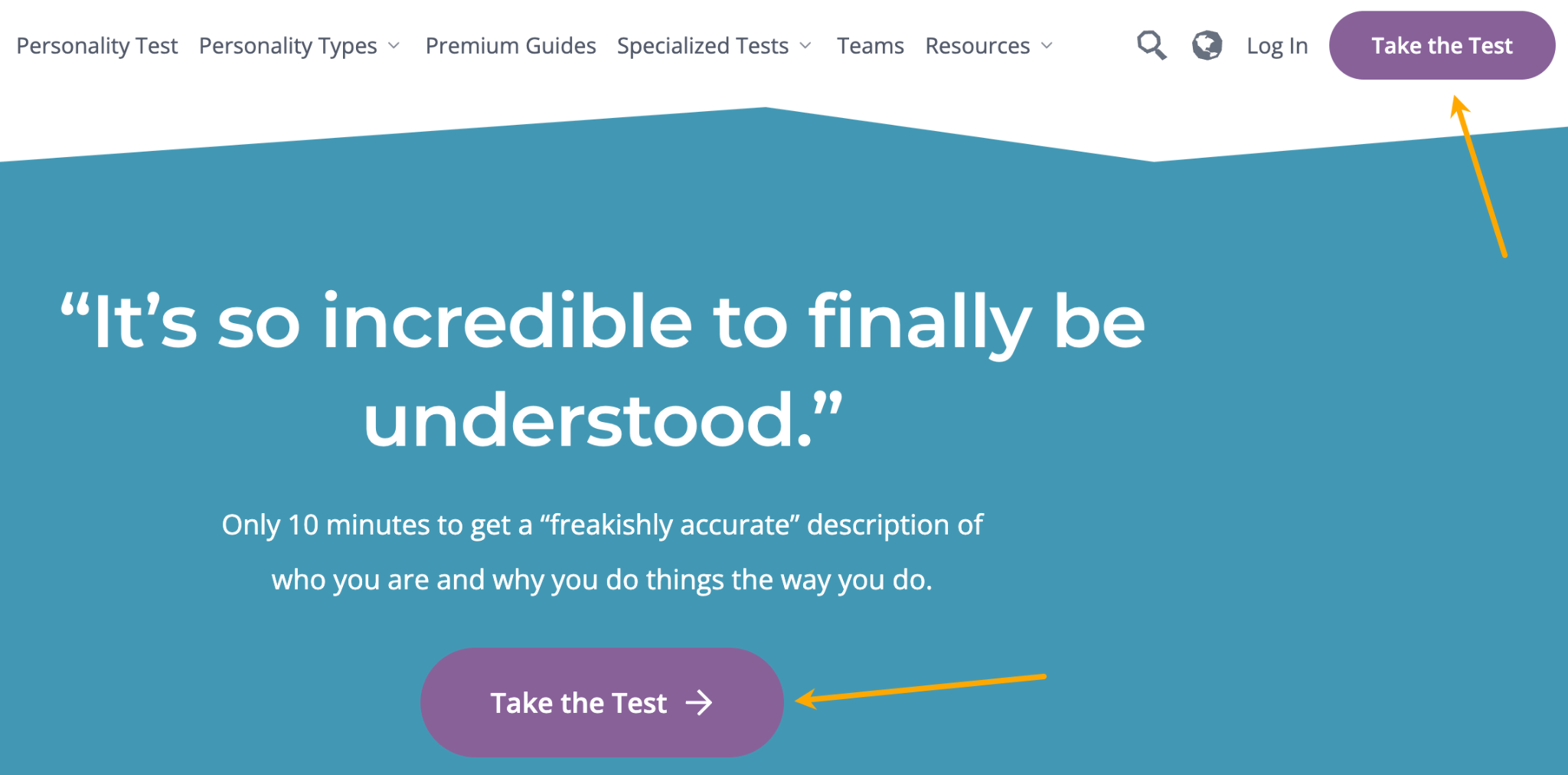
Another notable thing is how well the conversion path is designed throughout the site with the sole purpose of sending visitors to that page.
When you enter the site, there is absolutely no distraction; there’s 100% focus on the test.
After the test, you get a generous amount of free information on your personality. At that point, you’re most likely “hooked.” You’re then offered the opportunity to upgrade your experience: more advice, tips, and more specialized tests. And the site is selling this as frictionless as technically possible.
You even get an automatically created free profile which, I must admit, feels like your very own dedicated zone for personal exploration. Even the main CTA buttons change to lead you to your profile.
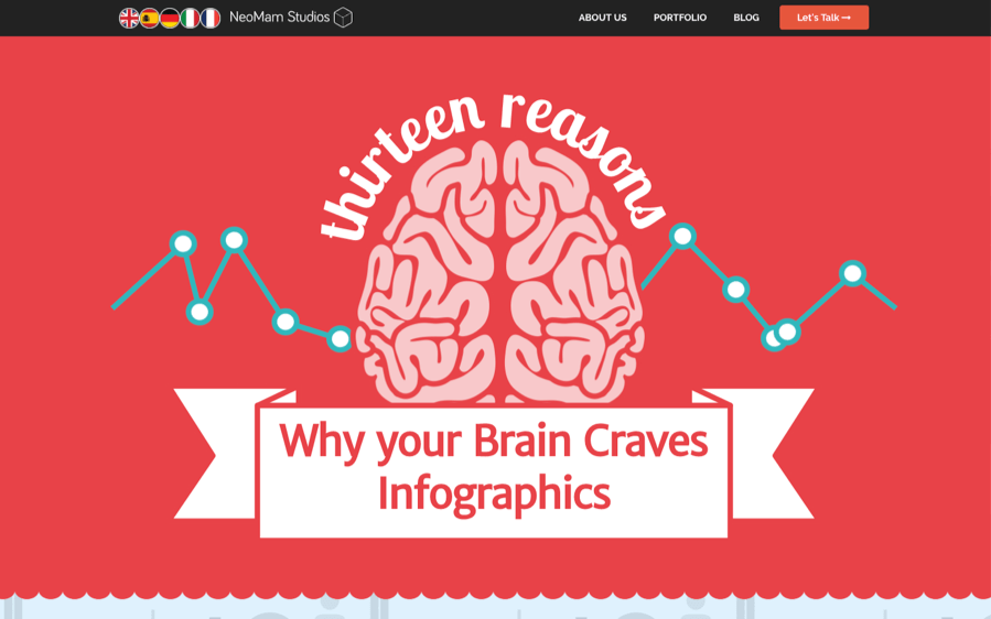
Launched in 2013, this is an infographic about why your brain craves infographics, created by an infographic design and marketing agency in the U.K.
It’s well designed and well researched. It’s also one of the few interactive pieces of content we’ve come across that actually resized correctly and worked on mobile (as of when this article was written).
NeoMam published this piece of content in July 2013 which, according to Google Trends, was nearly the peak of a long-term trend of interest in infographics.
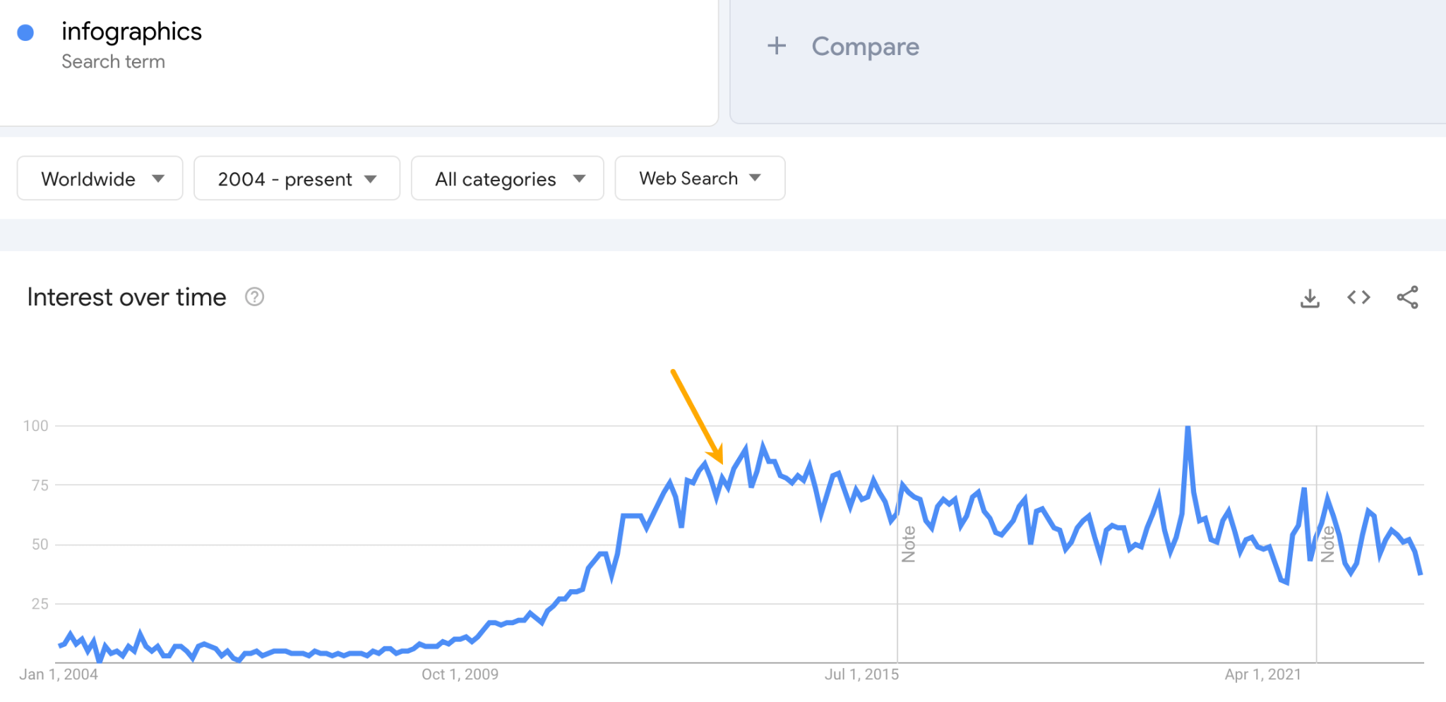
By publishing content about trending topics, you increase the pool of prospects who are likely to be interested in featuring the content. It’s akin to publishing something about the Barbie movie in 2023—if the content is good, journalists and bloggers will be falling over themselves to cover it.
And that’s exactly what happened in this case. NeoMam’s infographic got featured on a lot of huge sites, such as Huffington Post, Harvard Business Review, and Entrepreneur:
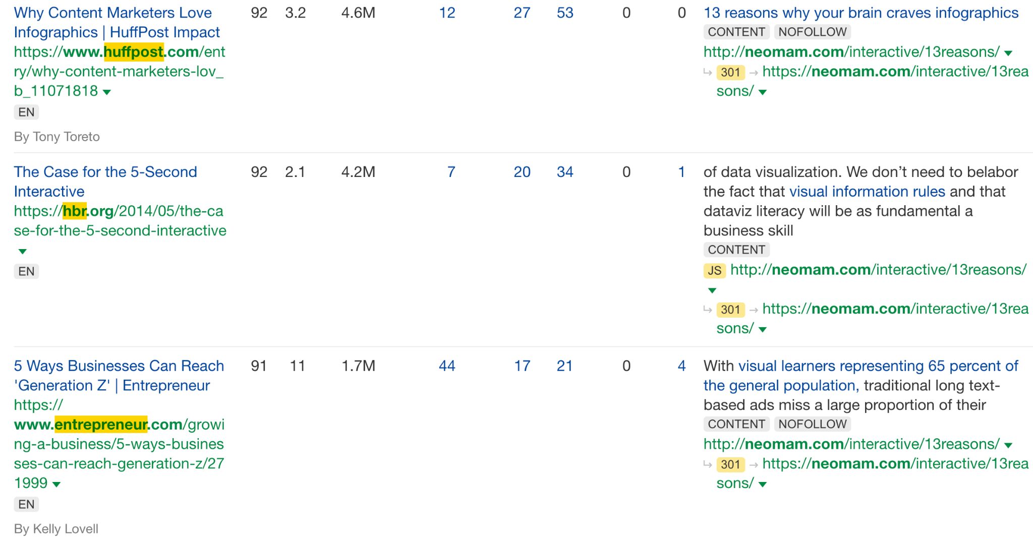
But what’s also notable is this work was featured in other lists like this one. So if someone looking for infographic inspiration comes across this example, they may hire the agency that created it.
Danny Ashton, the founder of NeoMam, also puts some of the success down to the quality and depth of research:
Back in 2013 you could get away with sources that didn’t quite make sense or just link to a blog. But one of the things I said to the team when we did this was to only talk about things that we could cite with a scientific journal. Going the extra mile when it comes to research quality was key for getting the trust from journalists looking to cover the story.

CoinDesk is an online magazine devoted to cryptocurrencies, web3, and the underlying technology. This example is one of the web’s go-to sources for checking the latest price of Bitcoin and some related market data.
There are millions of searches for the live price of Bitcoin every month. With this page, CoinDesk ranks high for these searches and generates massive traffic it doesn’t need to pay for.
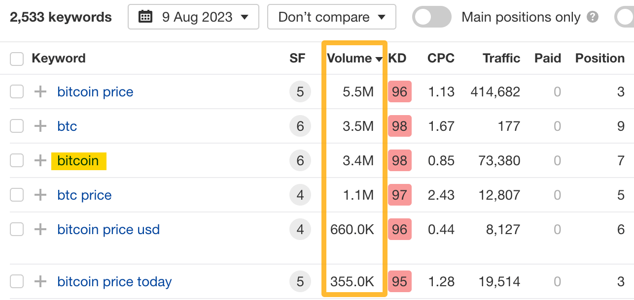
What’s in it for CoinDesk to go through all of that hassle to provide fresh market data? Especially when traders get their data from their trading apps? I can think of a few things:
- Advertising revenue from on-site ads, which get millions of views.
- Affiliate revenue; the “buy/sell” button you can see in the screenshot leads to third-party trading apps.
- Authority from all of the links pointing to that site. Which can, in turn, help it rank other content.
- Last but not least, increased readership. Its core content (news) is just a click away.
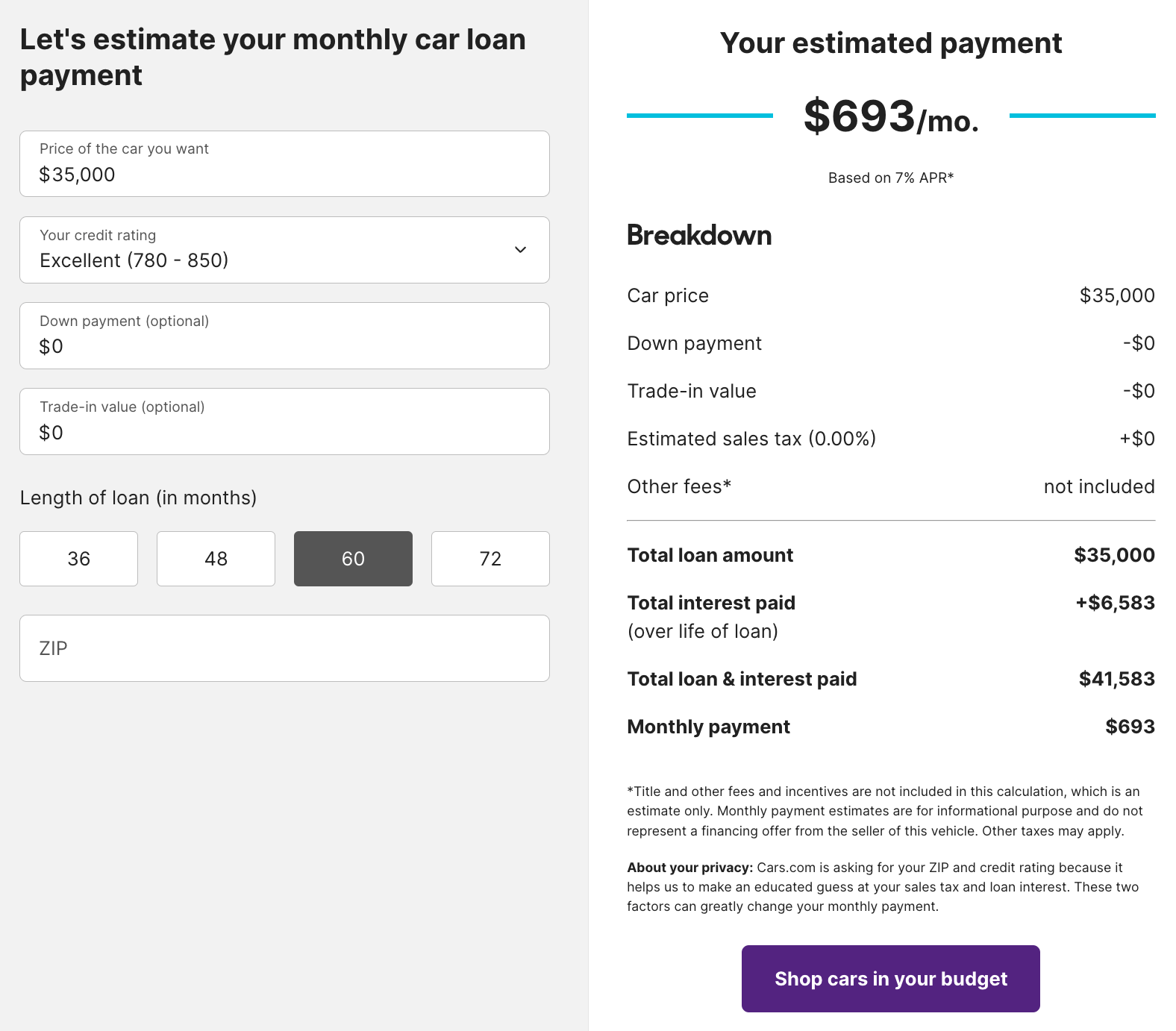
Cars.com’s Auto Loan Calculator does exactly what it says on the tin. But as you may have guessed, cars.com is not in the calculator business—it’s an online car marketplace.
Once it calculates the monthly payment amount, there’s an auto-generated search box underneath that lets you “search for cars in your budget.” Of course, the list of cars comes from cars.com.
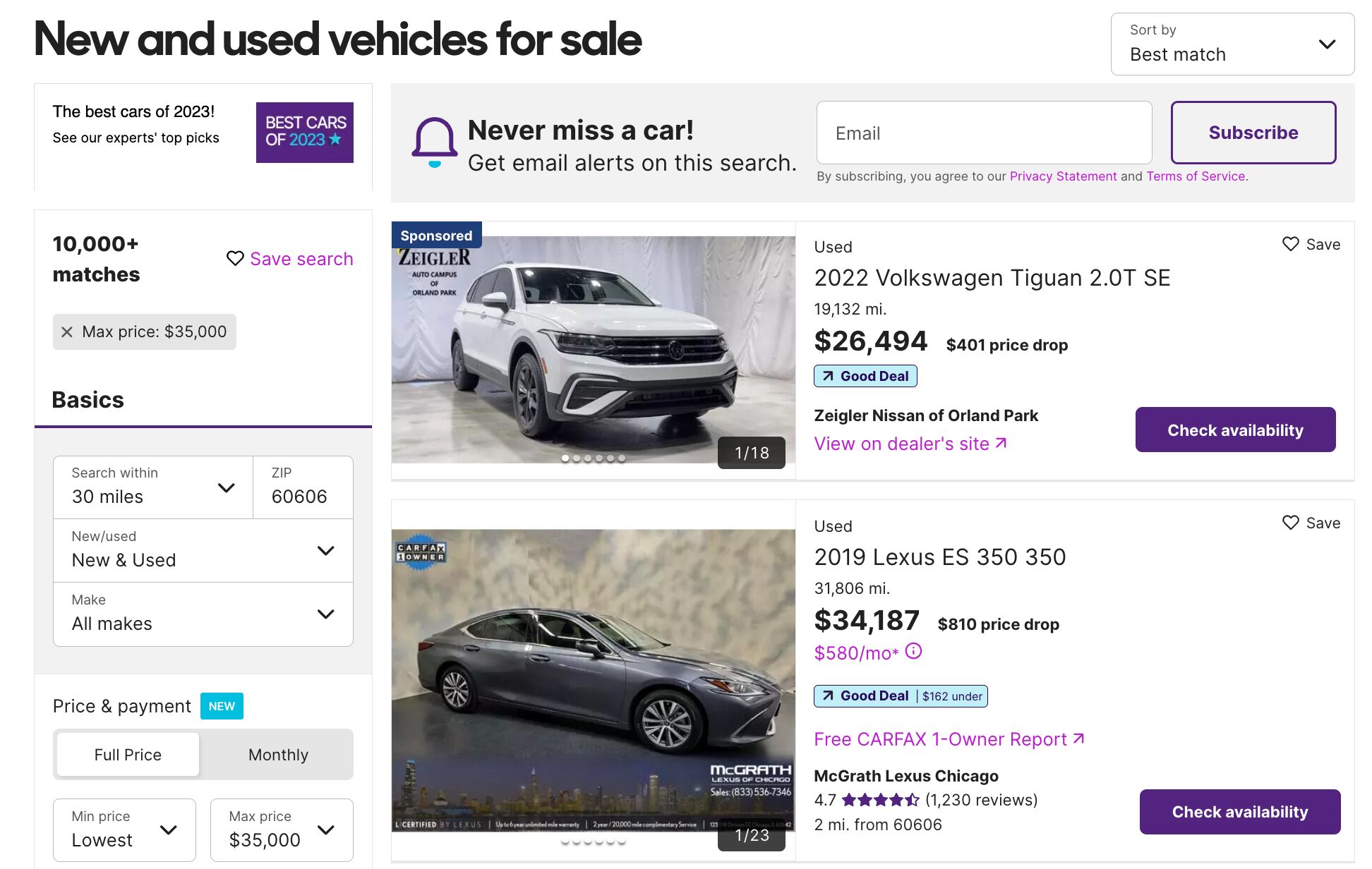
The phrase “car loan calculator” gets an estimated 475K monthly searches in the U.S.
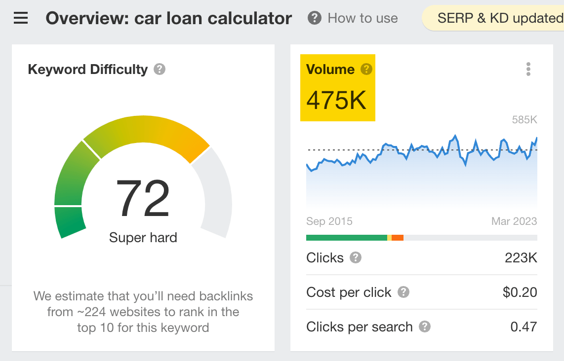
The calculator ranks in the top three in Google for that query. It also ranks in the top 100 for 8,970 other keywords, which also send traffic to the page resulting in an estimated 148,242 monthly visits.

That traffic then converts into leads when people search for cars on the website within that price range.
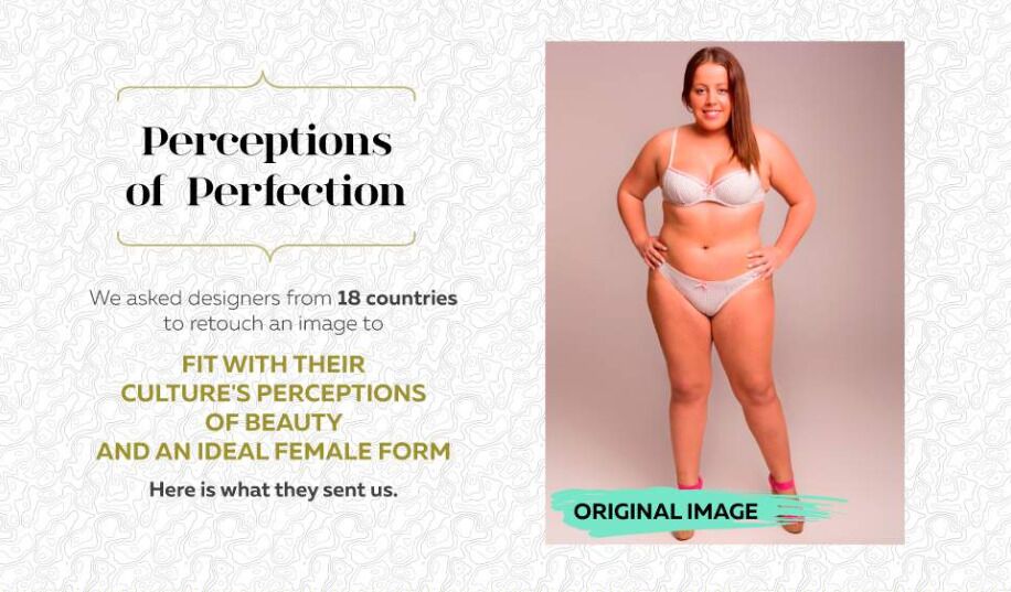
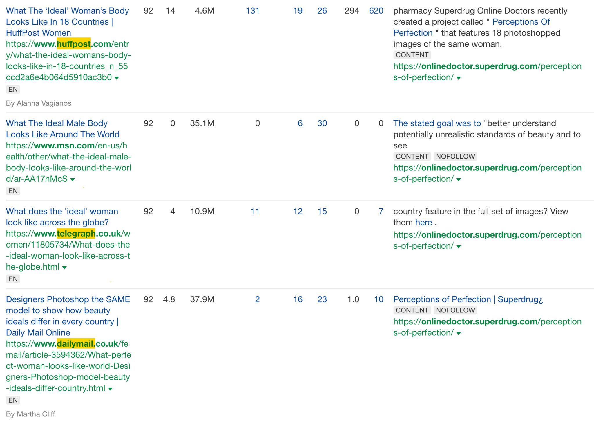
Superdrug, a health and beauty retailer in the U.K., asked female graphic designers from 18 different countries to retouch a photo of a woman to make her more attractive.
Here are just a few of the results:

A year later, it repeated the study with men:
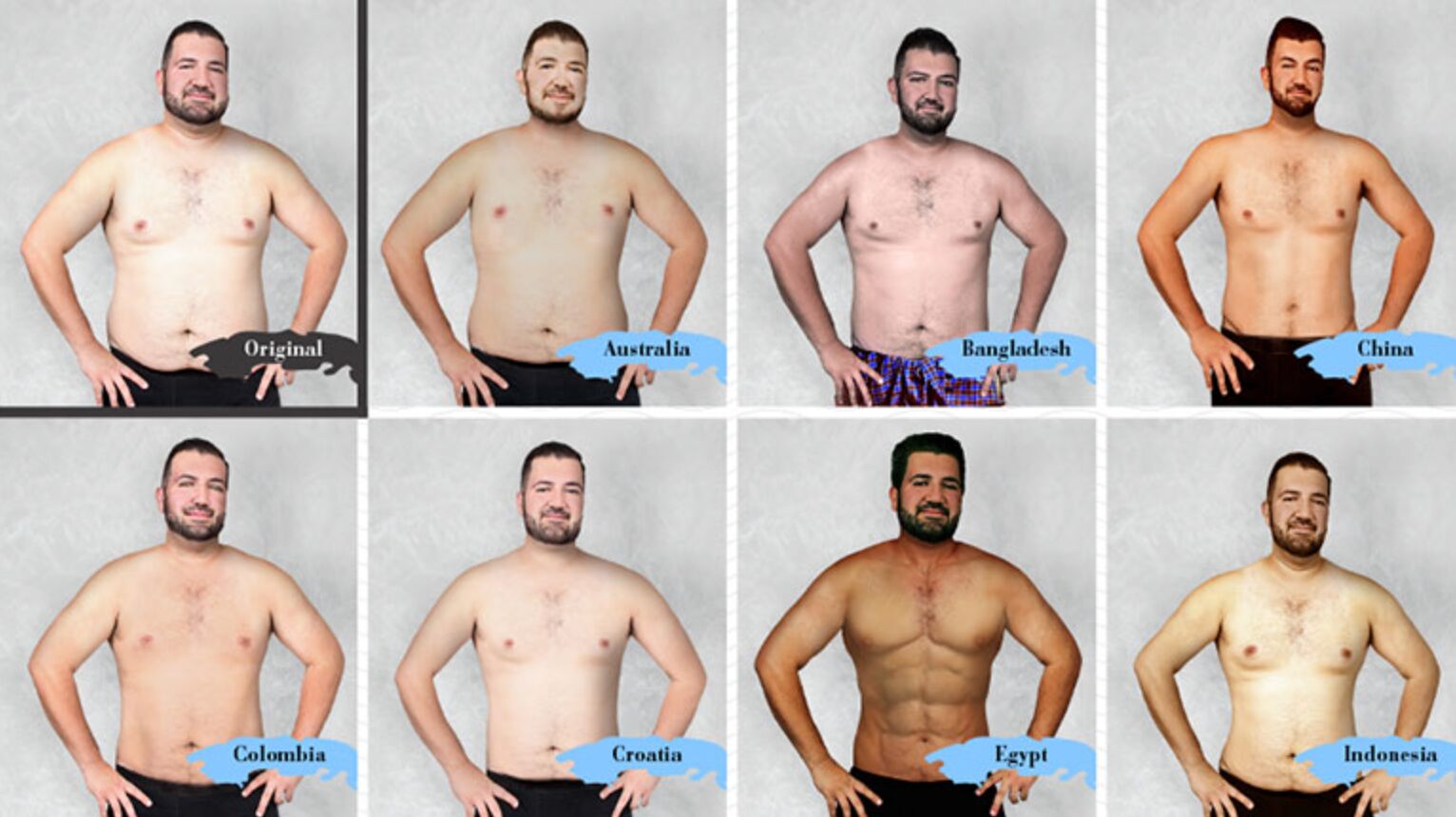
Each resulting image and body type is vastly different from the rest—which is the entire point.
Superdrug aimed to show that there’s no such thing as the perfect body. It’s subjective, not definitive. What’s seen as the ideal body varies massively from country to country.
Superdrug launched this campaign in 2015 when, according to Google Trends, the body positivity movement was starting to gain traction.
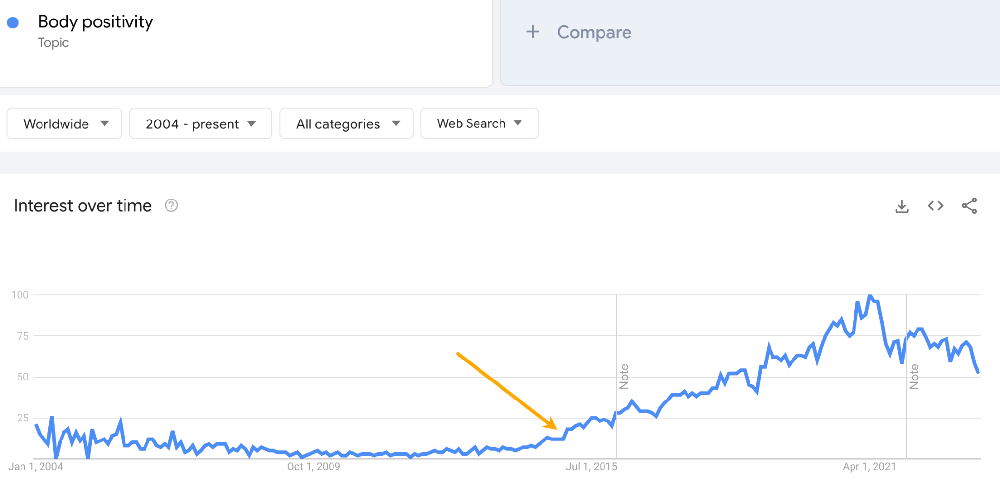
That meant there were many journalists and bloggers eager to cover positive, thought-provoking content around this subject, which led to features in big news sites such as Huffington Post, The Telegraph, and Daily Mail.
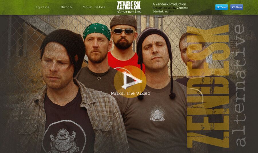
In 2013, Zendesk, a customer support solution, playfully created a fictional rock band called “Zendesk Alternative.” The band’s concept revolved around Zendesk stealing its name, leading to humorous and quirky situations.
Despite being entirely fake, Zendesk put in a lot of effort, establishing the band on various platforms like Facebook, Bandcamp, or YouTube, giving it the appearance of a real act.
Not only is it funny and insanely well executed, but it actively targets customers considering other alternatives to Zendesk and attempts to win them over.
The page ranks in the top five search results most of the time on Google for “zendesk alternative,” a keyword that gets 800 searches per month in the U.S.
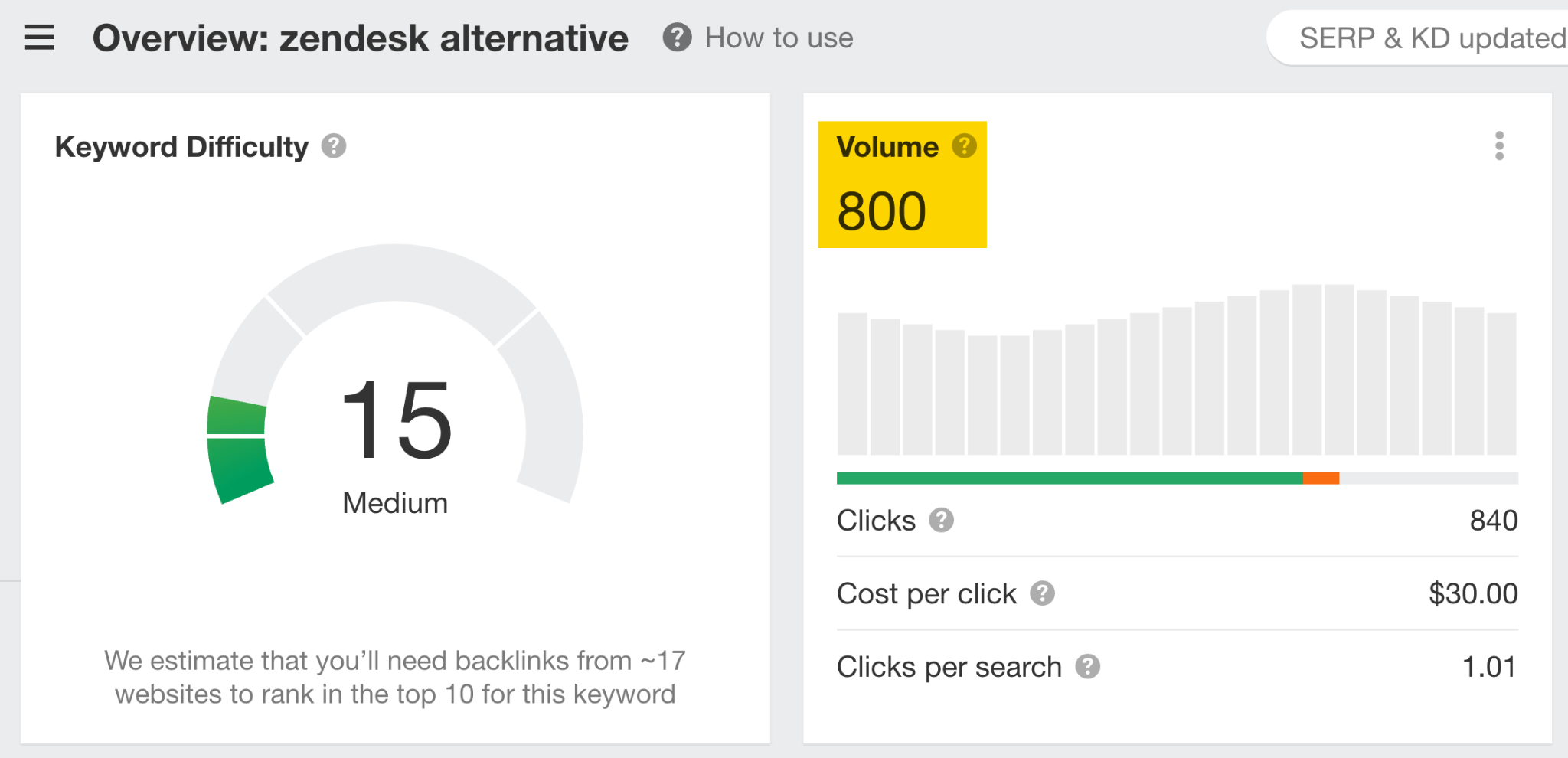
This is a keyword for which the bulk of traffic would ordinarily go to some other website.
Also, according to this archived article on radius.com, Zendesk closed five deals that originated from the Zendesk Alternative page within six months of the campaign going live.
Final thoughts
Gone are the days of fusty whitepapers and amateur infographics. Today, the bar for content marketing is higher than ever.
But there’s a silver-lining: that Netflix-inspired content series you want to pitch to your boss? It might not be such a hard sell.
Want to show me a piece of content that inspired you? Share it on X.
