User interactions, also called UX signals or user signals, include things like clicks, scrolls, swipes, and mouse hovers. These now play a major role in how Google ranks content and which brands gain more visibility in search results.
Here’s everything you need to know about merging UX and SEO to win over searchers and the algorithms and models that use their interactions as a data source.
User interactions aren’t direct ranking factors. For instance, more clicks don’t automatically mean higher rankings.
But user experience still plays a critical role in search.
During the DOJ’s 2023 antitrust trial against Google, internal Google documents confirmed that user interaction data is one of the three core pillars of search.
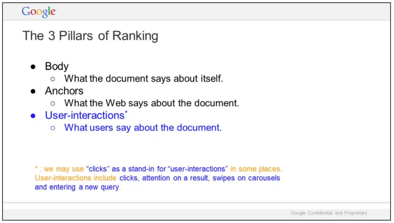
The easiest way to think about it is as a data source. Every click, scroll, or bounce feeds back into search systems.
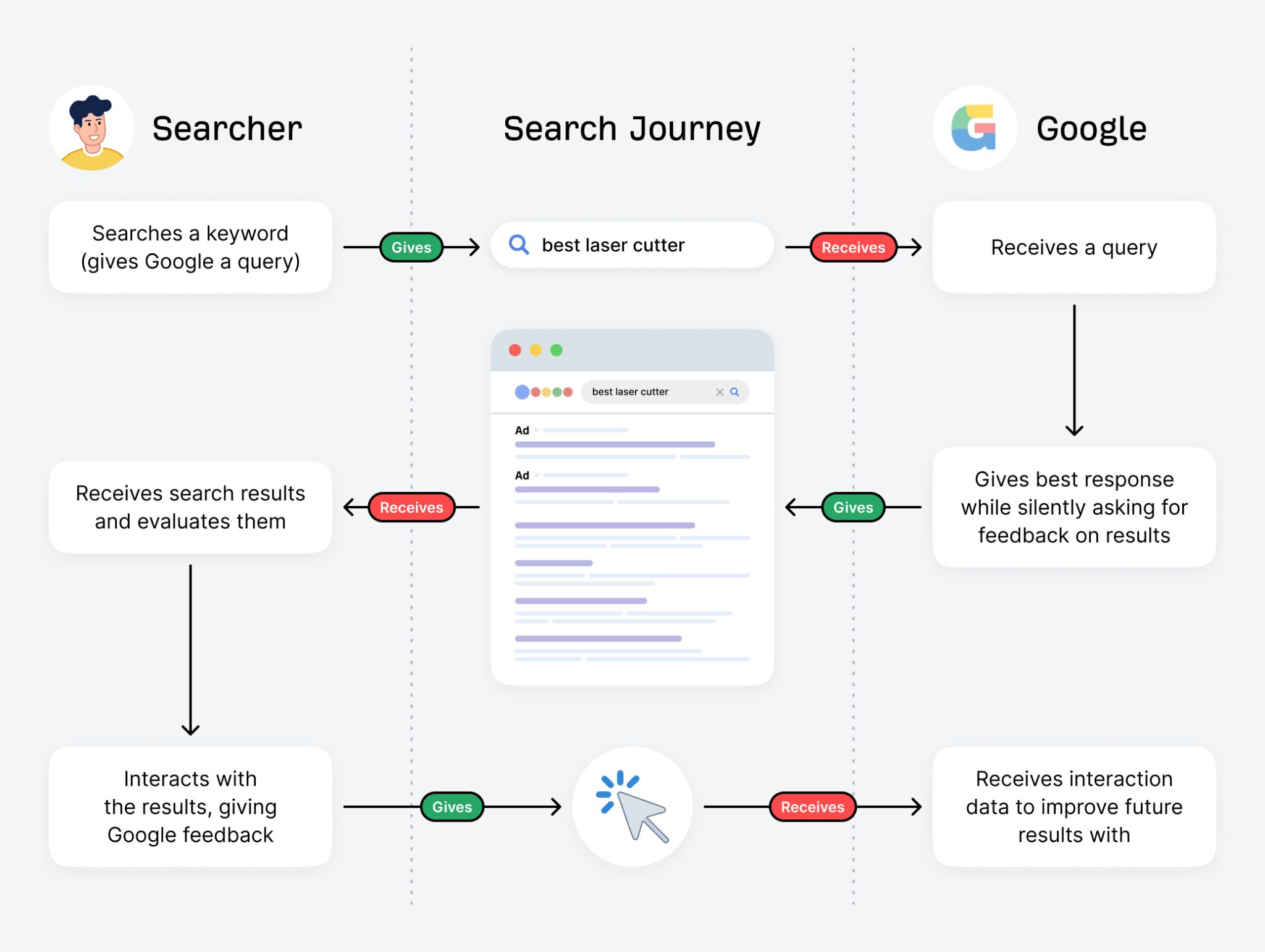
Every search is an intricate giving and receiving act between the searcher and the platform they’re using.
These user interaction signals don’t shift your rankings in real time, but they train learning-to-rank models—the machine learning frameworks search engines use to predict which results will satisfy future queries.
In other words, UX signals influence the long-term evolution of search results.
When it comes to AI search, the link is less direct. Your website’s UX doesn’t currently decide whether you’re cited in an AI response.
However, AI platforms already use interaction data within their platform to refine their models and personalize responses to users. It’s logical to assume that user engagement patterns may therefore influence which sources are trusted and surfaced more often over time.
In traditional and AI search, the outcome of good UX comes down to the patterns machine learning models detect from user interactions. Their goal is to provide quality results that satisfy their users’ needs following a search.
The websites that provide the best experience will be the ones that feature in future results.
Bringing UX and SEO together is about designing pages that work for both humans and search engines.
The two disciplines share the same end goal: helping people find and use information effectively.
Below, we’ll walk through a step-by-step process that aligns strong UX principles with proven SEO practices, so your site can rank well and keep users engaged.
1. Map out your information architecture
A solid information architecture is the foundation of every search-friendly and user-friendly website. It’s how you plan, organize, and label your pages so they make sense to both people and search engines.
This step is integral to both SEO and UX design processes.
Unfortunately, most SEOs treat this task as simply adding keywords to URLs, ignoring other elements like navigation and accessibility.
On the other hand, many designers neglect keywords altogether, making costly mistakes during redesigns when search performance is negatively affected.
To do it right, you should incorporate the best practices of both disciplines:
| SEO | UX |
|---|---|
| Start with keyword research | Make the main navigation intuitive |
| Map out SEO topic hubs | Use simple, clear labels for each page |
| Add keywords to URLs | Don’t cram keywords on brand pages |
| Use keywords in internal links | Ensure URLs are easy to understand |
| Make every page accessible within three clicks from the homepage | Add links where users are likely to need them |
No matter whether you’re a designer or an SEO professional, keyword research and topic mapping are the first things you should do when planning your information architecture.
Keywords are a form of user data.
You can use them to identify patterns in people’s language when they’re looking for information and match your site’s structure accordingly.
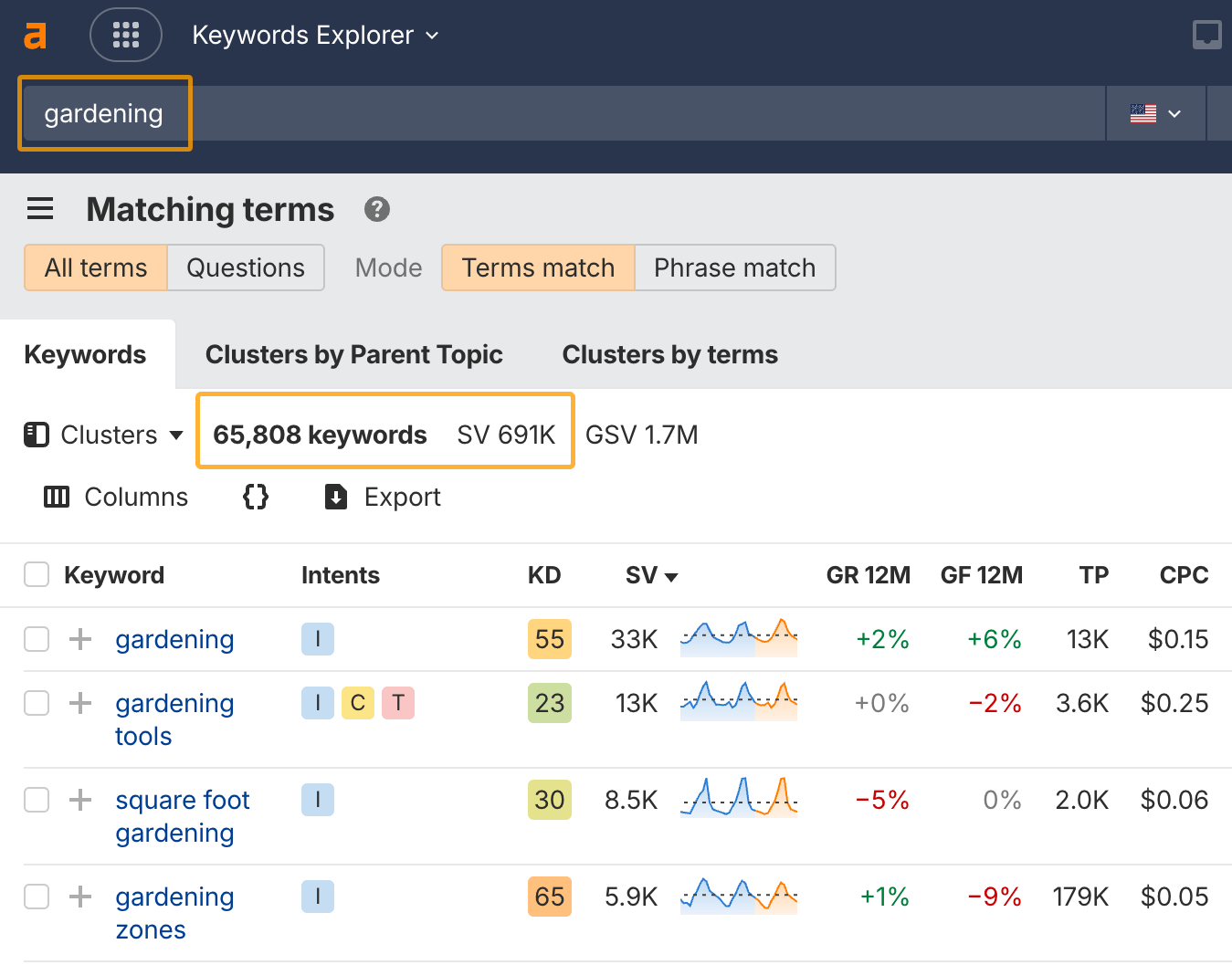
This is where Ahrefs’ Keywords Explorer comes in handy. You can enter any topic and find the exact keywords people search for. For instance, there are over 65,000 keywords about gardening that people search for in the US, getting almost 700,000 searches per month:
Check out my full process for building out an SEO topic map to help you find the best keywords to target.
As you identify relevant keywords and topics, you’ll need to decide which ones are worth adding as pages on your website. It helps to use a visual planning tool like Flowmapp:
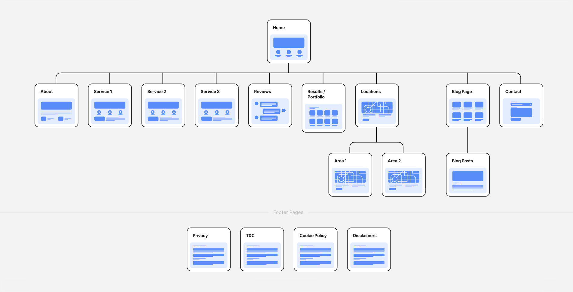
Each page has its own card where you can add SEO and design information, like:
- Keywords to target
- Page title and description
- Internal links to add
- Ideal URL permalink
- Design wireframes to use
- Essential branded elements
- Notes for content angles or direction
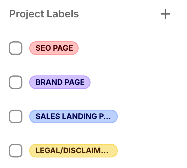
You can also use tags to map out each page’s intent.
Not all pages serve the same purpose. Some exist to capture organic traffic, while others are about brand building, lead nurturing, or support.
Once you know what pages you’ll be creating and how they will fit on your website, you’ll need to plan out the URL structure.
Make sure to use keywords naturally, avoid going deeper than three levels, and keep things clean and descriptive.
Check out these helpful guides on best practices for URLs and website structure if you get stuck:
2. Build intuitive navigation elements
Navigation is where your information architecture becomes real for users. It’s the set of cues that tells visitors where they are, where they can go next, and how to get there.
Done well, it keeps people engaged and reduces bounce rates. Done poorly, it overwhelms users and creates crawl inefficiencies that hurt SEO.
Common types of navigation elements used on websites include:
- Main menu (the unmissable one at the top of most websites)
- Utility menu (an optional slimline menu above the main menu with pages of secondary importance)
- Footer menu (the one right at the bottom of every page)
- Filter navigation (like those on the left of ecommerce pages to filter the products)
- Table of contents (usually on blog posts to help users jump to specific sections they care about)
- Breadcrumbs (at the top of deep pages to help users find other pages in the same category)
Your main navigation should be clean and purposeful.
For example, this is what it currently looks like for Ahrefs:

For best UX, keep the number of horizontal items to a maximum of seven. Seven is a magic number in menu engineering. It provides enough choice without being excessive. This is based on cognitive load theory and the fact that too many options can lead to analysis paralysis.
You can, however, use drop-downs to add more pages without overwhelming users.
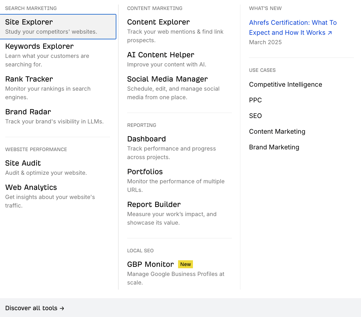
For instance, Ahrefs’ products are featured in a drop-down as a mega-menu style:
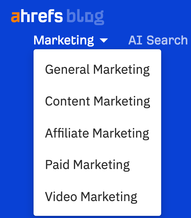
You can also use a list design like we do on the blog:
In general, it’s best to limit the number of top-level links to avoid decision fatigue.
Every extra item increases cognitive load. So, prioritize your highest-value SEO and conversion pages here.
For example, service-based businesses often highlight “Services,” “Industries,” and “Case Studies,” while e-commerce sites might use “Shop,” “Categories,” and “Sale Items.”
The footer navigation plays a different role.
It’s the place to include medium-tier SEO pages that don’t deserve main menu space but still need visibility. It’s also a great place for legal pages, credibility building, and essential brand information.
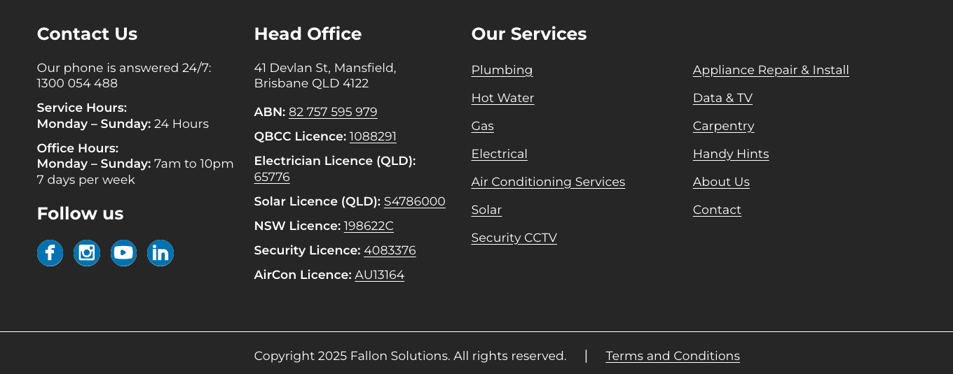
For example, here’s a simple footer design for a local plumbing business:
For a blog, you may decide to switch things up by adding blog categories, a search function, or resources.
Other internal navigation elements within the page are just as important. Sidebars, breadcrumbs, and in-content links guide users deeper into your site.
Breadcrumb navigation, in particular, supports both UX and SEO by reinforcing hierarchy, clarifying location, and giving search engines a map of your structure. Here’s what that may look like:

Check out our ultimate guide on website navigation for more tips.
And always remember that clarity is more important than creativity when designing any navigation element. Overly clever or vague labels or experimental menu designs might look trendy, but they confuse visitors and frustrate crawlers.
For example, this book publisher’s navigation sounds exciting:

But it was very difficult for users to find what they were looking for before the company changed it to clearer menu options!
Moral of the story: stick with familiar conventions, use keywords where it makes sense, and make the flow from one page to another intuitive.
3. Design UX and SEO-friendly page layouts
Once your site structure is in place, the next step is designing page layouts that work for both users and search engines.
Layouts dictate how information is presented, how easily people can engage with it, and how search engines interpret the content. A strong design balances clarity, scannability, and relevance without overwhelming the visitor or stripping out the elements SEO needs.
Unfortunately, this step is where most people go wrong (designers and SEO professionals alike).
Designers often prioritize minimal designs with little text, which gives search engines very little context to work with. Chanel’s home page, for instance, has fewer than 100 words, prioritizing visuals over content.
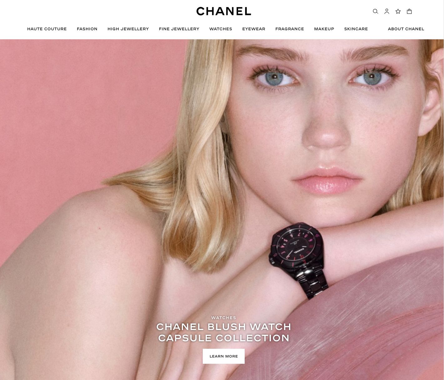
It’s great for aesthetics, poor for search visibility.
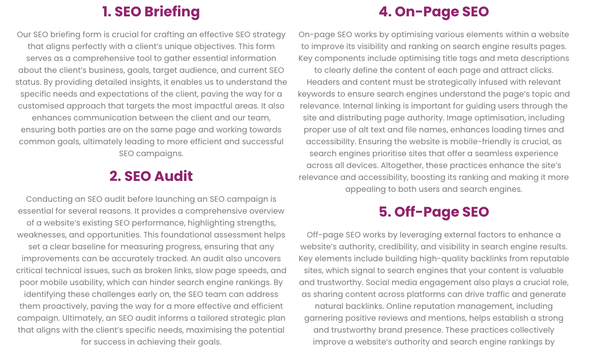
SEOs, on the other hand, often swing too far in the opposite direction, creating walls of text that overwhelm visitors…
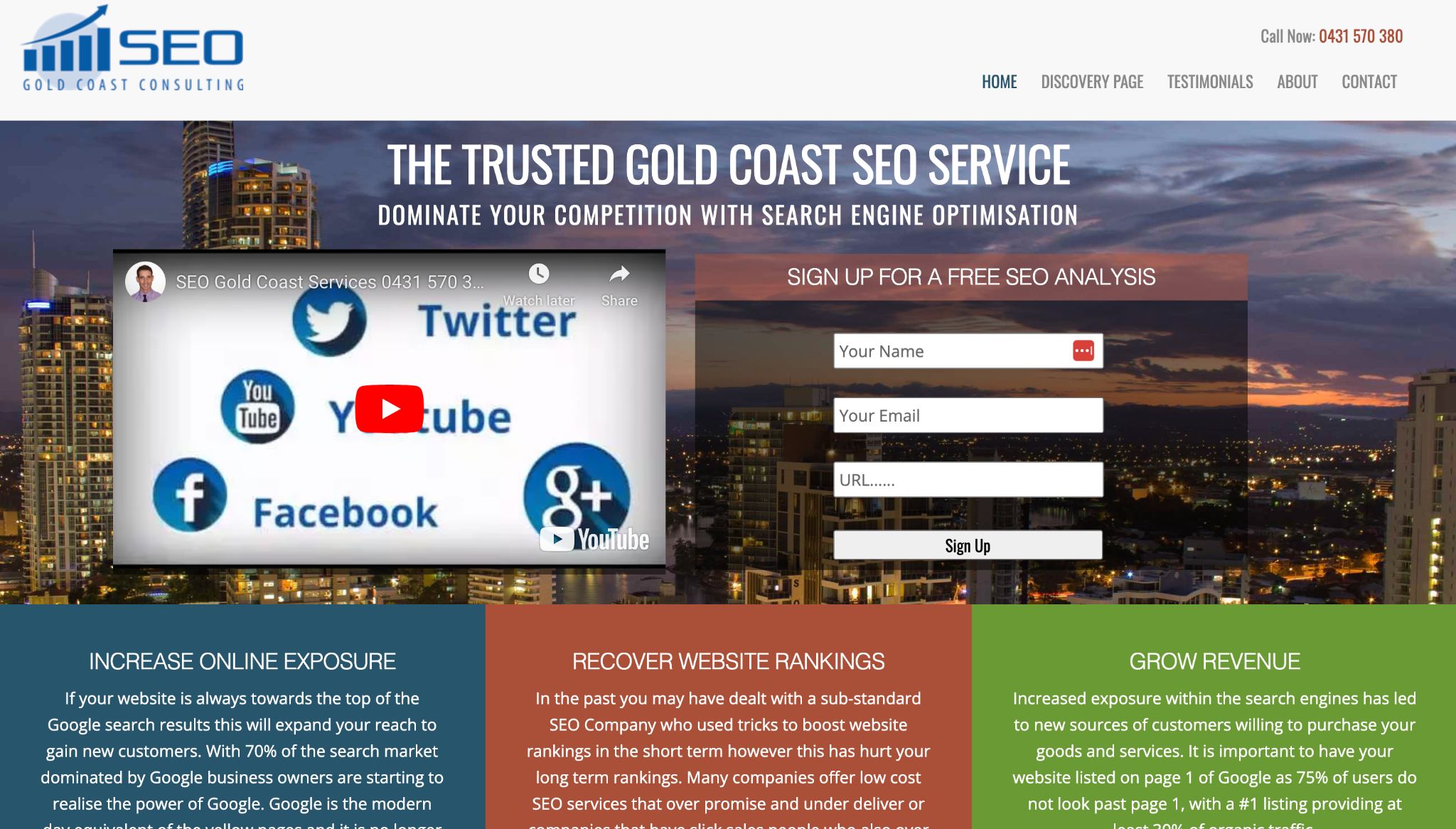
… or designing very cluttered layouts:
So, think of yourself as Goldilocks in this exercise, finding the ideal balance between design and SEO needs for each page.
Start by applying core UX principles to your page layouts:
- Aesthetic-usability effect: users perceive beautiful designs as easier to use. Clean, attractive layouts inspire trust, but only if they also provide substance.
- Cognitive load theory: when a page demands too much mental effort, people disengage. Structuring content into smaller, digestible sections (50–100 words each, separated by headings and supported by visuals) reduces overwhelm.
- Principle of least effort: users will choose the path of least resistance. Layouts should make it obvious where to click, scroll, or convert, without forcing people to hunt for answers.
- “User is drunk” or “user is my mom” tests: if your design only works for tech-savvy users, it’s too complex. Aim for layouts that are so intuitive that anyone can navigate them.
With these essentials in mind, move on to wireframing.
A wireframe is a basic sketch of a webpage that shows where things like headlines, text, and buttons will go before the final design is created.
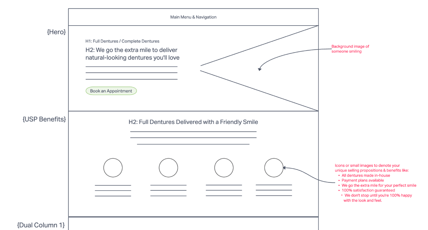
You can use any whiteboard or sketching tool like FigJam or Miro to create something like this.
This step is critical because it forces you to think about user intent and SEO goals at the same time.
For example, an SEO page targeting “commercial plumbing services” should lead with a strong hero section answering the query, then build credibility with supporting sections like case studies, FAQs, or reviews layered in logical order.
A strong page layout usually includes:
- Hero section: clear headline and value proposition (with the main keyword) above the fold.
- Calls-to-action: buttons or forms positioned to convert.
- Internal linking areas: related resources or services that guide users to explore your website.
- Content blocks: organized under descriptive headings, written for users and crawlers.
- Images and visuals: breaking up text and reinforcing content meaning.
Not sure how much content your page needs? Tools like Ahrefs’ AI Content Helper can give you a precise word count recommendation based on what’s currently ranking.
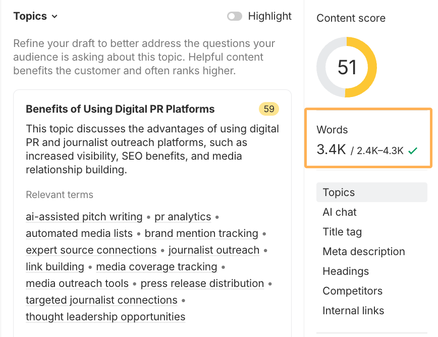
You’ll also get an idea of what content is needed for SEO sections on the page to cover the topic deeply.
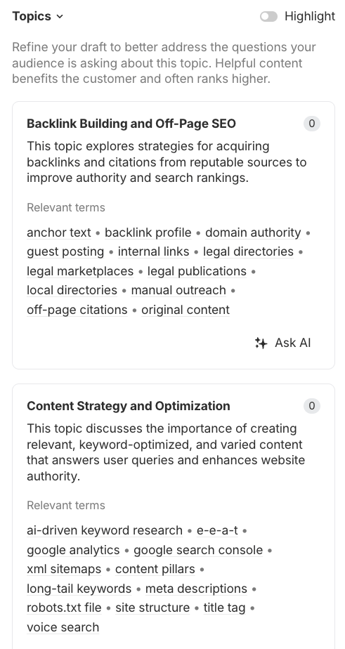
That way, you’re not guessing. Instead, you’re building layouts that balance search competitiveness with user-friendly design.
This balance between UX and SEO best practices ensures your content not only ranks well but also delivers experiences that keep visitors on-site and convert.
4. Use internal linking strategically
Internal links are the pathways that connect your pages together. They help users move through your site naturally and show search engines which pages are most important.
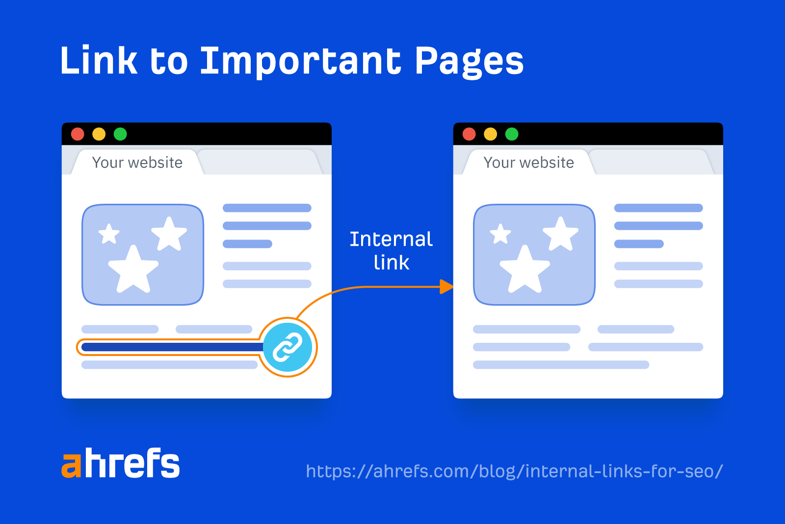
From an SEO perspective, internal links distribute authority across your site and show search engines which pages are your most important ones.
You can plan out your internal links visually by connecting the pages you think could link to each other, even if they’re from different sections of your site.
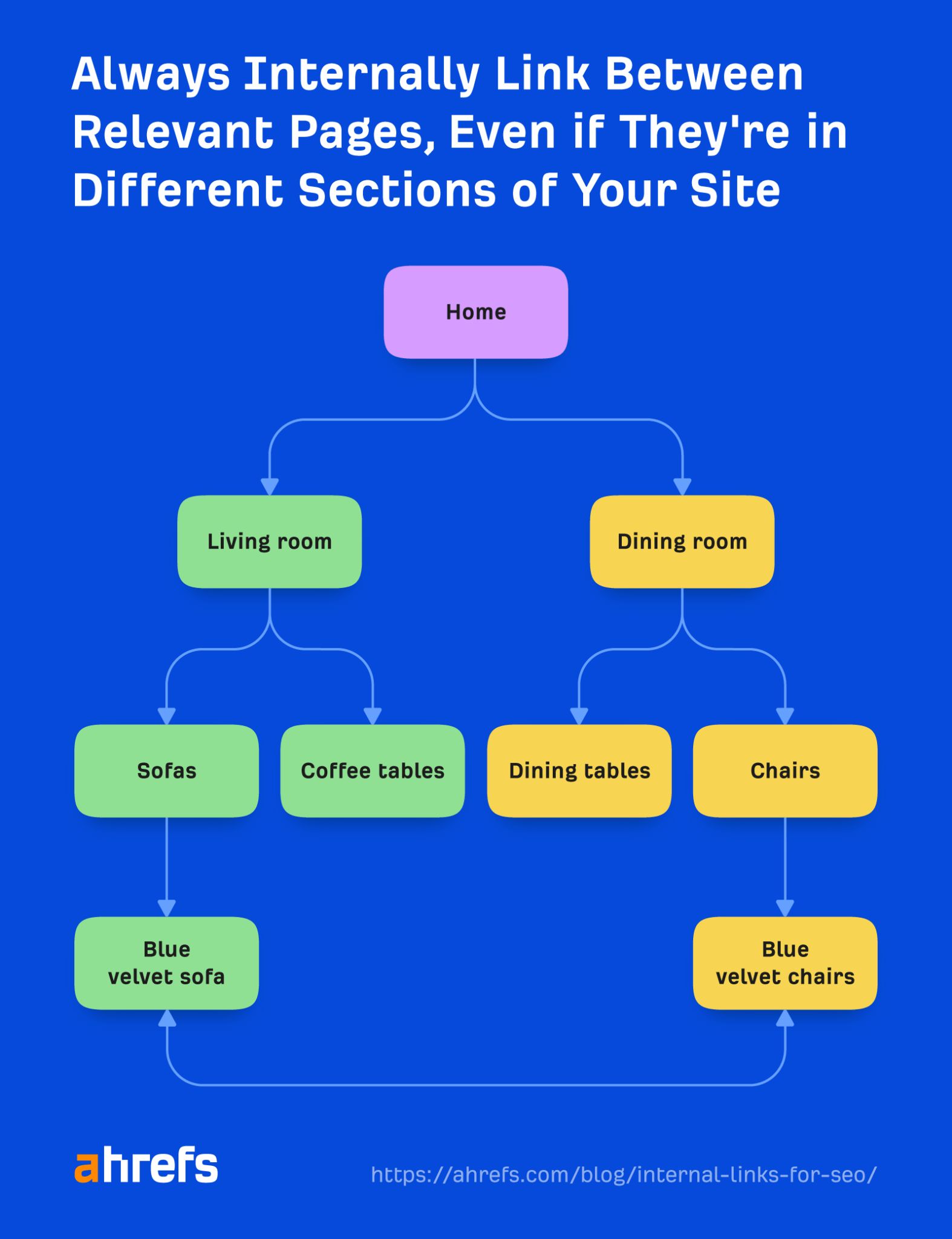
The first principle of internal linking is relevance. Links should feel natural, pointing to pages that genuinely help the reader take the next step.
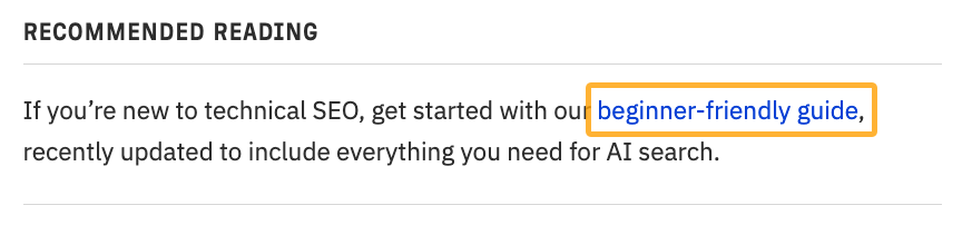
Anchor text also matters. This is the clickable text that is turned into a link. For instance, in this further reading widget, the anchor text is “beginner-friendly guide”:
Instead of vague anchors like click here, use descriptive wording that tells people (and search engines) what to expect.
When linking to SEO pages, it helps to incorporate keywords where possible, as long as they read naturally with the sentence. Don’t force them just for the sake of SEO.
Also, make sure you don’t always just include the exact keyword all the time. Switch it up from time to time.
If you have an existing website, you can find easy internal link opportunities in Ahrefs’ Site Audit tool.
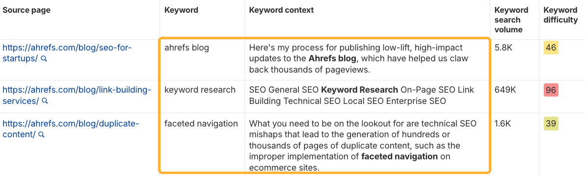
This report tells you exactly where to add internal links to help rank your pages higher in Google.
Check out our guide on Internal Links for SEO for more detailed tips to improve your website’s links for SEO and UX.
5. Optimize performance for users and search engines
Optimizing your website’s performance is as much about user experience as SEO.
Even the best-designed site can fail if it performs poorly. Search engines want to reward pages that are fast, accessible, and engaging, because those are the ones users trust.
The best place to start is running a crawl in Ahrefs’ Site Audit to uncover potential usability issues your site may have.
It goes beyond surface-level checks by flagging issues that frustrate visitors and undermine rankings:
- Slow load times
- Crawlability problems
- Broken links and pages
- Insecure content
- Core Web Vitals
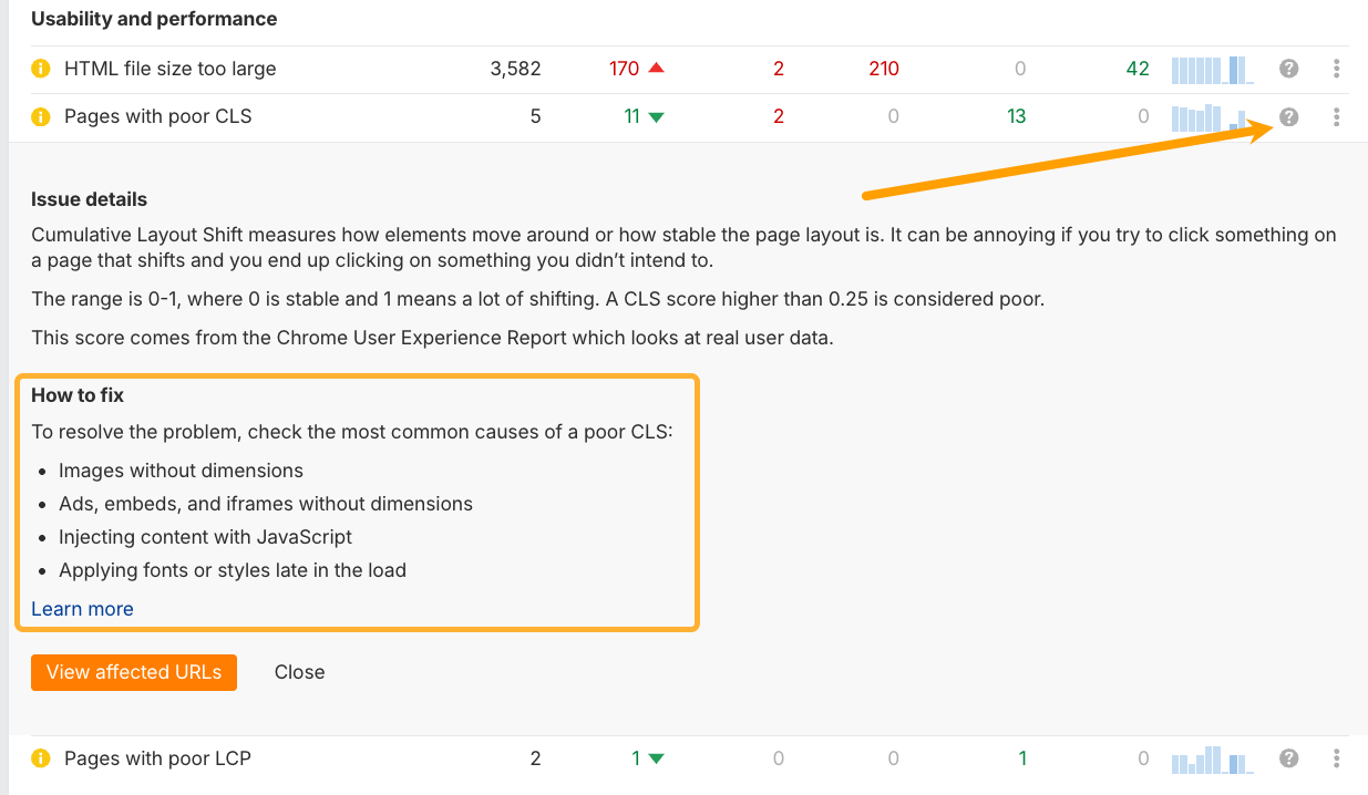
With over 170 technical factors checked for each page, it’s a comprehensive look at your website. Once you run a crawl for your website, check the All issues report for any usability and performance errors:
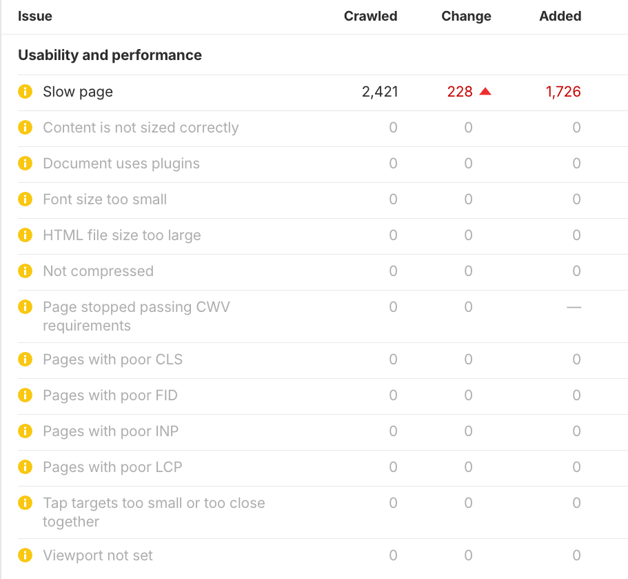
These measure your website’s UX performance.
If you’re unsure how to fix any issues that show up for your website, click the question mark symbols for an explanation:
You can also get data directly from Google PageSpeed Insights by enabling Core Web Vitals in your crawl settings:
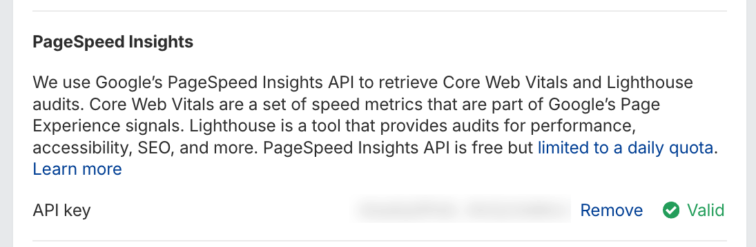
This will unlock more insights into any usability issues on your website.
For instance, the Performance report becomes a nice dashboard giving you a bird’s-eye view of your site’s UX performance:
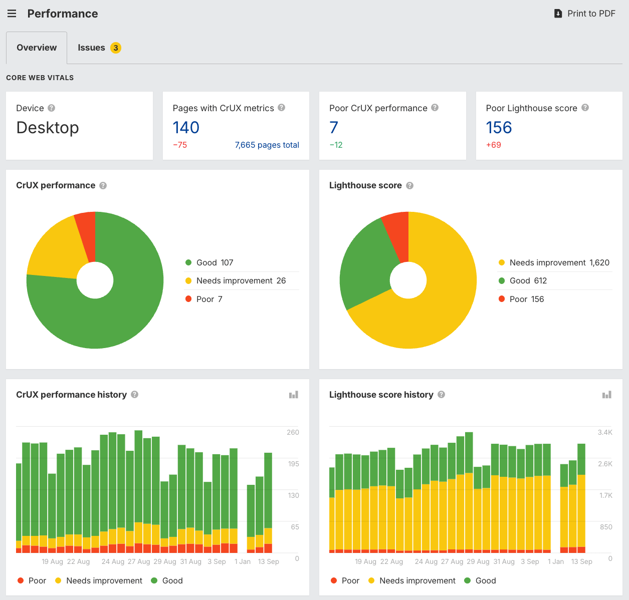
These metrics aren’t direct ranking factors on their own, but they reveal friction points that lead to poor engagement, exactly the kind of signals that can erode search visibility over time.
You can also use behavioral analytics tools like Microsoft Clarity or Crazy Egg to see how people interact with your site.
Patterns such as rage clicks, dead clicks, or quick backs (when users return immediately to search results) highlight where a searcher’s intent and your content don’t match. Quick backs, in particular, are an SEO red flag: they often signal that your content ranks but doesn’t satisfy the searcher, a problem that can cost you visibility in the long run.
The goal isn’t just hitting technical benchmarks.
It’s creating a site that feels seamless: fast to load, easy to navigate, and reliable on any device. By using Ahrefs’ Site Audit to monitor technical health alongside user engagement data, you’ll ensure your site stays both search-friendly and genuinely enjoyable to use.
Bringing UX and SEO together works best when both disciplines respect each other’s strengths.
Problems often arise when one side dominates the process, leading to sites that look polished but can’t rank, or sites that rank but frustrate visitors.
Here are the most common mistakes to watch out for.
SEO mistakes designers often make
- Wrong keyword selection: selecting keywords that are too competitive, mapped to another page, or not a good fit for the brand, reducing the chance of visibility in search.
- Intent misalignment: selecting keywords without considering what users really want, leading to content that ranks but doesn’t convert.
- Over-optimizing: cramming in keywords or creating awkward layouts “for SEO,” which harms readability and trust.
- Under-optimizing: avoiding visible content because “SEO is ugly,” leaving search engines with little to crawl.
- Minimal designs with no text: pages that look sleek but contain fewer than 100 words, making it nearly impossible to compete in search.
- Trendy experiments: overly “vogue” layouts or unexpected navigation patterns that look cool but confuse both users and crawlers.
- Undoing previous SEO work: redesigns that strip out optimized headings, links, or content that was supporting rankings.
- Misusing headings: treating H1s and H2s as stylistic choices rather than structural elements, which disrupts content hierarchy.
Design mistakes SEOs often make
- Overwhelming layouts: stuffing pages with too many elements or CTAs.
- Walls of text: prioritizing keyword coverage over readability, leading to blocks of unscannable content.
- Inconsistent messaging: mismatches between what’s promised in search snippets and what appears on-page.
- Unclear brand experience: focusing on technical SEO while neglecting branding, tone, and visual cohesion.
- Breaking flow: interrupting the searcher’s natural journey with pop-ups, irrelevant links, or poorly placed CTAs.
- Poor layout choices: ignoring visual hierarchy, making it hard for users to know where to look first.
- Too much “telling and selling”: pushing products or services aggressively instead of guiding users toward the right solution.
The takeaway? SEO and UX are complementary and must work in tandem. Avoiding extremes on both ends creates a discoverable, engaging website that’s built to convert.
Final thoughts
UX and SEO shouldn’t be separate checkboxes on your website to-do list. They’re interconnected forces that determine how people find, experience, and trust your brand online.
By aligning structure, navigation, page layouts, internal links, and performance, you create a site that’s both discoverable in search and delightful to use.
Ahrefs’ tools like Keywords Explorer, AI Content Helper, and Site Audit make it easier to bridge the gap, showing you what pages to build, how to structure them, and where to optimize.
The result: pages that rank higher, convert better, and give good UX.
If you’ve got any questions, reach out on LinkedIn anytime!